
YouTube is rolling out a new redesign for the YouTube app, and users are pissed off because of it… for a good reason. This new redesign doesn’t make much sense, as Google moved one of the two most-used sections out of reach.
New YouTube redesign makes no sense, and users are bewildered by it
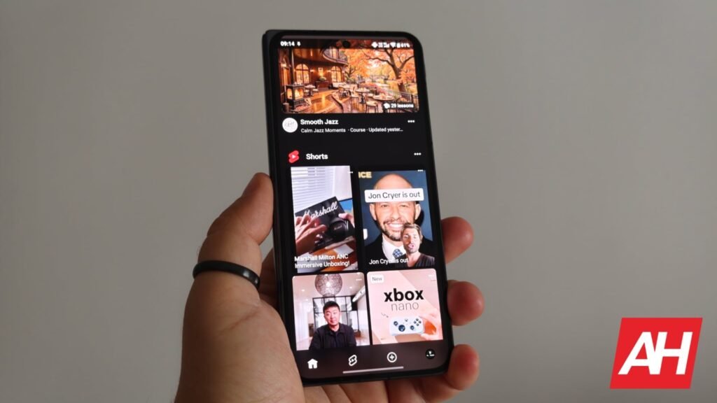
If you check out the image below, you’ll notice the new homepage of the YouTube app. One thing that you’ll immediately notice is that the Subscriptions tab is missing. It’s no longer located on the bottom bar in the new UI.

In addition to the Home and Shorts buttons on the bottom bar, the Upload button is located there, along with your profile picture and options related to your profile. The ‘Subs’ tab has been moved to the top bar, for whatever reason.
That tab now sits as the second option in the top bar, after the ‘Home’ options, and ahead of the Music, Live, and More tabs. The thing is, when you fire up the app, that top menu shows up only for a second, and then disappears until you scroll up. Yes, it’s not visible at all times.

To make things worse, when you fire up the app, Shorts are front and center now; they take up most of the screen on the default ‘Home’ tab. Needless to say, users are very annoyed by this. Many of them use that ‘Subs’ tab, which is out of reach a lot more than Shorts.
Google is obviously trying to push Shorts as much as possible. Not only is the option now very prominent in the bottom bar, but they’re taking up most of the default home screen.
Reactions are all but positive
There are so many Reddit threads (1, 2, 3, 4, 5, 6, and more) with furious users venting about the change. A Reddit user, v0id_user said: “I want to watch the people I subscribed to. Why is that the button I have to go looking for?”
Another user said: “The new UI was driving me insane, I think I opened my camera 10 times today trying to open subs section.”
Many users are pointing out that they’re using YouTube for content consumption. So, ditching the Subscriptions tab in the bottom bar to replace it with the Upload button is wild.
Google also removed the familiar category filters that let users quickly isolate Unwatched, Today, or Live Content. Instead, users now get an algorithm-heavy feed with prominent interaction icons.
Those couple of comments we’ve mentioned are some of the most relaxed ones on Reddit. Some people are furious with this change.
The post Users Are Bewildered by YouTube’s Latest Redesign, and Rightfully So appeared first on Android Headlines.