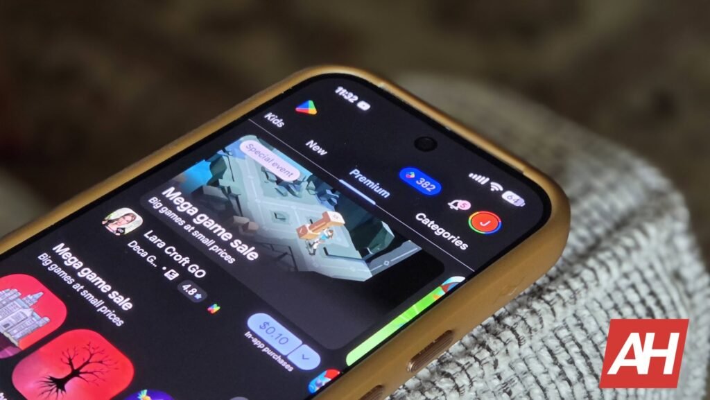

Pages for paid games on the Play Store are getting some touch ups with more style and a little bit of extra flair, thanks to efforts from Google to promote premium games more than it has in the past. The Play Store has of course always offered paid games, but the design of the Play Store has changed so many times over the years, the designs of how Google promotes paid apps and games has changed just as much.
Now it looks like Google is looking to emphasize paid content more by giving the individual pages of a paid app or game a flashier look that falls more in line with its current design standards. These changes are not yet widely rolled out and are currently in testing, but they were recently discovered in the 53.3.21-34 version of the Play Store.
Paid game pages in the Play Store feature color-matched UI elements
As part of these changes, Google has started implementing UI elements that match colors displayed in the large artwork for that specific game. In examples of these design changes shared by Android Authority, a page for the game Dredge shows artwork that features a sort of teal color for the water, and things like the buy button and the wishlist button feature matching colors to thematically bring things together. An example for Brotato does the same thing but the color is purple instead.
In addition to these design elements with matching colors, Google is also starting to label games with slang phrases to describe their reception from players. For instance, Dredge is labeled as a “certified banger” with that label sitting above the number of reviews the game has. This is as opposed to showing the star rating. Other terms include “absolute peak” and “solid choice.”
This design shift doesn’t seem to be entirely widespread yet, and it’s not made clear if this is a change that Google will ultimately stick with.


The post Play Store game ratings swap from stars to “being a certified banger” appeared first on Android Headlines.