
Google seems to be on a mission to make our digital wallets a lot more vibrant. For a few months now, developers have been working on a significant redesign for the Google Wallet “passes” interface. Recent previews from the latest app version suggest that this refresh is finally reaching its final stages. However, judging by early images of the redesigned Google Wallet pass UI, some may find the “colorfulness” too over-the-top in its current state.
Google Wallet UI design to bring a splash of color everywhere
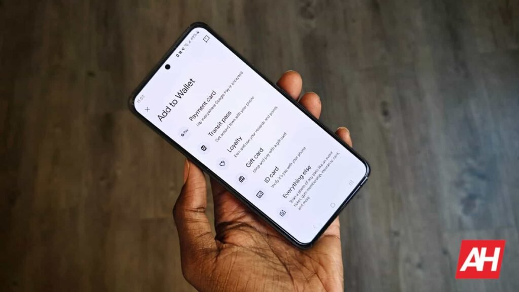
In the current version of the app, Google uses color to help you distinguish between a boarding pass, a gym membership, or a loyalty card. However, this new design takes things to a different level. Instead of small accents, the entire background of each pass now adopts a solid, bold hue.
As spotted by Android Authority, the interface now feels much more cohesive. The irregular screen elements and awkward edges found in earlier tests have been smoothed out. This creates a seamless transition between different sections of the app.


While a bold design can certainly help with usability, the latest tests show colors that might be a bit too intense for some. When you switch between passes, you are met with deep reds, bright purples, and vivid yellows that dominate the entire screen.


Changes to the Google Play Points screen
Plus, the Google Play Points screen now features a working progress bar and a cleaner layout that matches the overall aesthetic.


These high-contrast backgrounds make information easy to read at a glance. However, the sheer intensity of the palette might be overwhelming in dark environments or for users who prefer a more understated look. It is possible that Google will fine-tune the saturation or brightness of these tones before the official rollout to ensure the app stays “friendly” to the eyes.
As of today, these changes aren’t visible to final users yet. However, it wouldn’t be surprising to see an official announcement soon. Maybe in the upcoming Google I/O? Be that as it may, we won’t take long to find out.
The post Google Wallet to Go All-In on Color with New Passes UI, But Maybe Too Colorful? appeared first on Android Headlines.