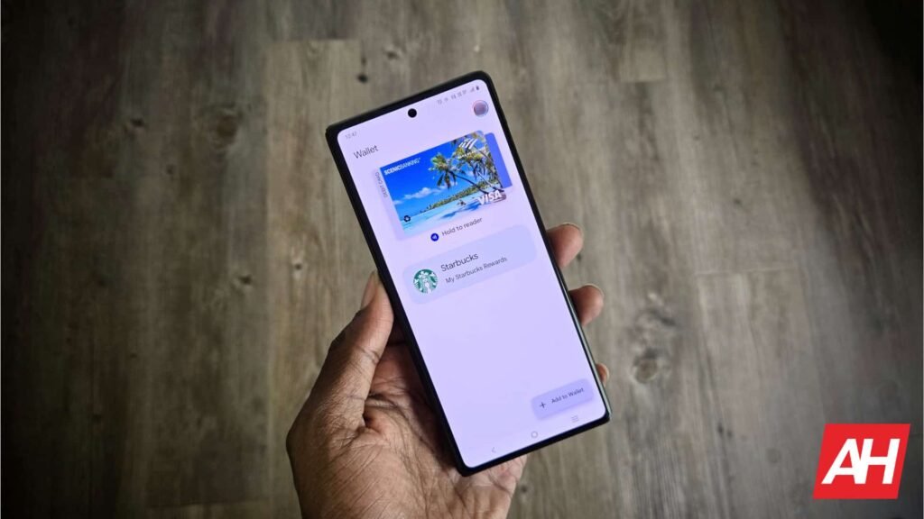

With every design change, Google tries to improve the user experience across its range of native apps. One of them is Google Wallet, which received a homepage revamp with search back in May. Months later, we’re now seeing yet another redesign, and this time it’s for passes in Google Wallet on Android. Here’s what’s changing.
Google Wallet passes redesign gives digital passes a fullscreen look
This change focuses on the passes section of the app. 9to5Google reports that instead of a small rectangular card on the Dynamic Color background, Google Wallet passes now fill the entire screen as part of the redesign. The page background now matches the brand’s primary color. This should make it easier to quickly identify the brand associated with each pass.
Scrolling down gives you access to key actions like calling linked phone numbers, visiting the official website, and other relevant options. Under ‘Settings’, you can now edit the nickname and manage how it’s used. These preferences were previously available in the three-dot overflow menu.
Access the old look with just a tap
Interestingly, the report notes the Google Wallet’s new redesign will allow users to access the old look completely just by tapping the rewind icon in the top-right corner. The report notes the redesign applies to all loyalty cards and boarding passes, including manually created ones. Transit cards, however, still use the old design. That’s about it for the changes. If you’re into bright themes taking over the screen, the new design should be quite appealing to you.
But then again, some background colors can be too bright, especially when you’re accessing passes during the night. Either way, the redesign is reportedly already rolling out widely to everyone, but if you don’t see it yet, give it a couple of days; you should receive it. This is because updates like these usually roll out gradually.


The post Google Wallet Passes Get a Colorful Fullscreen Redesign appeared first on Android Headlines.

