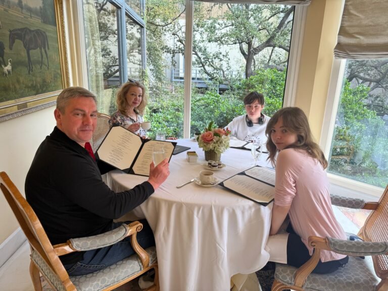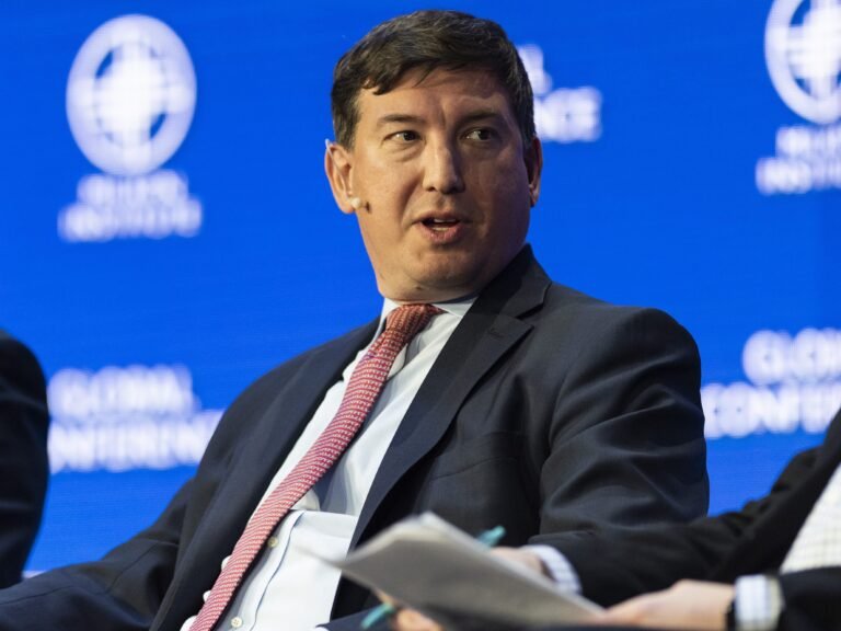
In May of 2025, news broke that Billy Evans, the partner of disgraced Theranos founder Elizabeth Holmes, was raising money for his own blood-testing startup, Haemanthus. At the time, Haemanthus stated explicitly on its official X account that it was “not Theranos 2.0.” Then, in Nathan Fielder and Lance Oppenheim’s blockbuster film You Can See Everything, which debuted in October, Evans point-blank described Haemanthus as “Theranos 2.0.”
Haemanthus has been shrouded in mystery since its inception. The glaring issue, of course, is that Evans’s plans sound distinctly similar to Holmes’s approach at Theranos, which led to her current sentence of 11 years in prison for defrauding investors. On social media, Haemanthus claims that “Elizabeth Holmes has zero involvement in Haemanthus,” while You Can See Everything paints a very different picture.
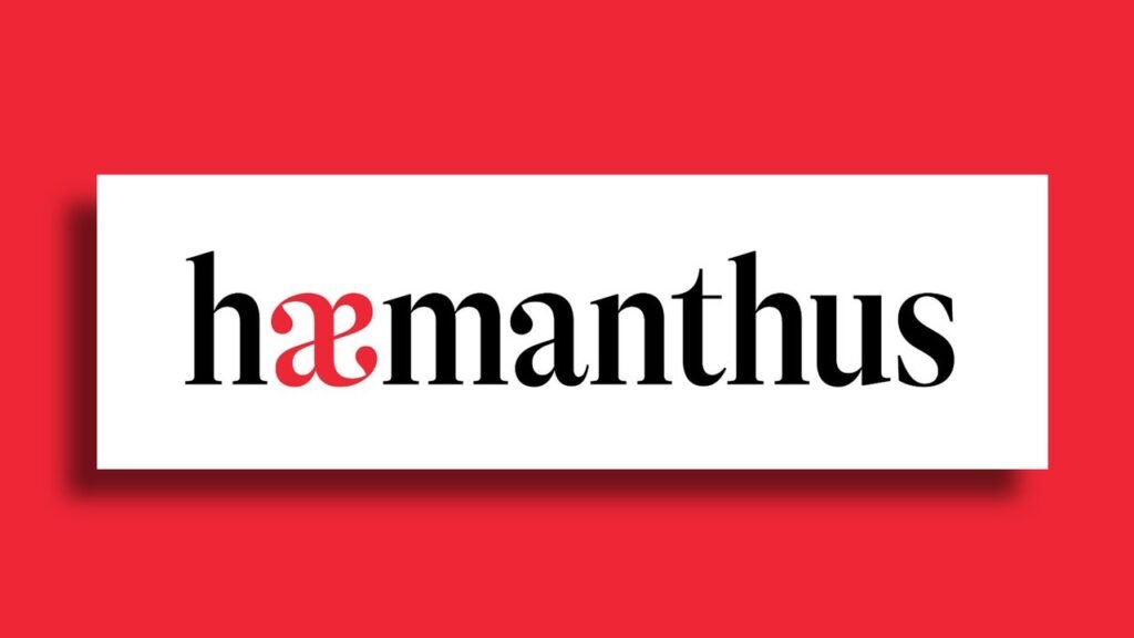
That’s led fans of the film to dig for any scraps of information that they can find about the company—which boil down to a few on-the-record statements, some patent applications, two defunct social media accounts, and one striking company wordmark.
We asked four designers what they make of the Haemanthus logo—the only element of a brand identity that the company has revealed thus far—and their responses paint a picture of a brand that’s uninterested in following the norms.
What we know about Haemanthus
Evans has been fairly tight-lipped about the workings of Haemanthus, stating in a May 2025 New York Times interview that the company is still in stealth mode.”
According to marketing materials reviewed by the Times for that piece, Haemanthus’s device will initially use a laser to scan blood, saliva, or urine from pets and analyze the samples on a molecular level. The company’s long-term goal is to develop a stamp-size, wearable version of the product for humans, which it predicted would take about three years and $70 million to develop. At the time of that story, the Times reported that Evans had raised about $18.5 million from investors.
As of this writing, the U.S. Patent and Trademark Office is examining the company’s request for a trademark. According to Google Patents, the company has submitted at least six patent requests for Raman spectroscopy systems (the diagnostic tool at the core of the company’s proposed technology), one of which has been granted.
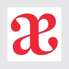
Haemanthus has a LinkedIn account with no posts and an X account that was briefly active in 2025 (one of the 14 posts is just the Mark Zuckerberg quote, “In a world that’s changing so fast, the biggest risk you can take is not taking any risk”). Both accounts feature the one piece of branding that Haemanthus has made public: a black serif wordmark with an “a” and “e” that have been fused together and rendered in red. The a/e ligature (called an “ash”) also appears to serve as a stand-alone brand mark.
Fast Company reached out to Haemanthus on X and LinkedIn to ask about the design and its intent. We didn’t hear back by the time of publication.
What a wordmark can (and can’t) tell us about a mysterious company
Given that there’s no publicly available information about Haemanthus’s brand identity, it’s impossible to know what the company intended to convey with its wordmark. However, as with any brand identity, the design embeds multiple stylistic choices, each with distinct cultural connotations, that might say something about how Haemanthus’s founders plan to position the company.
Here’s what four designers make of the mark.
Jesse Reed, principal, Order Design: “If you were showing me this wordmark and you wanted me to describe it without knowing what space it was in, I would probably categorize it as editorial. It’s a high-contrast serif, which you see most commonly used in newspapers. It could simply be for contrast against other sans-serif grotesques that are used in the biohealth industry. There is some connection there with the use of that ligature, which is a Latin character that was used mostly in Old English. That, paired with that type choice—there’s something that they’re hinting at with this, potentially rooted in some deep human history.
But are they doing that, or is it purely an aesthetic and they have no idea actually why they’re choosing it? It might have no meaning whatsoever. And I don’t even want to give Billy Evans any credit for anything.”
Thomas Kurppa, cofounder, Kurppa Hosk: “The red is an obvious reference to blood, but the letterforms introduce something more ambiguous. There’s a tension between scientific heritage and almost biological, ornamental expression.
Most biotech companies use design to communicate precision, clarity, and technological progress. Haemanthus takes almost the opposite approach: It’s expressive, historical, and unusually ornamental. In a field where scientific credibility is everything, that choice stands out, and it’s almost mysterious. But distinction and earning trust are two very different things.”
Dariush Aghai, cofounder, Study Hall: “A biotech company, particularly one with this history, needs to communicate scientific credibility, transparency, and trust. Instead, this feels more akin to the visual language of heritage luxury and private wealth. We know the leadership comes from extraordinary means, and the identity projects their perception of prestige and credibility, rather than what their audience needs to trust them. Founders often mistake personal taste for brand strategy. They build brands that reflect how they see themselves, rather than how they need to be understood.”
Teemu Suviala, global chief creative officer, Landor: “When a company has such a limited public presence like Haemanthus does, its logo can end up carrying more meaning than it was designed to bear, which puts a lot of pressure on a single brand asset. We all read these things differently, based on our experience and interests. And what’s important to remember is that a logo is not a brand. We’re missing all the other elements of a working design and communications system.
A brand is also an accumulated perception in people’s minds: all the memories, associations, expectations and emotional connections built through every encounter with a company or a product. These are shaped by a complete brand identity system, products, experiences, communications, marketing, and rituals. What I’m saying is, we are definitely not seeing everything here.”