
If you frequently rely on digital assistants to streamline your day, you are probably familiar with clunky menus blocking your active workspace. Fortunately, Google is rolling out a major aesthetic redesign for its Gemini app with a cleaner, highly dynamic UI hitting devices worldwide, giving the AI assistant a new injection of personality and speed.
A minimalist overlay with hidden power
The visual upgrade starts the moment you summon the assistant on your screen. The new Gemini app overlay adopts a refined, minimalist look that stays out of your way. Instead of crowding your view with text blocks, Google tucked your favorite everyday shortcuts neatly inside a single “+” (Plus) button.
Tapping this panel splits your workflow into clear, actionable categories. First, a dedicated input section allows you to seamlessly attach items to your active prompt. From here, you can quickly grab images from your local gallery, activate your camera for real-time analysis, upload documents, or pull files directly from Google Drive. You can even hook into your custom Gemini Notebooks instantly.
Right below your assets sits a brand-new creation suite. This area gives you instant access to advanced generative features. It allows you to create music tracks or generate digital art without digging through deep settings. For professionals, the menu provides a direct shortcut to the dedicated Canvas UI—a specialized workspace built with programmers and coders in mind. There is also a structured learning tool designed to help you dive deep into complex educational topics.


Pulsing colors for Google Gemini UI’s new UI
Beyond raw functionality, Google is addressing user privacy directly within the new panel. The interface introduces a physical toggle for “Personal Intelligence.” If you are cautious about how cloud systems analyze your daily routine, this clear on-off switch lets you cut off contextual tracking in a single tap.
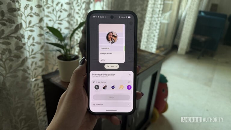
When you decide to expand the assistant into the full-screen interface, the app truly comes to life. The static backdrop is gone, replaced by a smooth, shifting gradient. As the system processes a prompt, these colors begin to animate and pulse with a gentle heartbeat effect.


This dynamic animation carries over to the privacy-focused Incognito mode as well. However, to ensure you never accidentally share sensitive queries on the wrong profile, the private window swaps bright colors for an unmistakable, moody gray palette. To cap off the visual update, Google refreshed the default typography. The clean new font face significantly improves text legibility, making long research summaries noticeably easier on the eyes.


The post Google’s New Gemini UI Rolling Out with Gradient Vibes, Pulsing Animations and a New Font appeared first on Android Headlines.