Madonna announced her new album Confessions on a Dance Floor II with sans-serif typography from the same creative agency behind Charli XCX’s brat.
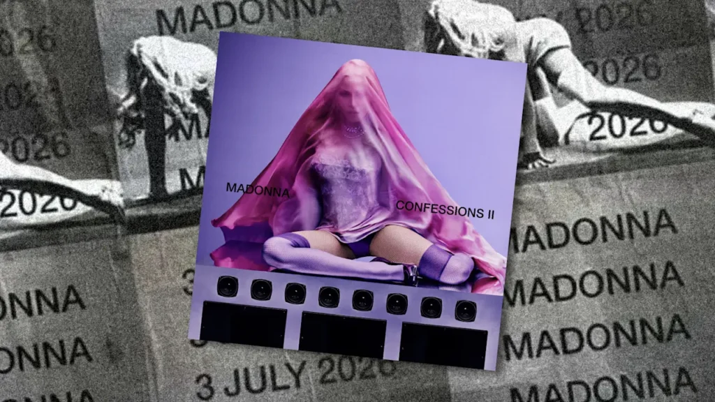
On wheat paste posters and short-form video posted to social media, Madonna teased her forthcoming album, out July 3, and its first song, “I Feel So Free,” in words. “Madonna Confessions II” is written on the album cover in Helvetica, a workhorse sans-serif font that’s one of the most popular fonts in the world because its minimalist form looks simple and perpetually modern.
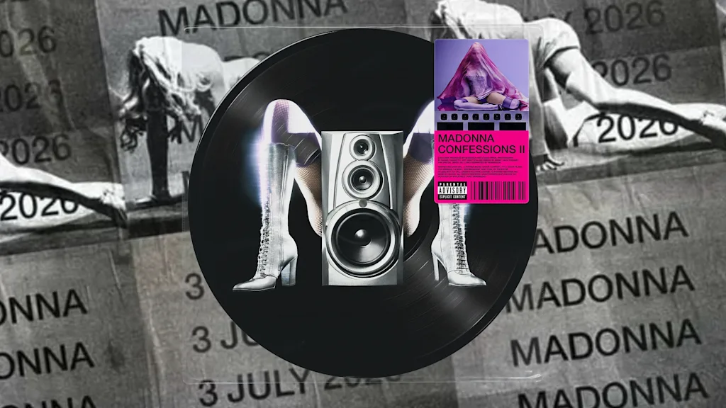
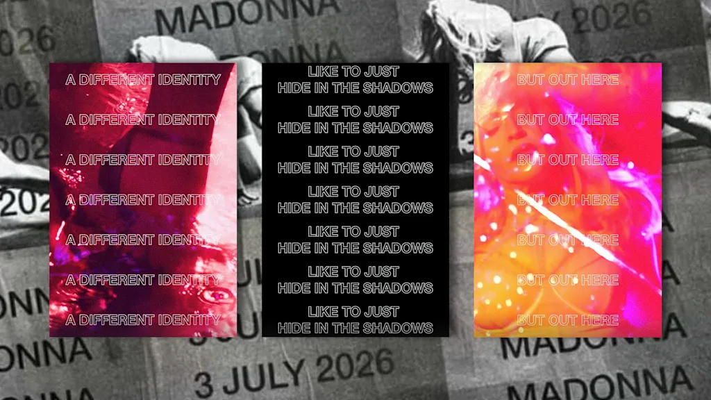
Typography was used throughout Madonna’s announcement to spell out “Confessions II,” “COADF 2,” and other promotional copy in all-caps, sans-serif typefaces, and some of the text is vertically stretched or outlined. The singer isn’t using a single font for this album launch; she’s using a whole font book. In an Instagram Stories video, text flashes and repeats vertically on screen, along with a strobe warning. It’s loud, fast, and eye-catching. A new, provocative M logo for the album shows the singer’s legs in high-heeled silver boots making the shape of the letter out from behind a speaker.
For a sequel to Madonna’s beloved 2005 dance-pop album, Madonna reunited with producer Stuart Price who recorded, co-produced, and co-wrote the original Confessions on a Dance Floor. The snippet for the first track Madonna teased sounds squarely within the dance pop universe that the first album introduced. For the album’s graphic design, though, Madonna turned to a new creative partner that’s taking a type-first approach.
Special Offer, Inc., had previously worked with artists like Haim and Miley Cyrus, but it was its art direction for 2024’s brat that put it on the map. Charli’s breakthrough album, known for its neon green color scheme and out-of-focus Arial Narrow font, won the Best Recording Package at the 2025 Grammys.
After its launch, brat-style typography appeared just about everywhere: as murals, in an unofficial album cover generator, on merch (both official and unofficial), and on deluxe edition of the album. The brand also extended to flashing typography for Charli’s Sweat Tour with Troye Sivan and the video titles for her “360” and “Guess” music videos. Special Offer, Inc., which is credited for art direction for Madonna’s new album, did not respond to a request for comment.
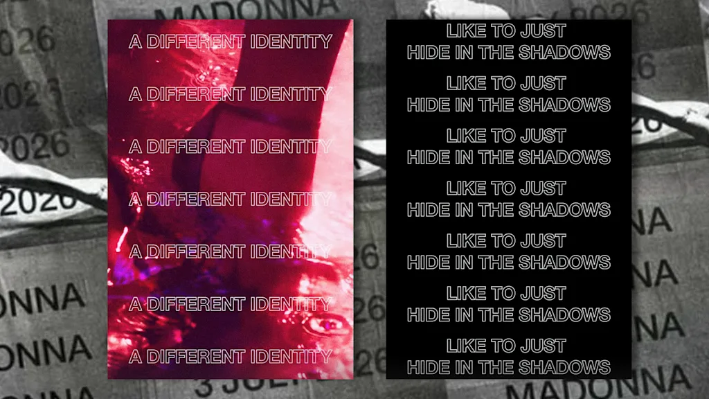
Madonna once promoted her music through platforms like MTV, but today it’s short-form video where music gets traction, and the strobing, type-first approach Special Offer, Inc., is taking works well on smartphones where short, bold, visually arresting text stops you mid-scroll.
“The typography for an artist like Madonna is interesting,” says designer Nolan Strals, who’s made album artwork for artists including Titus Andronicus, Beach House, and John Legend and the Roots. “She’s always been played in clubs, but this feels like a bid at relevancy for a new generation… It’s typography not aimed to get the attention of her old fans, but to feel relevant to people who get their culture from TikTok.”
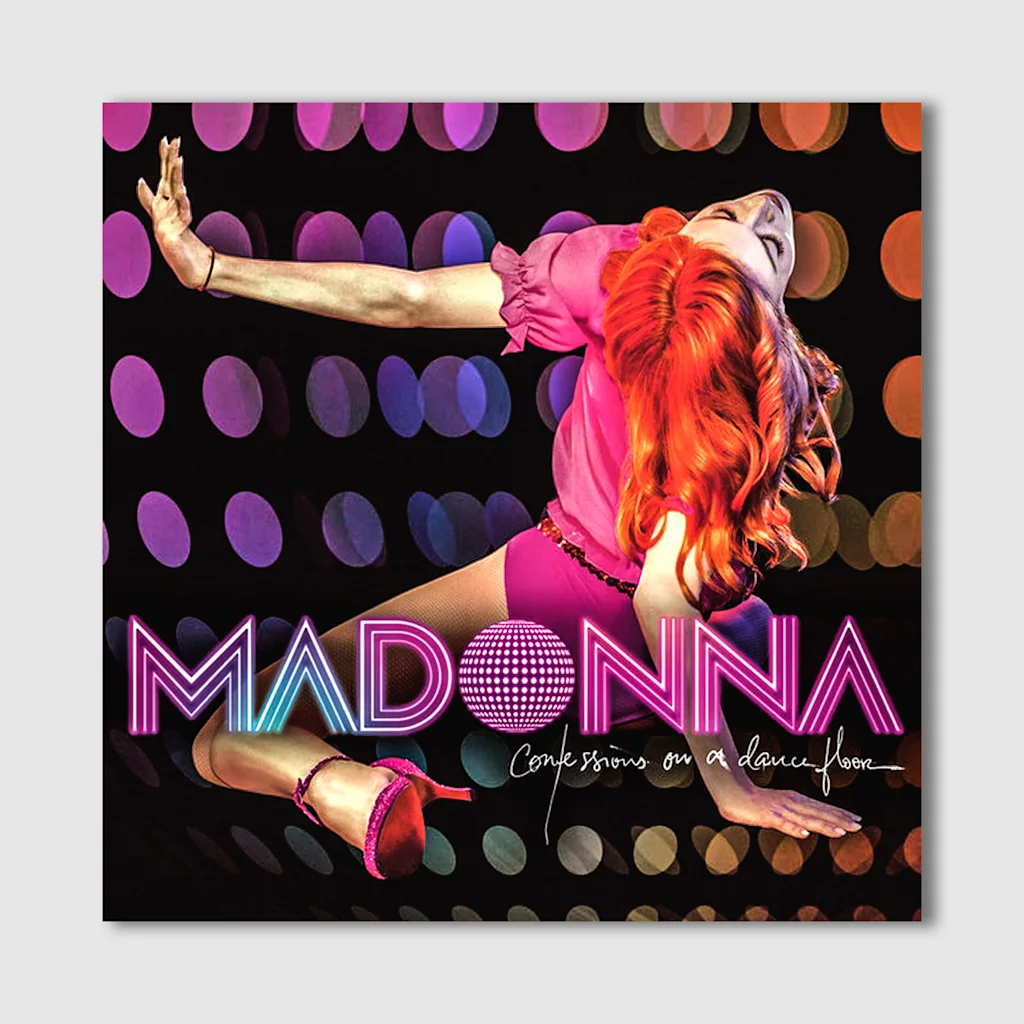
The typography used for the original Confessions album included a Madonna logo that turned the O into a disco ball. The handwritten album title, track listing, and liner notes recalled the look of disco-era album art lettering from artists like Michael Jackson and Grace Jones. Photographer Steven Klein shot the artwork that showed Madonna in red hair, a pink leotard, and sparkling heels, and designer Giovanni Biano did the art direction and graphic design. The color scheme for the album, which spun off hits like the ABBA-sampling “Hung Up” and “Sorry,” was pink and purple while the lighting was dark and moody.
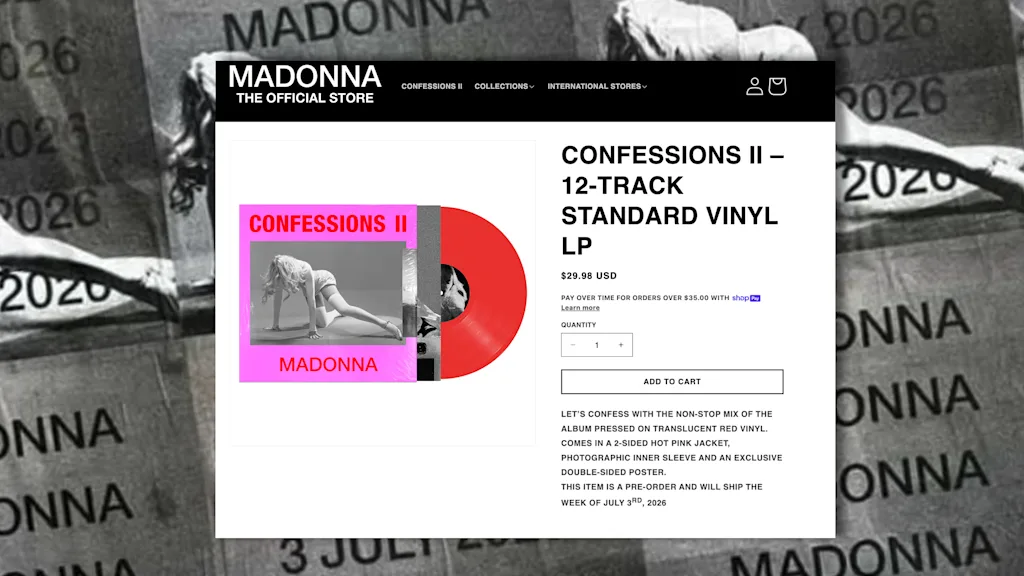
A bright pink, red, and purple color scheme for the new album packs a Bratty, high-contrast visual punch, but echoes the colors of the original album art. Then there’s the photography for Confessions II, which this time around is more high fashion with a magazine-quality editorial look showing Madonna with fabric over her head wearing a floral pattern top and fishnet stockings. Her shoes this time aren’t sparkly, they’re all black.
Using Helvetica on the album cover is a simple but smart play, because while the font is widely used, such as across New York City’s subway system and in logos like Target and Jeep, it also appears across art and fashion. Special Offer, Inc., has used the closely related font Arial in its work for Charli and Addison Rae, and before his death, Virgil Abloh used Helvetica to write words out on his designs.
More than 20 years after the original album’s debut, the COADF visual identity has grown an extended universe that appeared on tour, a subsequent live CD-DVD, and an anniversary edition of the album. For the sequel, Madonna’s designers are building on what came before. The look of the new album is elevated, like Confessions on a Dance Floor all grown up.