The plant-based meat category has spent the last several years fighting an uphill battle in a cultural climate that’s turned food into a political statement. MorningStar Farms, one of the oldest players in the game, just rebranded to remind people that meat alternatives are nothing new—and they’re not going anywhere.
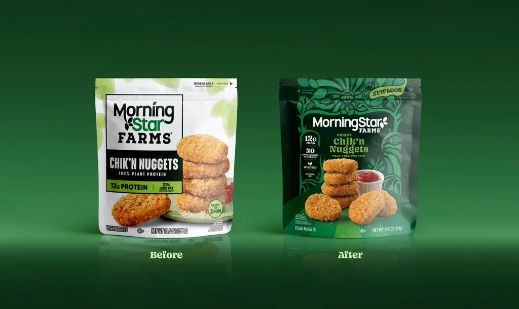
MorningStar has been making plant-based meat long before “plant-based” was its own category in the frozen section. The brand was founded in 1974 and acquired by Kellogg (now Kellanova) in 1999. Over the last several decades, it’s expanded its offerings from Bacon Strips and Sausage Patties to Korean BBQ Riblets and Buffalo Chik’n Patties. This month, in partnership with the agency Design Bridge and Partners, it’s rolling out a rebrand—complete with new typography, a vibrant green color palette, and a retro look that’s intended to both call back to its heritage and jump out on shelves.
MorningStar’s new look comes at a fraught moment for the broader meat alternative category. Competitors like Beyond and Impossible Foods are struggling with declining revenue (a challenge both have attempted to meet via their own rebrands), and others, like the vegan chicken nugget startup Nowadays, have gone out of business entirely. Meanwhile, fake meat has become a flashpoint in a broader culture war, symbolic of a climate-friendly movement that’s been largely drowned out by the carnivorous MAHA crowd.
In spite of this, Morningstar Farms’ new brand doesn’t seem very interested in taking sides in the ideological debate over fake meat. Instead, it intentionally leans on the company’s 52 years in business to send a simple message: Plant-based alternatives have been here for decades, and they don’t have to be unfamiliar or scary.
How fake meat turned into a political flashpoint
Just a few years ago, fake meat was a rapidly growing category and investor darling.
In 2019, the stock of Beyond (then Beyond Meat) hit an all-time high of $234. Three years later, it formed a partnership with McDonald’s on a meat-free burger called the McPlant. Popular restaurants like New York City’s Eleven Madison Park had recently taken meat off the menu entirely. By the end of 2022, Impossible reportedly had more than doubled its retail sales.
Today, the picture looks drastically different. Beyond’s stock price is down to around $8, an 88% year-over-year decline, and the company ended 2025 with a 19.7% revenue slump. The McPlant is dead in the water. Eleven Madison Park added meat back onto its menu at the end of last year. At the Semafor World Economy summit in 2025, Peter McGuinness, the Impossible Foods CEO, said that plant-based meat was “not in vogue right now.”
Experts argue that meat and meat alternatives have become symbols for right-wing and left-wing viewpoints, respectively, especially in light of the Make America Healthy Again movement. As Fast Company wrote late last year, “the plant-based world—and the public’s desire for bold action for the climate—is in retreat.”
Meat alternatives are undoubtedly having a public perception problem, and Impossible and Beyond have both attempted to use design to remedy it, though with opposite strategies. In 2024, Impossible Foods debuted a richly red, meatier look to appeal to a more mass market crowd. McGuinness said that the rebrand was intended to dispel the brand’s “elitist,” “woke” reputation. In 2025, Beyond dropped the “meat” from its name and leaned into a greener, more veggie-forward direction.
MorningStar seems to be taking a third route with its rebrand. The new look sidesteps the culture war entirely, neither projecting meat adjacency nor aggressively playing up its veggie content. Instead, the new look amps up a brand truth that newer competitors can’t claim: MorningStar has been in the meat alternative game since long before the current political headwinds.
“Our initial hunch was, that’s a thing that [the brand] can say without flinching,” says Ben Sherwood, creative partner at Design Bridge and Partners. “It was an understated truth of the brand that hadn’t really been touched on before, but was a point of difference when you look at the rest of the category and the question of nutritional benefits or the fad diet world.” One internal mantra became a guiding principle: “They weren’t good because they were old; they were old because they were good.”
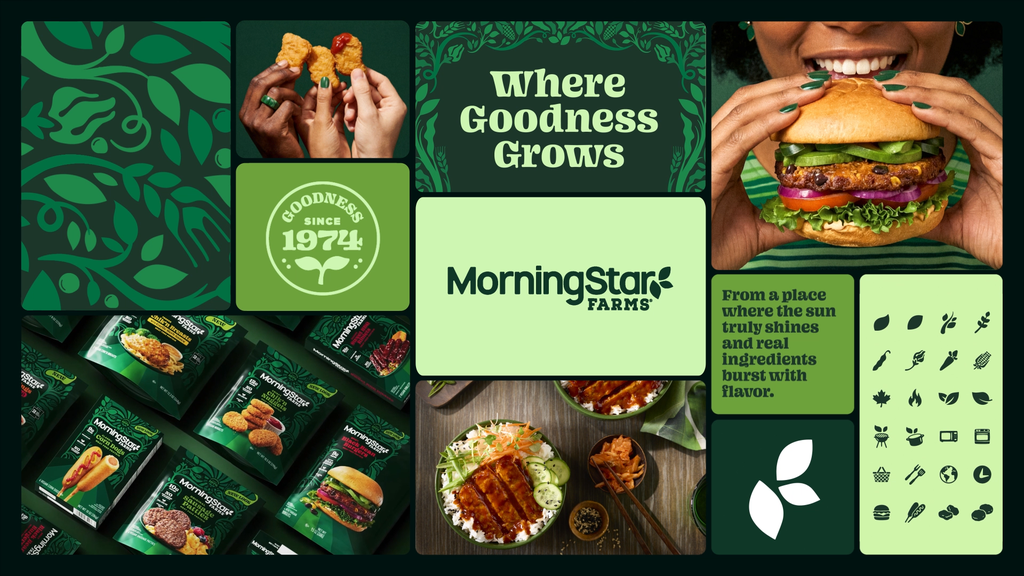
MorningStar takes a page out of a ’70s cookbook
Mosley says the new brand had three main goals: First, to re-center MorningStar’s 52-year heritage; second, to help shoppers identify the benefits they care about (like taste and protein content); and, third, to make it easier to find MorningStar on shelves.
To capture the brand’s origins, Sherwood had his team take a trip back to the ’70s. That meant listening to era-specific playlists, digging through old records and posters, and looking back at MorningStar cookbooks from the time.
“1974 was post-hippie era, post-Summer of Love [in 1967],” Sherwood says. “There was still a love for this back to nature idea and conscious, healthy living.” At the time, he adds, there was a cultural acknowledgment that cutting back on meat consumption was beneficial. The question for his team was whether MorningStar’s new brand could “tap into some of those roots to make it less of a barrier to actually get here—and not be so tribal as to say, ‘You must use this label if you’re going to buy this brand.’”
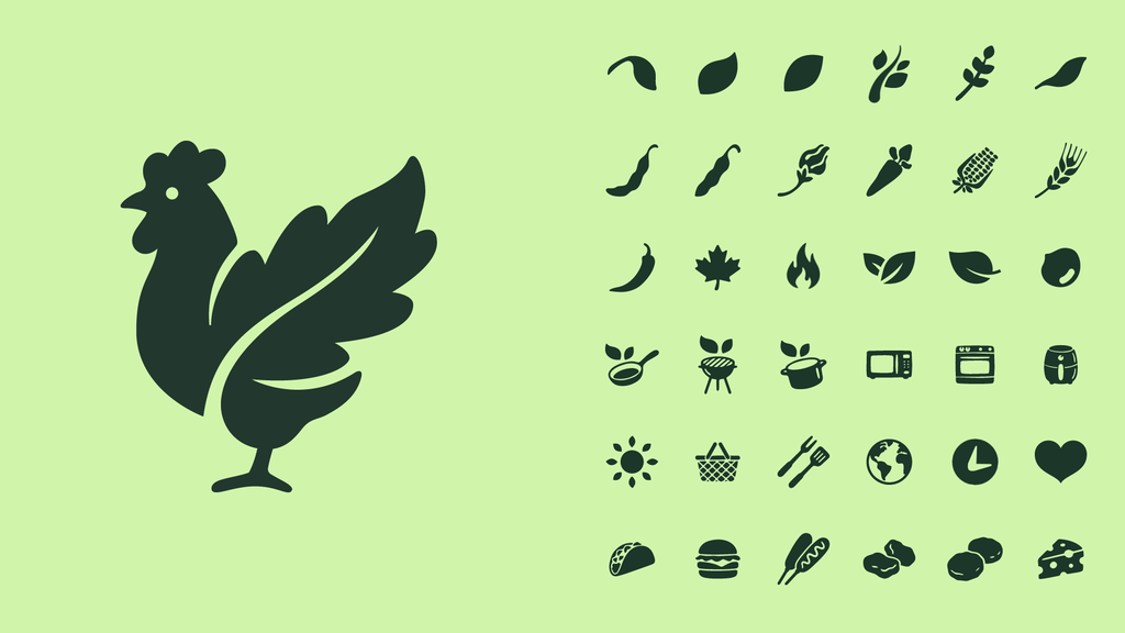
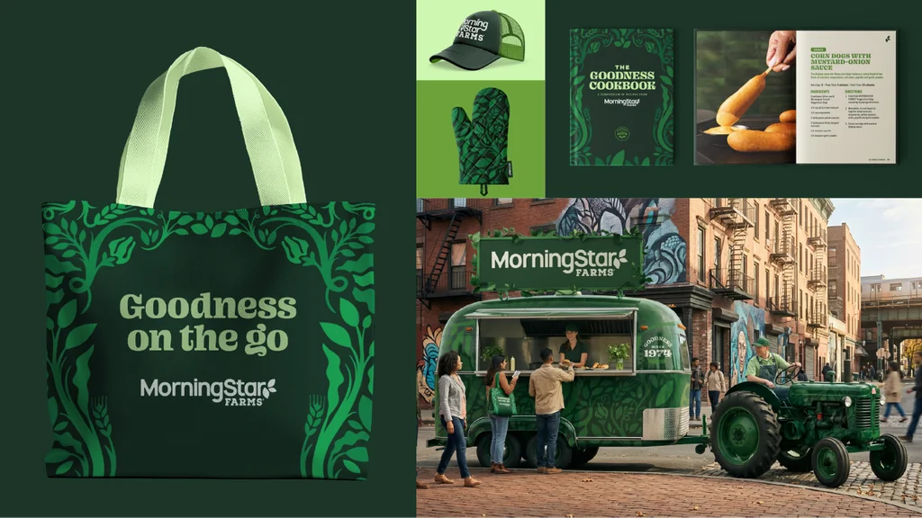
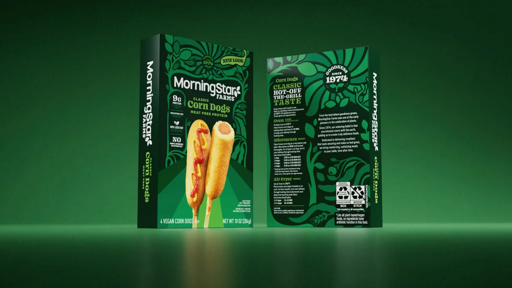
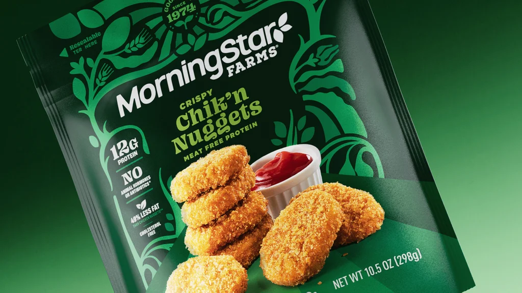
That “good green earth” inspiration appears in several of the brand’s touchpoints. A key motif across the new packaging is an illustration system, made in-house at Design Bridge, inspired by ’70s woodcut prints. Look closely and you can find nods to classic MorningStar ingredients like wheat, soy beans, and corn kernels.
“It’s called the trellis—this idea that plants are the backdrop of this brand, therefore plants are the backdrop of our design system,” Sherwood explains.
The trellis illustrations serve as a kind of frame to draw the shopper’s eye to key on-pack claims, like “since 1974,” protein and fat content, and “no animal products or antibiotics.” Sherwood’s team also worked with the food and beverage photographer Stephen Hamilton on new product imagery that feels ever-so-slightly inspired by a retro dinner setup: familiar dishes, like nuggets and chicken parm, plated the way your mom might’ve done it.
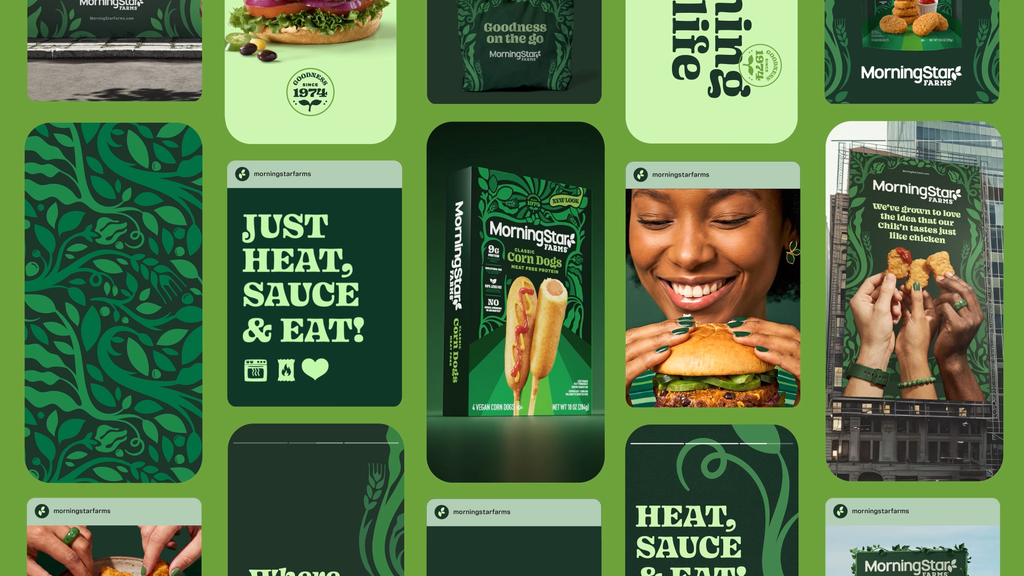
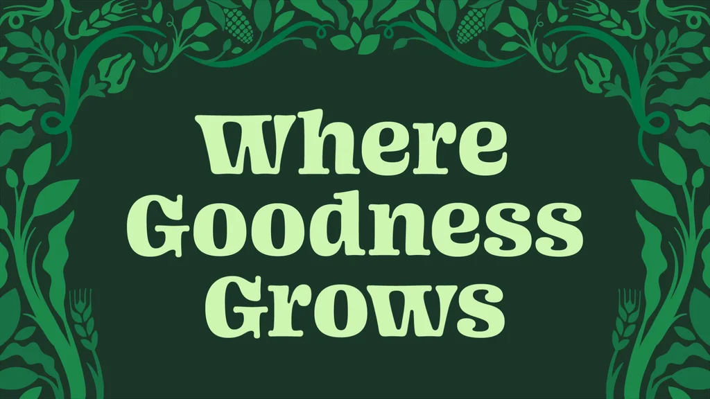
The final touch is a retro serif font called Blazeface by Ohno type foundry, which Sherwood says was chosen because it feels both vaguely ’70s and sufficiently modern. In all, the new brand’s rich green and enticing photography is a far cry from its former aesthetic, which was primarily white and felt almost sterile—an aesthetic that, Sherwood explains, created a “lab-grown idea” that the brand wanted to push away from.
“We did really want to counter this stark white world that they were living in—it was more a functional aesthetic—to get back into something that felt more organic and more real-food-driven,” Sherwood says.
So far, Mosley says, early reactions to the rebrand suggest that it’s “helping strengthen brand recognition and shelf navigation.” More broadly, if the rebrand is successful, it could prove that plant-based meat companies can hold onto customers without playing into the politicization of the category.