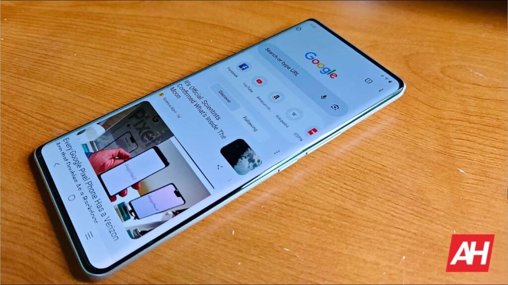

Throughout the years, we’ve seen Google make various UI updates to its Chrome browser on Android. Perhaps one of the biggest and most controversial changes was moving the address bar to the bottom. Well, it seems Google isn’t done tinkering around yet as the bottom bar in Chrome could be getting a redesign.
Chrome bottom bar to get redesign
According to the folks at 9to5Google, they discovered that the bottom bar in Chrome for Android is getting a redesign. In the past, the address bar simply moved to the bottom along with other buttons and UI elements. So instead of being at the top, it’s at the bottom, so the learning curve wasn’t that steep.
However, in this new design, Google has shaken things up a bit. Now, instead of the buttons sitting to the right of the address bar, Google has placed it one row below the address bar, as you can see in the screenshots below. These new buttons now live at the bottom of the app, regardless if you choose to place the address bar at the bottom or top of the app.
The bottom navigation bar now houses a dedicated Gemini button, a button that opens a new tab, and a button that lets you see all opened tabs. The three-dot icon button that opens the menu remains next to the address bar. As 9to5Google notes, it seems that Google originally planned a similar redesign in 2020. However, the company did not do so back then as it was apparently “disorienting.”
Not necessarily a good change
That being said, this change could cause some issues for users. For those who keep their address bar at the top of the app, this change should really have that big of an impact on your day-to-day usage. However, for users who swapped it to the bottom, that’s where the problems come up.
This is because by adding a new row of buttons at the bottom combined with the address bar, it really eats into the browser’s display and real estate. Depending on what you’re looking at, this could affect how much information is displayed at once. This is made worse when Tab Groups are opened, which adds a third row.
In any case, we’re not sure if Google is planning to keep or stick to the design. Hopefully there is enough feedback from users to force them to go back and rethink it. Alternatively, you could always go back to using the address bar at the top.


The post Chrome’s New Bottom Bar Redesign Might Be Too Much of a Good Thing appeared first on Android Headlines.