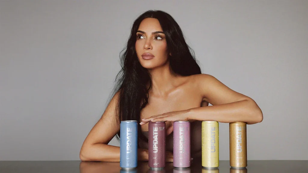
Say what you will about business and media mogul Kim Kardashian, but if there’s one thing she undoubtedly excels at, it’s building a personal brand so recognizable that all of her ventures scream “Kim.” She’s done it once again with her new energy drink brand Update, which looks like it could’ve organically spawned in the walk-in fridge of her sleek Los Angeles home.
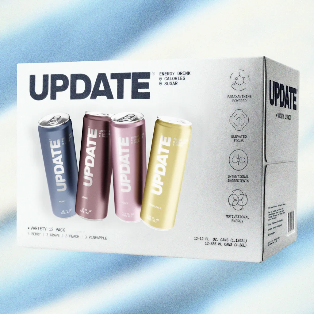
Update is a four-year-old energy drink brand founded by CEO Daniel Solomons. On February 24, the brand revealed a full packaging and design overhaul and introduced Kardashian as a cofounder in its new era. In an interview with Fast Company, Solomons said that Kardashian had been a steady customer since 2023 and began offering feedback on the brand’s formula and packaging, which ultimately led to her formally joining the team. In addition to Kardashian’s sign-on, Update also announced a 4,000-store distribution deal with Walmart, which will begin on March 1.
This isn’t just a celebrity brand endorsement. Since joining Update, Kardashian has worked closely with the team to completely rethink Update’s branding, taking it from what Solomons describes as a “masculine tech bro” look to a can that feels perfectly natural in Kardashian’s hand. This shift taps into the refined personal brand that Kardashian has built over the past several years—one that’s perhaps most exemplified by her ultra-successful apparel company Skims, which embraces simple, minimalist shapes; a color palette of neutrals offset by pops of pastels; and a futuristic yet grounded ethos.
For Kardashian, Update is essentially Skims in a can: a drinkable version of the aspirational aesthetic that’s at the core of all of her business ventures.
Onboarding the right agency for the job
Designing a modern energy drink is no small task. The energy drink aisle is notoriously crowded, and it’s only getting busier as functional beverages take off among wellness-focused young consumers. According to the agency Grand View Research, the global energy drinks market was estimated at $79.39 billion in 2024 and is projected to reach $125.11 billion by 2030.
To design a beverage that would actually stand out on shelves, Update turned to an agency with a healthy background in thinking up breakout brands for saturated markets: Day Job, the design wizards behind brands like Fly by Jing, the adaptogen drink Recess, and the viral protein bar brand David, which recently exploded in popularity in no small part due to its ultra-minimalist, refined look.
“The lesson we take from the success of naming and branding David is that a brand doesn’t need to be your friend,” says Rion Harmon, Day Job’s executive creative director. “It just needs to be very, very good. People want excellent products. And it’s okay for your branding to reflect that.”
For Update, that meant leaning into Kardashian’s tonal, minimalist aesthetic that aspirational shoppers are already familiar with, rather than attempting to design an energy drink for the everyman.
Designing a drink that “feels like Kim, without saying Kim”
Update’s original branding included a palette of bright (almost neon) metallic hues, paired with a stenciled wordmark and some highlighted nutrition info. The overall look was akin to a beverage one might expect to see in the Tron universe or in a gamer’s stream—needless to say, it was far off base from something Kardashian might design.
“The category of energy drinks is extremely loud,” Harmon says. “Lots of color, lots of neons, lots of overlapping graphics, lots of chaos.”
But, according to Harmon, Kardashian had a vision for the brand as soon as she joined the team. She wanted it “to express a clean, premium futurism to reflect the innovative approach to energy,” he says. (Update’s formulation relies on the ingredient paraxanthine, a molecule that the body naturally converts into caffeine—which the brand says gives its products a less jittery feeling.)
Day Job took this concept and spun it into a variety of different cans, all totally different in their approach to logo, layout, type, and color. Kardashian then selected her top cans and provided the team with specific notes for each.
“She was very involved, from initial vision to minor refinements, creative directing all along the way,” Harmon says. “She has a very sharp eye, her feedback is always clear, she has real aesthetic vision, but she’s collaborative as well.”
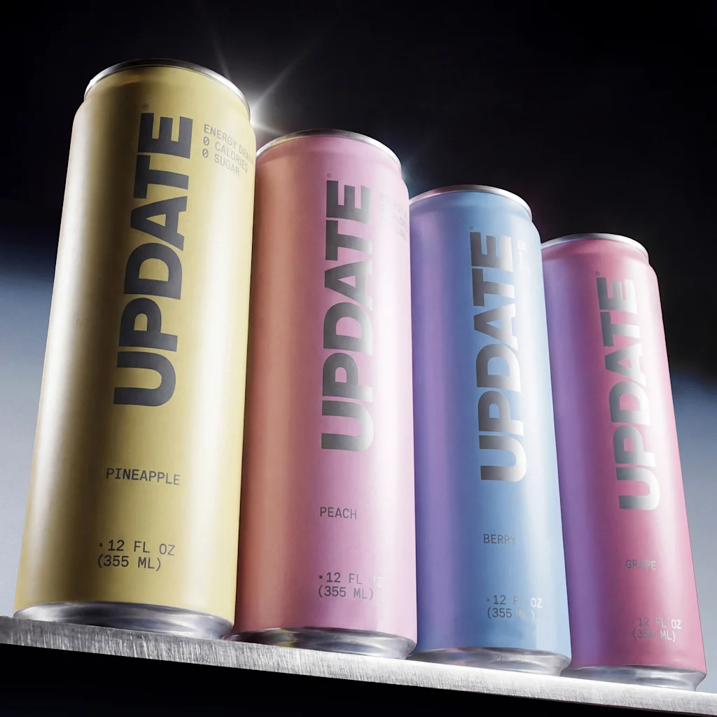
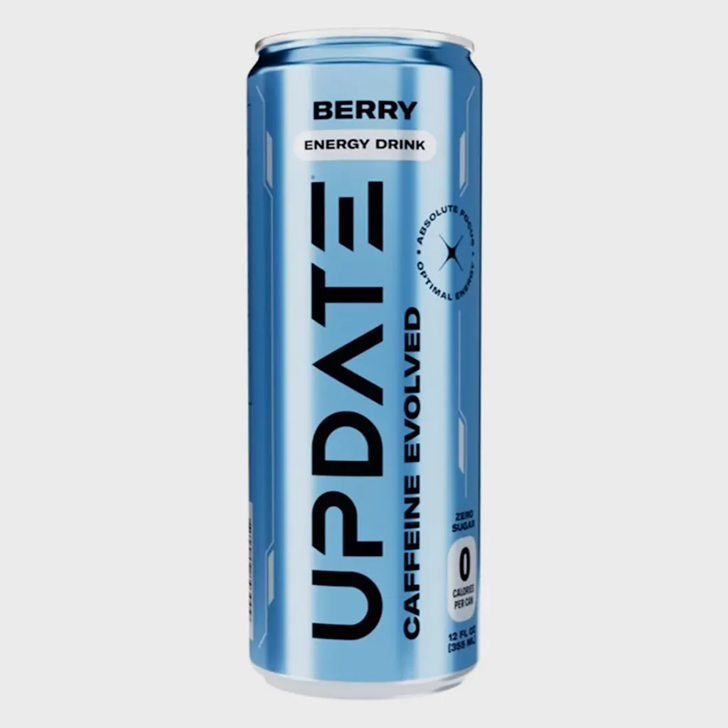
The final design brings together a palette of muted metallic blue, pink, maroon, and yellow, all of which look like they could star in the next NikeSkims collection. As it did with the packaging for the protein bar David, Day Job minimized any text on the cans to the barest of bones, leaving only subtle notes on flavor, calories, and sugar content. They replaced the techy logo font with a bolded sans serif. Harmon calls it a “nearly non-logo”—something simple and default, but with a reflective materiality to evoke futurism.
In sum, Update is a beverage that would look perfectly natural next to a pair of ballet-core joggers—or nestled in Kim Kardashian’s expertly manicured hand.
“Kim’s body of work has a recognizable quality, and that’s something we wanted to inform the brand identity,” Harmon says. “It needed to feel like Kim, without saying Kim. We wanted to find the line between something that fits in her fridge, and the fridges of Walmart.”