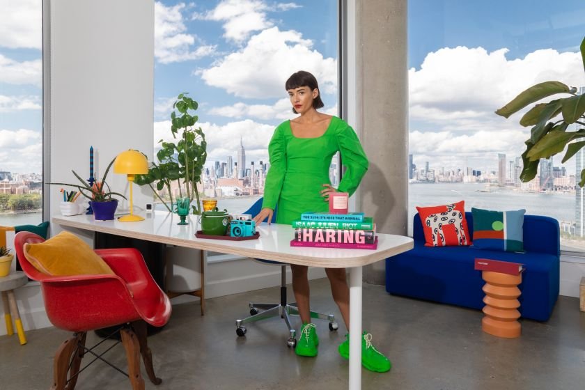

Jessica Walsh
We’re delighted to welcome Jessica Walsh to Creative Boom. In her first column, she argues that branding has become too safe and interchangeable, and makes the case for expressive, human-crafted typography as one of the last true ways to stand out in an AI-driven world.
Typography has always been the quiet backbone of branding. It shapes how brands speak, feel, and are remembered. But here’s the problem: the fonts that are easiest to use for branding rarely have real personality, and the ones with personality often aren’t practical enough to live inside a full brand system.
After years of building brands, we kept hitting the same wall. Not because there aren’t enough fonts (there are literally thousands), but because so many of them feel interchangeable. Or the ones that actually feel unique and ownable? They’re already everywhere, overused to death.
A lot of type foundries understandably focus on mass-market needs: ultra-neutral workhorse sans serifs, or fonts that are basically just a slightly warmer, narrower, rounder, or “friendlier” cousin of something that already exists. These fonts do their job. They’re flexible. They’re safe. They sell well. But safety isn’t what builds distinction.
When everything starts to feel like a variation on Helvetica, branding blurs together.
The brands we remember had typographic balls
Historically, some of the most iconic brands were bold enough to let typography carry real emotion and character. Coca-Cola built an identity so distinctive that its script became inseparable from the brand itself. Warmth, nostalgia, human connection, all baked into the letterforms. IBM used typography to project precision and intelligence long before “brand systems” were even a thing. MTV went in the opposite direction: a constantly shifting, expressive type that mirrored youth culture and rebellion rather than uniformity.
Nike uses bold, forceful typography to reinforce energy and momentum. Disney built an entire emotional universe around a whimsical type that instantly signals imagination. The New York Times relies on typography to communicate credibility and trust.
These weren’t neutral choices. They were emotional ones. And they made those brands unmistakable.
Then everything got efficient
As branding became more systematised and scalable, a lot of that emotion got sanded down. Efficiency quietly replaced expression. Everyone started optimising for “versatility” and “accessibility” (which, don’t get me wrong, matter), but somewhere along the way, we lost the weird, the bold, the opinionated. In a world saturated with brands, distinctiveness isn’t optional anymore. It’s survival.
The custom type trap
When budgets allow, we design custom typefaces for clients. It’s an incredible way to create deep ownability. But let’s be real: custom typography isn’t accessible to most brands. It’s expensive, time-intensive, and often completely out of reach for smaller teams or emerging companies.
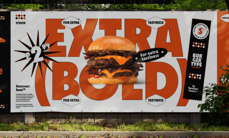
So what are they supposed to do? Keep cycling through the same 20 trendy fonts everyone else is using, hoping this time it feels fresh? Retail fonts absolutely have the power to build great brands—but only if they’re designed with robust brand systems in mind, not just posters or one-off editorial layouts.
That means thinking about real-world use: headlines, body copy, digital interfaces, packaging, motion, scale.
We need fonts that are:
– Robust enough to carry an entire brand system
– Distinctive enough that they don’t feel like everything else
– Flexible enough to work across mediums
– Actually accessible to studios and brands without massive budgets
But the industry still skews toward either ultra-safe workhorses or expensive custom. Not enough lives in that sweet spot between expressive and practical.
Typography in the era of AI
AI will make everything look the same. We’re already seeing it. Most AI-generated images share the same aesthetic. Every template library offers the same layouts. Brands are starting to blur together in ways we haven’t seen since the peak Swiss-modernist takeover of the early 2000s—except now it’s happening at internet speed.
And it’s about to get worse. Deepfakes are getting so good that even experts can’t always tell what’s real. Photography? Questionable. Video? Questionable. Illustration? Probably AI. We’re entering an era where people will crave proof of human craft more than ever, because they literally won’t be able to trust what they’re seeing.
But typography? A truly great, human typeface still requires a human. A trained designer who understands rhythm, optical balance, personality, and voice. AI can generate ideas for letterforms, sure, but type design is far behind image generation. This is likely because vector design is much later to AI than raster imagery.
Custom typography is about to become one of the most powerful ways for brands to signal: a human made this.
In a world where everyone has access to the same AI tools, templates, and stock libraries, owning beautiful, well-crafted typography might be the easiest way to actually stand out. Not just because it looks different, but because it proves you cared enough to build something with intention instead of hitting “generate”.
Especially since, for now, no truly functional AI typeface generator works at scale. Plenty claim they do—but they’re really just starting points or inspiration tools, not something you can rely on as a real type design workflow.
The brands that win in the next few years won’t be the ones with the slickest images, photos, or videos. They’ll be the ones that feel unmistakably human. And I think typography is one of the few places where humanity is still undeniable, where people can still instantly see a gorgeous custom font or lettering and feel: a human made this.


