In the midst of the current government shutdown, thousands of flights across the U.S. have been delayed or cancelled. With no clear end to the shutdown in sight, it’s time to revive a tried-and-true tool that’s dependably delivered soul-crushing news to fliers for more than a decade: the Misery Map.
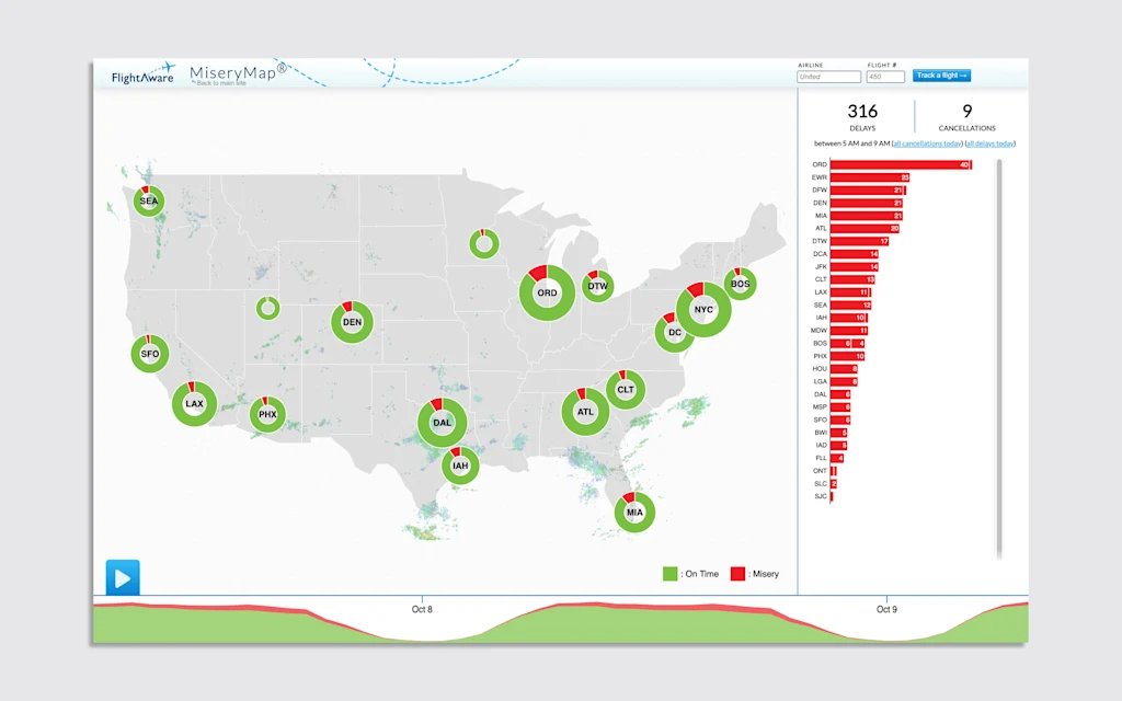
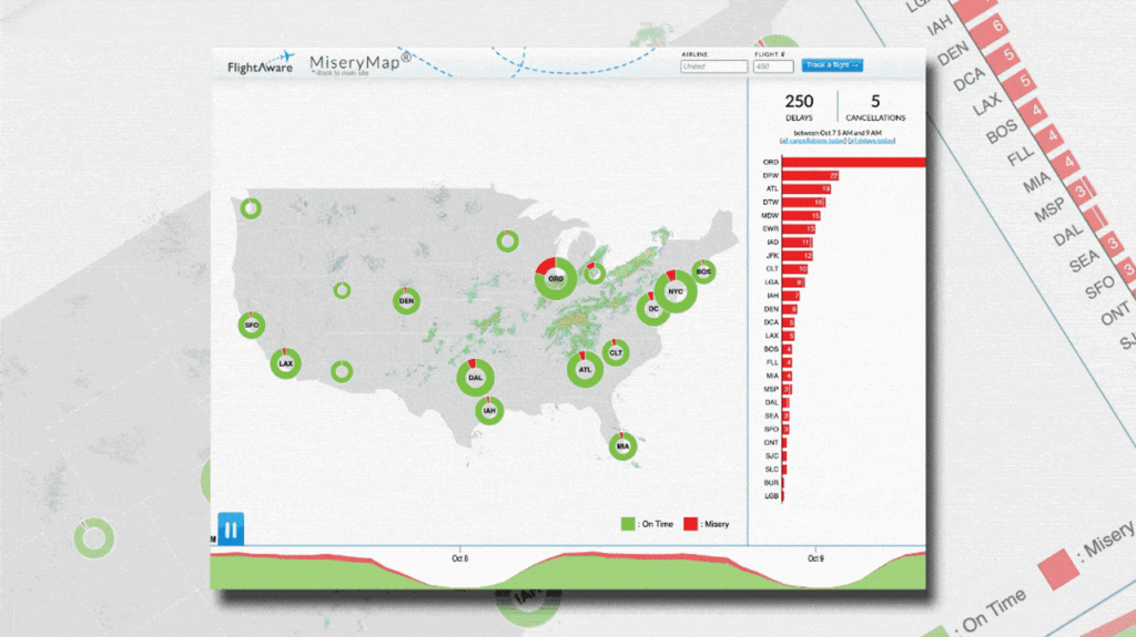
The Misery Map is a live tool that tracks weather across the U.S., tallies the number of delays and cancellations at every major airport in the country across 17 city hubs, and graphs popular flight destinations with the chances that upcoming flights will actually make it on time.
Operated by the flight tracking website Flight Aware, the map has been delivering a no-nonsense picture of how bad your day at the airport will be since 2013—and if the last few days are anything to go by, you should probably just bookmark it now.
Why is air travel so bad right now?
During a government shutdown, air travel is one of the services to feel an immediate impact. That’s because, during a shutdown, air traffic controllers are considered essential workers, but not quite essential enough to receive a paycheck—meaning they have to keep showing up to work with only the promise of future retroactive pay.
Back in 2019 during a partial government shutdown, rampant air traffic control and TSA agent absences were one key factor that pressured the government to reopen. And now, just nine days into the current shutdown, those absences are already putting a strain on air travel infrastructure.
Over the last several days, the Federal Aviation Administration (FAA) has ordered a reduction in the number of flights in and out of Orlando International Airport in Florida and Newark Liberty International Airport due to low staffing. On the afternoon of October 6, Hollywood Burbank Airport’s control tower shut down entirely due to a lack of air controllers, forcing pilots to follow procedures typically used at small airports with no control tower.
According to data from Flight Aware, total daily flight delays and cancellations averaged around 5,000 between October 6 and October 8. The FAA told NBC News on October 8 that delays have been reported at airports in Boston; Burbank, California; Chicago; Denver; Houston; Las Vegas; Nashville, Tennessee; Philadelphia; and Phoenix. As long as the government shutdown continues, delays are expected to become more common.
How to use the Misery Map
For anyone with an upcoming flight, the current uncertain state of air travel means that an already stressful travel day might get exponentially worse. That’s where Misery Map comes in.
The beauty of the Misery Map is in its simplicity. According to this tool, a flight can only have two states of being: “on time” or “misery.” Flights in the “on time” category are noted in green, whereas “miserable” flights are recorded in red. Each of the map’s 17 hubs includes a circular graph that’s divided into red and green chunks based on how many of its flights have proceeded according to plan for that day. At a quick glance, the map dilutes the complicated flight landscape to help travelers understand their odds of a pain-free travel experience at any given time.
For those looking for more details, the Misery Map includes several other helpful features. By hovering over any given city, fliers can see how other flights have fared on popular routes that day. Routes indicated in green have seen a majority of on-time flights, while those in red have already seen delays.
A play button in the lower left side of the screen even lets users watch a mutli-day timelapse of the tracker to understand how flight conditions have evolved based on the day, time, and weather conditions. Travelers can also search for a specific departing flight for more details on its flight path and average delay times.
We can all agree that flight delays are miserable—but at least there’s a way to see that you’re not the only one dealing with travel woes. After all, misery loves company.