When we consider the subway, it’s often for reasons that have to do with decay and deterioration. The switches are outdated. The elevators are broken. The train is late (again). Of course it could be better, but rarely do we pause to take in what the system does right.
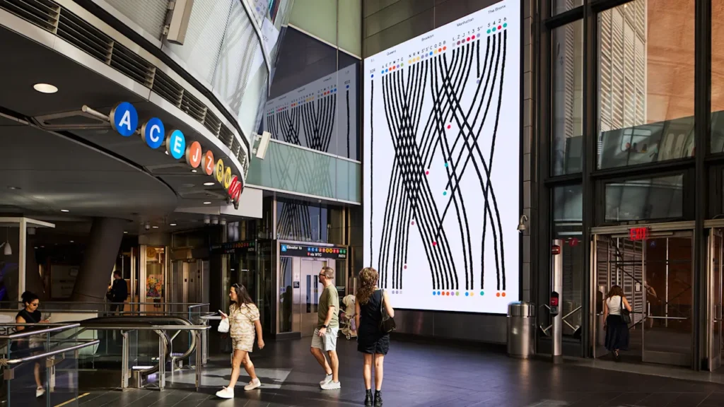
Its 25 lines, 472 stations, and 665 miles of track traverse the city and offer a tremendous amount of mobility. And now, a new digital installation at the Fulton Street subway station by the information designer Giorgia Lupi and her team at Pentagram pays tribute to the system.
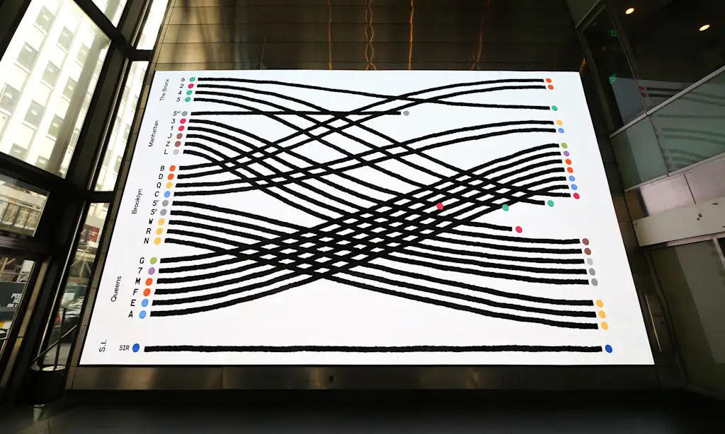
“Sometimes adults lose the ability to see magic in mundane things and to treat what we experience every day with a bit of wonder and romance,” Lupi says. She translated those feelings into the installation, a two-minute animation of the New York City Transit lines.
Inspired by Craigslist Missed Connections and the city’s open data portal, A Data Love Letter to the Subway, as it’s titled, appears on 50 screens throughout the station, which are normally used for advertising, and plays every hour on the hour through December.
“There’s such an incredible world if you think about the subway,” Lupi says. “I wanted to create a story and to almost give a bit of a personality, like a character in a children’s book, to those lines. They thread this beautiful system that sits underneath us and that we use every day.”
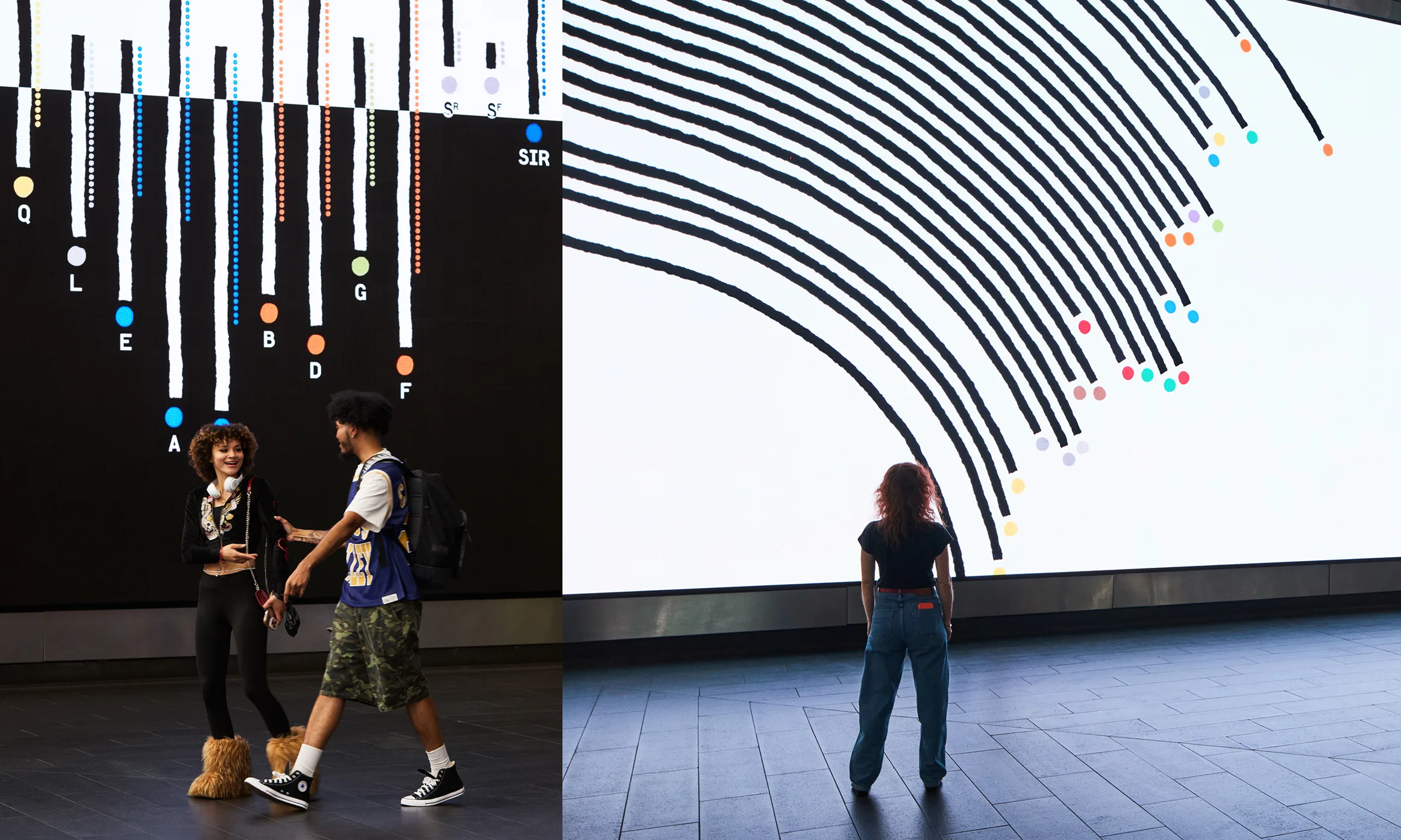
The graphics show where the trains travel, converge, and go their own ways as well as various facts about the system, from the age and length of lines to the ones that go above ground or never see the sun. Lupi has turned this information into a charming animation that makes visible what most New Yorkers take for granted. “I have this little bit of a curse that I see data everywhere,” Lupi says.
Since the screens are of various sizes, Lupi and her team created slightly different animations to fit the frames. At a few moments during the film, they all converge. Lupi compares the experience to dance choreography where individuals have their solos, but then become synchronized. She and her team stuck to a mostly black-and-white palette and minimalist graphics to depart from the cacophonous images that usually show up on the station’s screens. To stop someone when everything is shouting for their attention, simplicity can be remarkably effective.
The installation also commemorates the MTA Arts & Design program’s 40th anniversary; three additional four-month digital installations will appear across Fulton Center over the next 12 months.
So far, the installation has been received warmly. “A former coworker just wrote to me: ‘Oh my gosh, am I crying thinking about trains, spending time together?!’” Lupi says. “It’s nice—and not because we need more tears or more moments of hard feelings—to remind ourselves that there are different ways of seeing pretty much everything.”