Swifties have a new favorite font.
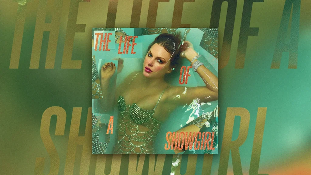
Gazzetta is the tall, sans-serif type family by Nicaraguan type designer Edwin Moreira that Swift is using on her forthcoming The Life of a Showgirl album, out Oct. 3. The award-winning typeface spells out the album’s name and tracklist across multiple variants.
Moreira, a heavy metal fan, tells Fast Company that he found out Swift was using his font after a Swiftie friend told him.
“At first, I couldn’t believe it, but then I confirmed it really was Gazzetta,” he says in an email. “It has been an incredible surprise to see a typeface I designed connected to such a huge cultural moment; it’s surreal but deeply rewarding.”
Unlike artists like Mariah Carey or the Rolling Stones, who tend to use consistent branding from album to album, Swift switches things up between eras, choosing type styles from Blackletter font for Reputation to marker handwriting for 1989 in order to best suit the mood of each album.
For The Life of a Showgirl, with her Las Vegas showgirl-style wardrobe for the album photo shoot and the jagged collage-style treatment for the album art, Swift is using a font that’s loud. In all-capital letters, the album title is rendered in tabloid headline style, and the letters are filled in with glitter.
Swift said on the podcast New Heights that the album is about her inner life while on tour, and fiancé Travis Kelce said it has “bangers.” But even without hearing the music yet, the album already has a clear visual aesthetic. Swift is introducing a visual world to reinforce the storytelling of her music on the album—table stakes for any big pop music release today—and Gazzetta will typeset it.
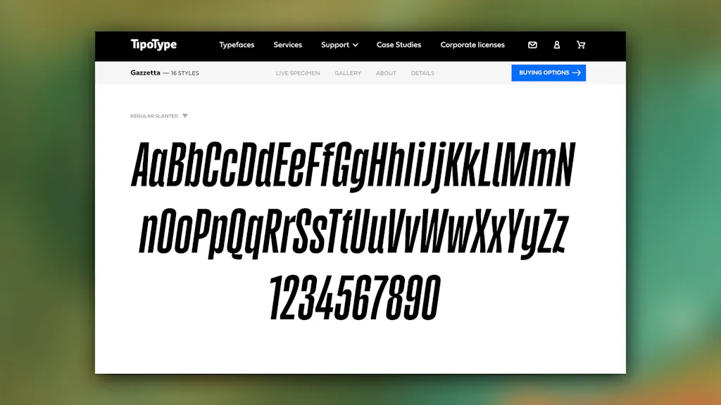
Gazzetta was released in 2022, and it’s published by the type foundry TipoType, which says the font’s condensed, Neo-grotesque letterform is perfect for book covers, newspapers, magazines, posters, and large-format materials. Like a vinyl record. Moreira, who was an apprentice in editorial design, says it was “inspired by the aesthetics of grotesque, condensed typefaces used in many newspapers, as a way to honor the legacy of the printed press.”
“My intention was to reimagine that functional, utilitarian style for contemporary use, keeping its strong and compact character but giving it a somewhat contradictory visual voice—energetic yet friendly,” he says.
Moreira says it’s been fascinating to watch Swifties embrace Gazzetta. “They were actually the ones who almost immediately investigated which font it was, and who its author was,” he says. He adds that it shows “how typography can transcend boundaries and create unexpected connections,” like food and architecture. It also convinced a heavy metal fan to post about Swift’s 12th studio album.
Swifties have recreated The Life of a Showgirl look themselves, as has Elmo. Moreira—who says some of his favorite heavy-metal logos are for the bands Dimmu Borgir, Hecate Enthroned, and Carach Angren—re-created it, too, on an Instagram post in which he’s sporting heavy metal-style face paint with black and orange glitter. And, in his Gazzetta font, the caption reads: “The Life of a Birthday Boy.”