In President Donald Trump’s ongoing second-term White House remodel, even the typography is getting the Mar-a-Lago treatment.
New signage has begun rolling out at the White House this fall. First, the words “The Presidential Walk of Fame” appeared in September in the gold Shelley Script on the West Colonnade. The signage appears above the presidential portraits Trump installed to troll former President Joe Biden.
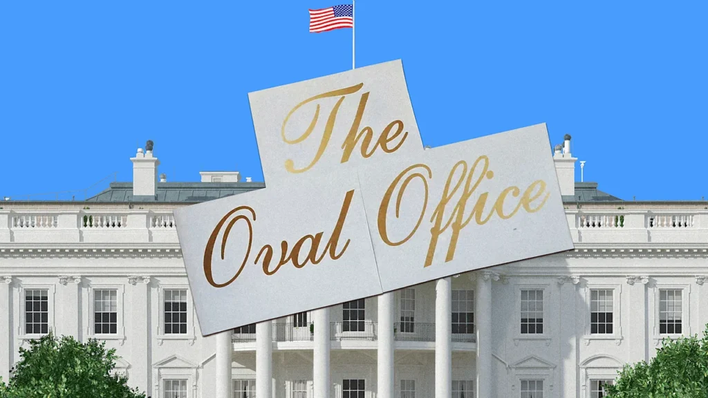
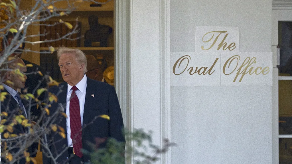
Now new images show lettering that reads “The Oval Office” written in the same font, and which appears to be going up on its exterior wall.
The White House press office did not immediately respond to a request for comment about whether more signage will be going up. An auto-reply to Fast Company’s inquiry included text that blamed Democrats for staff shortages due to the ongoing government shutdown.
Shelley script goes off-script
Trump’s new, gold White House signs are aesthetically aligned with other recent redecoration efforts, including his planned ballroom. To critics who find it tacky, though, it’s not necessarily the type choice that’s off.
“Shelley is one of a handful of long-standing, go-to formal script fonts,” Charles Nix, senior executive creative director at Monotype, tells Fast Company in an email. “It’s testimony to the quality of the design (and the skill of the designer) that it perseveres as visual shorthand for formal or ‘fancy.’”
Famed type designer Matthew Carter designed Shelley Script for Linotype in 1972. It’s been used for everything from winery websites to book covers, according to Fonts in Use, and it’s a go-to choice for wedding invitations.
“The typeface is perfectly fine, and it does seem in keeping with the dignity of the White House,” type historian Paul Shaw says. “The problem is not the fit, but the idea of even slathering the phrase ‘The Oval Office’ on the exterior. It looks like part of a theme park.”
Further, Shaw says, “The ‘Walk of Fame’—is this Hollywood or Las Vegas?—cements that tacky association. Fortunately, this is one of the least egregious things that this short-fingered vulgarian has done in the past 10 months.”

Mar-a-Lago North
Script fonts also seem less the domain of the West Wing than the East (RIP), before Trump had it torn down to make room for a 90,000-square-foot ballroom.
The fonts of the West Wing are the fonts of the state, like Courier New, which is used in executive orders. While the West Wing is for government functions of the executive branch, the East Wing, where the offices of the First Lady were once located, was for soft power. Before it was destroyed, the East Wing housed the White House Calligraphy Office, which produces the White House’s most famous script lettering on social documents like invitations and state dinner menus.
Trump has already added gilded embellishments to the Oval Office and turned the Rose Garden into a concrete patio that resembles the one at his Florida home and club. Now it seems he’s cribbed its typography as well, with each detail making the people’s house appear much more like Mar-a-Lago North.