
Image licensed via Adobe Stock
We showcase this month’s freshest fonts to elevate your design projects, from playful unicase characters to experimental scripts and modernist revivals.
Tired of the same fonts? Then maybe it’s time to shake things up. After all, the power of a distinctive typeface to capture attention, convey personality and create memorable experiences can’t be underestimated. And while that doesn’t mean change is good simply for change’s sake, it shouldn’t be discounted either.
This month’s collection of new typeface releases highlights the remarkable diversity within type design today. From whimsical unicase characters that seem sculpted from Play-Doh to sophisticated geometric sans serifs that pay homage to mid-century Modernism, these fonts demonstrate how type designers continue to find fresh approaches within established traditions.
In short, June’s releases cater to every creative brief. Each typeface embodies a unique perspective, representing countless hours of craftsmanship and creative problem-solving from some of the industry’s most innovative minds.
So, as you consider how to make your next design project stand out from the crowd, why not explore these typographic treasures? After all, in a world of visual sameness, the right typeface might be the perfect way to find your distinctive voice.
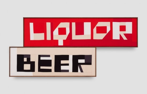
1. Clearly by Big Fog Foundry
A recent release from Brian Dove’s Big Fog Foundry, Clearly is a flared typeface for display and headline use that has been expanded from its original single Light weight (released in 2023) to a comprehensive family of seven weights ranging from Light to Black.
Clearly occupies an interesting middle ground in its emotional tone. The soft curls of certain forms bring warmth that’s balanced by sharp terminals elsewhere. This tension creates a typeface that adapts to various settings without sacrificing personality, making it remarkably versatile for a display face.
Drawing inspiration from Old-style and Victorian-era serifs as well as their contemporary interpretations, Clearly holds itself with elegance while remaining distinctive. Its condensed forms give the lighter weights a balance of strength and fragility, while the darker weights express a higher contrast. The designer recommends using Clearly at medium to large sizes for applications including book covers, logotypes, wrought iron gates, and—with a touch of wry humour—funeral home branding.


2. FL Rare by Contemporary Type
FL Rare is one of the premium typefaces that mark the launch of Contemporary Type’s carefully curated font shop. After years of showcasing cutting-edge typography to a large Instagram community and co-organising the Inscript type-and-tech festival, the platform now brings together typefaces that combine high quality, fresh aesthetics, and unique design approaches.
Designed by Alex Slobzheninov, previously of &Walsh, FL Rare embodies all these values: an efficient grotesque infused with subtle traces of handwriting. Its clean shapes closed apertures, and low contrast place it firmly in the functional sans-serif category, but unexpected details reminiscent of pen movements give it a distinctive character uncommon for the genre.
3. Gilway Paradox by Art Grootfontein
From type designer and illustrator Art Grootfontein comes Gilway Paradox: an innovative sans serif with a unique dual-width design that creates visual rhythm and dynamic energy. Its most distinctive feature is its ability to toggle between character widths with a single click, utilising OpenType functionality, which opens up countless creative possibilities.
This versatile, rounded typeface balances warmth with motion and is available in three weights (Light, Regular, and Bold) plus matching italics. Each style maintains a playful yet polished tone that works across various applications, from branding and editorial layouts to packaging, fashion and beauty.
Gilway Paradox joins Grootfontein’s earlier Gilway family, a playful, rounded sans-serif condensed typeface that includes four styles, including a shadow variant. With support for over 30 languages—including major European languages, as well as Afrikaans, Swahili, Filipino, and Zulu—this typeface offers both visual distinctiveness and global versatility.


4. Exat by Hot Type
Exat is an ambitious typeface from Marko Hrastovec’s Hot Type foundry, paying homage to EXAT 51, the pioneering Croatian art and architecture collective of the 1950s. Inspired by the modernist ideals of this influential group, Exat captures the essence of the International Style while incorporating extraordinary width and weight options.
The typeface began with the redrawing of a single letter “a” from Ivan Picelj’s self-published “Edition a” art booklets, which featured a modified version of Helvetica. From this starting point, Hot Type constructed an entire typographic world that strikes a balance between form and function, as well as neutrality and character.
Exat comprises an impressive 21 styles across three width subfamilies (Condensed, Normal, and Wide) and seven weights (from Extra Light to Black), all available as a variable font for maximum flexibility. There are 1,715 glyphs per style, including multiple numeral sets, extensive currency symbols, circled and squared characters, math symbols, arrows, and even a dingbat set.


5. ABC Solar by Dinamo
ABC Solar is a highly customisable geometric sans from Berlin-based Dinamo Typefaces that combines influences from iconic early 20th-century typefaces such as Kabel, Vogue, Metro No. 2, Johnston, Erbar-Grotesque, and Futura. The result is neither a simple remix nor a straightforward homage but rather a contemporary interpretation that carves its own identity.
One of Solar’s defining characteristics is its round shapes, exemplified by its almost circular capital O. While some letters feature simple construction (like the single-storey ‘a’ and cross-like ‘t’), the open counters and straight terminals in characters like ‘c’ and ‘s’ break from strict geometry to create a sense of fluidity.
The typeface includes eight stylistic sets that reference various geometric and humanistic designs from the early 20th century, allowing designers to dramatically alter its appearance. The family is divided into two subfamilies: Solar, optimised for legibility and functionality, and Solar Display, designed for tight and punchy headlines. With its extensive weight spectrum and matching italics, ABC Solar offers exceptional versatility while maintaining a distinctive character.


6. FH Oscar Pro by Typografische
FH Oscar Pro is the latest addition to founder Fatih Hardal’s recently renewed catalogue at Typografische. This neo-grotesque font combines the structural logic of early grotesques, such as Akzidenz and Breite Grotesk, with softened geometry, introducing rounded corners that reduce visual tension and enhance readability.
Designed for versatility across both screen and print applications, FH Oscar Pro includes comprehensive language support for Latin, Greek, and Cyrillic scripts. Its thoughtful collection of stylistic alternates makes it particularly well-suited for editorial design and user interfaces.
The typeface exemplifies Typografische’s approach to creating contemporary interpretations of classic forms. FH Oscar Pro successfully balances typographic neutrality with distinctly human touches, resulting in a versatile system that maintains personality without sacrificing functionality.
7. Honeymoon by Dinamo
Currently available only through Dinamo’s “Early Access” program, Honeymoon represents a truly experimental approach to script typography. This unconventional typeface combines two seemingly contradictory concepts—monospaced construction and flowing script forms—to create something genuinely unique.
Described as a “true Dinamo-style monospaced Script typeface for all our friends and lovers,” Honeymoon embraces romantic features like single-width uppercase alternates, extravagant swashes, and other celebratory alternates. The design team of Fabian Harb and Arnaud Chemin, with production by Hugo Jourdan, have created a typeface that challenges expectations while maintaining coherence and usability.
The constraining monospaced structure creates an interesting tension with the expressive, flowing nature of script typography, resulting in a typeface that feels both systematic and exuberant. For designers seeking something truly different, Honeymoon offers a refreshing departure from conventional script options.