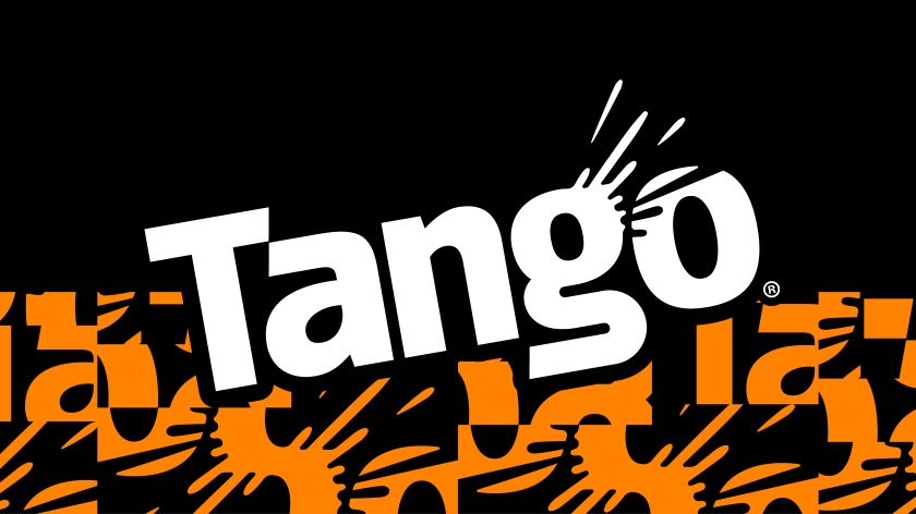
Bloom held on to Tango’s boldness, British mischief, and intense flavour hit, but stripped out the expected in its new identity, making it credible to younger audiences who can spot when brands are trying too hard.
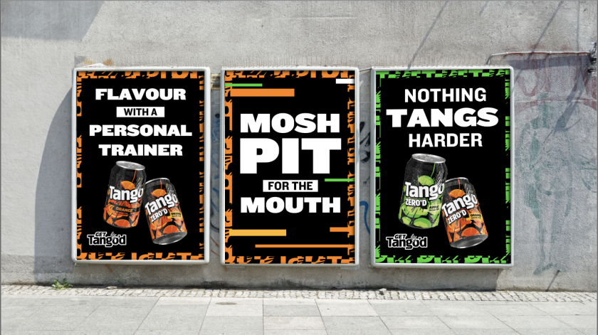
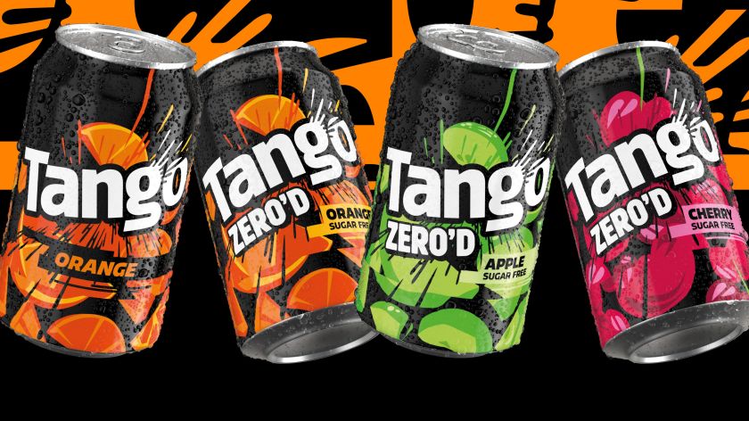
Tango has teased a first look at its new identity, designed by branding agency Bloom, ahead of the official rollout in March. This first instalment sees the new look applied to a sugar-free limited edition named ‘Thirst Trap’
Bloom was tasked with creating something that would appeal to a new generation that’s used to bolder codes of culture grow bolder. Of course, Tango is already quite a big personality in the soft drinks space, so Bloom’s challenge was to retain that irreverence while also incorporating richer, richerculturally relevant visual language.
Stuart Witter, associate creative director at Bloom, sheds some more light on the need for change, saying “the issue was that it had started to look a bit rehearsed”, which is risky when Tango’s target audience “reads visual systems the way previous generations read copy”.
He argues that Gen Z and Alpha “understand hierarchy and irony intuitively, and they know when a brand is shouting just because it’s insecure”. Their solution was to apply a 70/30 principle to the design: 70% energy and chaos, but 30% breathing room, so the momentum actually reads clearly.
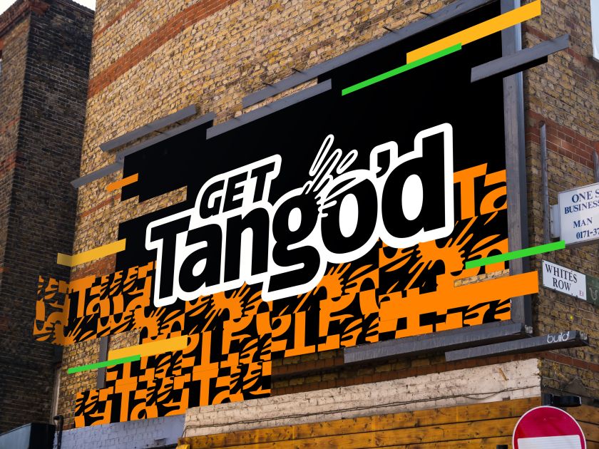
In practice, that meant being ruthless about hierarchy on pack, letting the marque lead (now with a hidden pip in the ‘a’ and an extra nod to the unmistakable ‘tssst’ on the ‘g’) and leaving space for flavour cues that are both bold and disciplined. “We utilised things like fractured crops and a specific 10-degree tilt (The Tangle) to create controlled chaos,” Witter explains. “We trusted the audience to join the dots rather than spelling everything out for them.”

Another driver of the redesign is the increasing overlap of digital and physical spaces where Gen Z and Alpha exist, along with the glitches that occur between them. It seems Tango’s goal is to make the brand at home in the disruptive signals and gritty moments of our new ‘phygital’ world. This idea could easily have become a surface-level aesthetic with a mass FMCG brand, but Bloom sought to design a system that mimics volatility.
“We had to treat digital disruption as a behaviour, not just decoration,” says Witter. “In a digital world, feeds fracture and formats collide; nothing sits still.”
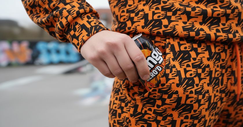
One of the most noticeable assets in the new identity is the hack pattern, built from sliced and reordered letterforms and assets, that creates a really unique energy around the brand. Crucially, though, it still had to make sense and stay grounded to a point. Every disruption has to serve a purpose, either pointing to the flavour or amplifying the energy.
Witter adds: “If an asset didn’t clarify the product or intensify the tangy taste story, it didn’t make the cut.
“That discipline prevents it from drifting into art-project territory and keeps it anchored in the product truth: an intense hit of taste and refreshment.”
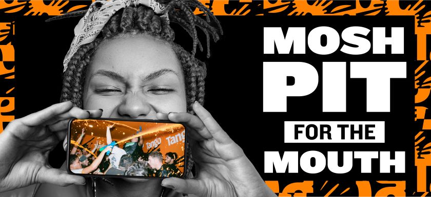
As well as the brand’s unmistakable mischievous tone, Bloom breathed new life into its high-saturation colour palette, bursting graphics, and product staging. Another stand-out is the lifestyle photography, which makes the viewer feel part of the action.
Witter describes that pack as “brutally simple” on shelf, with a black-dominant upper canvas to let high-contrast colours slam against it. Sounds simple, but, as Witter says, “when the fundamentals like the bold typography and clear navigation are rock solid, you can afford to be unexpected and uninhibited with the surrounding visuals without scaring anyone off”.
Instinctively, you’d think working on a brand like Tango comes with a certain amount of creative freedom. After all, it’s always claimed to be bold and fearless. Surprisingly, though, Bloom exercised a fair amount of restraint, too.
“The balance comes from being very clear on our guardrails: we want shock, not scandal,” says Witter. “We want to be on the right side of edgy, because outrage without intent is just noise.”
Harriet Dyson, marketing controller at Carlsberg Britvic, says: “It’s no secret that carbonated drinks are a very competitive category, and the past few years have seen huge shifts as brands look to reconnect with consumers seeking new flavours, benefits and values.
“Tango has never been a follower of trends […] but as codes of culture grow bolder – what Gen Z and Gen Alpha are eating, drinking, wearing, sharing – we knew Tango needed a flexible new identity that would connect with these drinkers.”
The response from long-term partner Bloom certainly seems to be closing that gap, without coming across as too needy or cliched in a bid to attract younger generations.