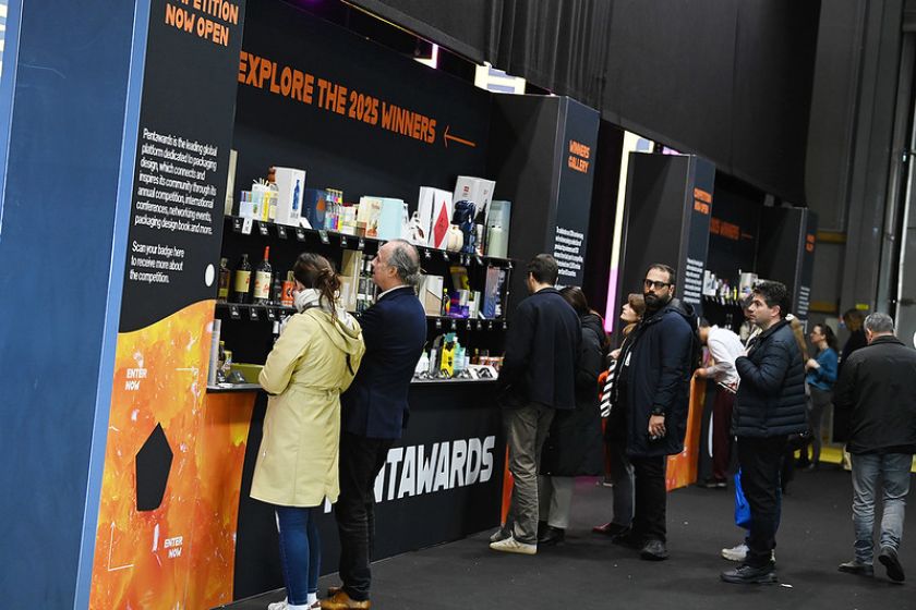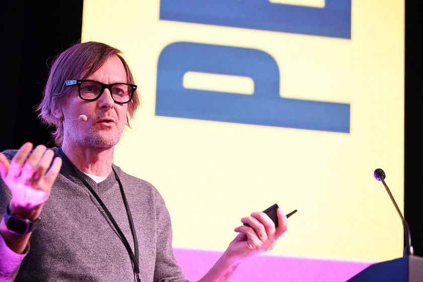
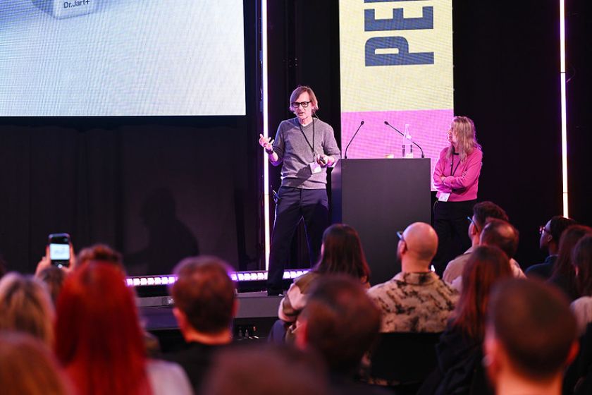
At Pentawards Festival in Paris, Paula Scher and new industrial design partner Piotr Woronkowicz made a compelling case for 3D thinking – showing how systems, structure and tactility can futureproof a brand.
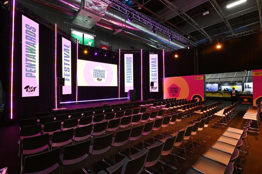
When you think of world-renowned design firm Pentagram, your mind doesn’t immediately go toward packaging design. Yet there they were on the Pentawards Festival stage at Paris Packaging Week, represented by none other than design legend Paula Scher and their newest partner, Piotr Woronkowicz.
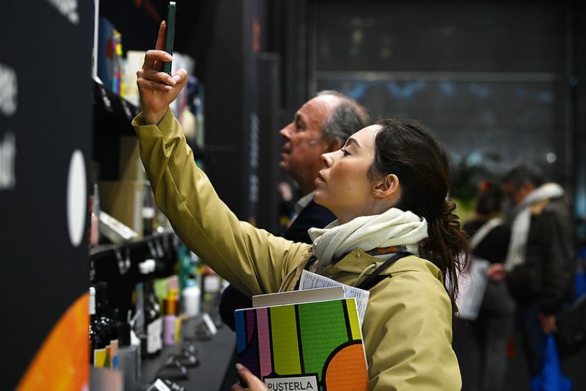
It felt slightly surreal to see them up there, because access to those kinds of studios usually only happens at events with a hefty ticket price, and this one was free. You could feel the excitement in the crowd packed with packaging obsessives and brand teams alike, scribbling notes at speed (myself included).
I’d interviewed Piotr just last year when he joined Pentagram as its first industrial design partner, which was a notable hire for a studio historically synonymous with 2D brilliance. Seeing him in dialogue with Paula at this particular event felt like a statement that the studio is actively investing in physical brand experiences and iterations.
While it’s likely the first time we’ve seen Paula and Piotr on a stage together, they’ve actually been collaborating for years. First, when Piotr worked on Paula’s team as a designer in 2012, and then when he launched his own design studio, Piotrworks, in 2015.
Unlikely inspirations
Paula opened with characteristic frankness, admitting that she’s “not a product designer” and “mostly design identity systems”. What’s clear is that, whenever the opportunity to design packaging has come up over the years, she’s called Piotr.
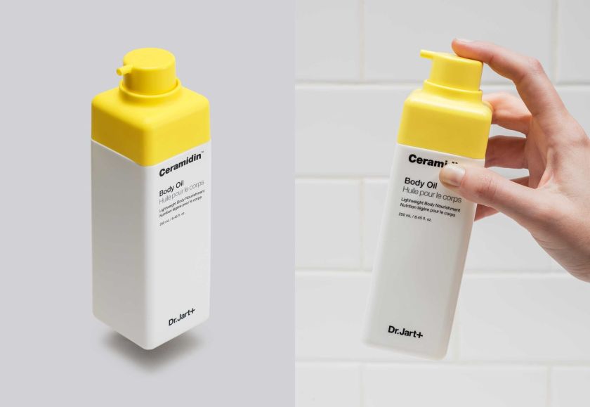
One of their most notable projects together was Dr Jart+, the Korean beauty brand straddling the line between dermatology and cosmetics. The starting point was very plain, with off-the-shelf bottles, a Helvetica logo, and medical severity that bordered on intimidation.
The solution was to look everywhere except the beauty aisle. The design team visited paint shops, garden centres, and sculpture suppliers, but ultimately it was hardware stores that unlocked it. Something about the language of repair and the optimism of fixing something broken.
That unlikely insight reframed the entire system, leading Paula and her team to develop a family of plus-sign symbols. Each one represents what the product does (restore moisture, even tone, minimise pores). Meanwhile, Piotr reshaped the bottles into compact, square forms that felt stackable, efficient and joyful to hold in your hand.
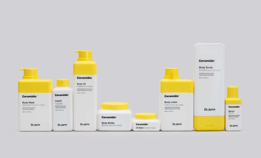
In the context of this project, Piotr mentioned the debate of whether form or function should come first. Arguably, in packaging, it has to be the latter. That’s why not every graphic designer can do packaging – it takes a deeper understanding of 3D design.
In the case of Dr Jart+, Piotr spoke about how the viscosity of the product affects its design language. For example, a wider oval opening was needed for thicker oil lotions, while a sharper point was needed for fast-flowing formulas. He also mentioned twisting mechanisms that eliminate product waste in travel and rounded corners that make plastic feel almost “soft and cushy”, as Paula put it, transforming your emotional relationship with the object.
Years later, the line is still evolving in-market, which is a testament to how aesthetics and system thinking work together beautifully to make a design last longer and allow the client to move it forward on their own into new lines and products. Pentagram didn’t just deliver fish; they taught the client how to fish.
Magnets, rituals and the joy of frictionless form
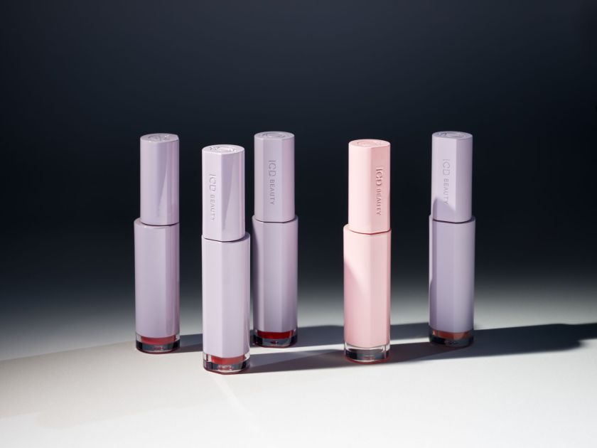
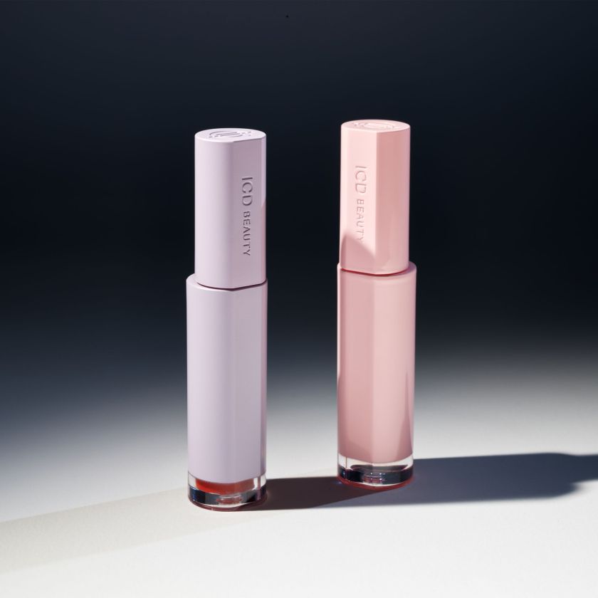
Next came ICD Beauty, where a circular logo became the blueprint for a magnetised lip colour and gloss pairing. If you’ve ever had to fumble through your handbag for your makeup, this one is for you.
The two forms essentially “find each other” inside your bag. It’s functional, but also quite poetic. Peter described it as solving “the stress” of product separation, a small but real friction point with these types of products. I’ve seen packaging that uses magnets as a bit of a gimmick, but here it’s an example of industrial design logic meeting brand storytelling.
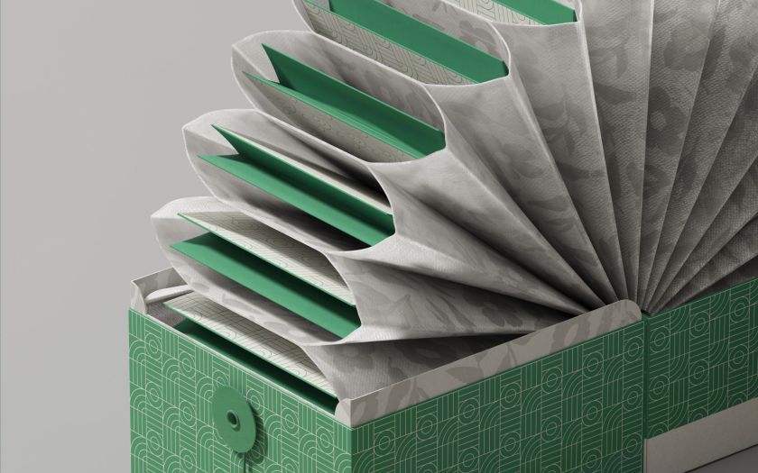
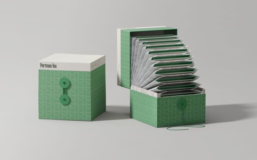
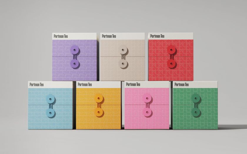
Pentagram also showed an equally delightful packaging experience they designed for a premium tea brand from Singapore.
Inspired by tea farms and pop-up books, the packaging opens ceremoniously. Inside, a watertight “porter” pocket holds the tea between steeps, because this particular tea is designed to be infused five times in an hour. The system is complex internally but intuitive externally, creating a ritual object that’s much more than a box.
It seems that so much brand discourse today centres on digital ecosystems, and here was Pentagram investing serious intellectual capital into physical ritual. Everything they showed you just wanted to reach out and touch, and that seems to be something people are craving after half a decade of disconnect.
Packaging as performance
Paula’s section moved back into what she jokingly called “packaging buildings”, a reference to the identities she’s created for institutions like the Memphis Art Museum and the Curtis Institute of Music. The fact that she creates custom typefaces for every project is impressive, and it really makes a difference when you see the case studies. She also discussed how some systems are deliberately constrained to ensure longevity and how animation is used as a form of governance.
What struck me most across the whole talk was how seamlessly the conversation moved between physical structure and graphic language. It reinforced something that often gets lost in packaging debates: great packaging isn’t separate from brand. It is “brand”, just made tangible.
Why this moment matters
Pentagram hiring its first industrial design partner in New York isn’t incidental. It happened at a time when design narratives skew digital, showing that they’re doubling down on 3D thinking, materials and tactility.
Yes, consumers shop online more than ever, but the box still lands on your doorstep. The bottle still sits on your bathroom shelf. The tea still unfolds on your kitchen counter. Packaging is one of the few brand moments you physically hold.
During the Q&A, AI inevitably surfaced. Paula called it “a faster pencil”. Piotr was more cautious, wary of marketing hype versus actual utility in physical design. Both were clear on the fact that tools don’t replace originality, though.
It was especially resonant in a room dedicated to something as stubbornly material as packaging. AI can simulate structure, but it can’t replicate the sensation of a rounded corner in your palm. It can render a magnet, but not the satisfaction when two objects click together.
Walking out of the talk, I kept thinking about that debate of function over form. It seems to me that one doesn’t have to come before the other, because they can both work simultaneously if they’re both part of the conversation at the start. It’s obvious that this is what’s happening at Pentagram and that the two are finally speaking the same language.
Perhaps that’s the real surprise of seeing them at Paris Packaging Week. It’s not particularly shocking that a world-renowned identity studio can design packaging, but it’s kind of amazing to see them championing packaging as one of the most sophisticated stages for identity to perform.