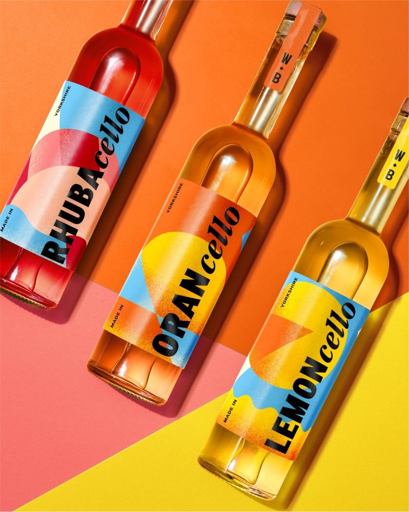

Independent studio OurCreative has unveiled a vibrant, sun-drenched identity for Wolfe Bros’ Rhubacello, adding a distinctly British twist to the traditional Italian liqueur and giving the growing Cello category a fresh, modern edge.
OurCreative is once again shaking up tradition, this time with a distinctly Yorkshire take on an a classic digestiv. The team has revealed the latest addition to Wolfe Bros’ Cello range, Rhubacello, a fruity new liqueur crafted by Yorkshire distillery Double Six Drinks.
Following on from the success of their Lemoncello and Orancello, the new Rhubacello continues the studio’s mission to bring a contemporary perspective to a category long dominated by old-world charm and nostalgic design codes.
As lighter, lower-ABV serves enjoy a resurgence – particularly in the warmer months – the Cello category has found itself back in the spotlight. According to CGA by NIQ, 93% of cocktail drinkers opt for mixed drinks in the summer, with many seeking seasonal flavours. Rhubarb, a long-standing British garden staple, has emerged as a breakout star, celebrated for its tart, nostalgic taste, and is increasingly featured in trend reports for 2025.


“Cello is one of those categories dominated by old-world charm and traditional design codes,” says the team at OurCreative. “With Rhubacello, we wanted to celebrate Wolfe Bros’ northern roots while still capturing that Mediterranean spirit – expressive and full of flavour.”
That balance is evident in the design through the label, a vibrant wraparound composition of abstract forms that draws inspiration from cocktail silhouettes, coastal landscapes, and the Wolfe Bros diamond emblem. A stippled, sun-faded texture brings depth and tactility, while the palette, led by a punchy Mediterranean sky blue, ties the range together.
At the same time, vertically stacked typography adds a subtle nod to English pronunciations, and a gloss-black detailing ensures the bottles stand out, even in the low light of a busy bar.
“The blue, in particular, was born from the idea of the Cellos being a quintessential summer drink – capturing the feeling of being sat in a sun-drenched piazza, cocktail in hand,” explains Joe Wallis, Design Director at OurCreative.


For Rhubacello, the team introduced a playful but deliberate nod to the star ingredient: a rhubarb slice abstracted within the geometric system, brought to life through a palette unmistakably inspired by the plant’s pink hues. It’s a clever move that allows Rhubacello to sit comfortably within the range while standing apart as the newest addition.
Looking to mid-century Italian design for inspiration, the studio drew on the bold, pared-back graphic language of figures like Erberto Carboni. This influence shines in the simplified shapes and forms that wrap around each bottle, offering a more contemporary and stylised take on traditional liqueur packaging. As Joe describes it, “Simple, playful, and built to disrupt those summer bar shelves.”
Texture also plays an important role in the final look, as stippling gives a sun-drenched, slightly worn effect that leans into the coastal and Mediterranean aesthetic. The gloss detailing, meanwhile, serves a practical function, helping the label pop in moody lighting, which is a thoughtful touch for products destined for busy bars and restaurants.


Since partnering with Wolfe Bros in 2023, OurCreative has been instrumental in shaping the brand’s evolution from regional newcomer to national challenger. Originally tasked with simplifying the Wolfe Bros gin labels, the studio’s work not only refreshed the brand’s aesthetic but also delivered tangible business benefits: reducing label print costs by 60% and cutting manual labelling time dramatically, from 60 seconds to just 10 seconds per bottle thanks to an automated system. This, in turn, gave Wolfe Bros the ability to scale at a much faster pace.
“A strong visual identity can do great things for challenger brands with tight budgets,” Joe says. “It’s about creating something that feels authentic and exciting but also cost-effective – helping brands grow without relying on flashy finishes or expensive materials.”
That pragmatism runs through the Cello range, too. Without the luxury of bespoke bottles or elaborate embellishments, OurCreative focused on maximising the impact of the label itself. It’s a lesson they learned early on and one that has shaped the entire project.

The launch of Rhubacello is particularly timely given the flavour’s growing popularity. But translating a classically British ingredient into a visual identity that feels both nostalgic and fresh is no small task.
“We wanted to combine the mid-century graphic language that gives the range its nostalgic feel with a more literal interpretation of the rhubarb slices,” says Joe. “It’s a simple, modern expression of the ingredient – recognisable but still refined.”
With national listings now rolling out and seasonal specials planned, Wolfe Bros’ Cello range is no longer a regional secret. With its Yorkshire-grown twist and bright, contemporary look, Rhubacello seems well-placed to steal the summer spotlight.