
To celebrate its 40th edition, New Designers has unveiled a striking new identity by TM Studio that looks ahead rather than back, trading nostalgia for bold abstraction, material intrigue, and a collective design spirit.
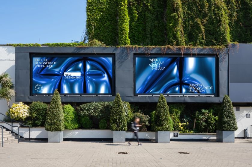
New Designers, the UK’s leading showcase of graduate design talent, has unveiled a new campaign identity to mark its 40th anniversary. Designed by long-time creative partner TM Studio, the refreshed visual direction sets out a future-facing tone for this summer’s milestone edition, eschewing nostalgia in favour of playful abstraction and a renewed focus on community over individualism.
Launched in 1985, New Designers has become a defining rite of passage for UK design graduates. It’s where many get their first foot in the industry and where employers go to discover talent across disciplines, from textiles and furniture to digital and game design.
The fair has always aimed to strike a balance between youthful energy and professional ambition, but with its 40th edition on the horizon, TM had the added challenge of creating something that could celebrate its legacy without feeling stuck in the past.

“It was important that our interpretation of the anniversary was celebratory rather than harking back,” says Johnny Tsevdos, creative director at TM. “We explored ideas around celebrating important designers that have passed through the halls of New Designers, but in the end, we felt that looking forward to the next 40 was the more important message.”
That ethos is embodied in the centrepiece of the new campaign: a balloon-like, hyperreal material that’s both recognisable and ambiguous. At first glance, it evokes birthday celebrations or party decorations, but the details (an engraved ’40’, surreal reflections, and a texture that defies categorisation) invite closer inspection.
“We resorted to ‘engraving’ the number into a balloon,” Johnny explains. “It immediately made it more abstract… And in that obscurity, we were hoping to represent the diversity of New Designers.”

The campaign builds on a longstanding relationship between TM and the fair. Over the years, they’ve judged awards, led portfolio reviews, and designed multiple campaigns. That context helped shape the decision to move away from showcasing individuals or specific disciplines and instead create a visual language that feels more open and adaptable.
“A big shift in the evolution of the creative has been moving away from spotlighting individual designers or objects and towards simpler, more impactful imagery,” Johnny explains.
That shift isn’t just aesthetic; it’s also strategic. In an increasingly digital-first world, the visual identity for New Designers must flex across platforms and formats, capturing attention while leaving space for layered content. “Our designs now avoid a single ‘hero’ focal point and instead serve as a kind of visual landscape,” Johnny adds.
The concept also taps into a broader cultural mood. In a moment defined by collaboration, social awareness and collective authorship, TM’s choice to emphasise community over the cult of the individual feels timely. “Not to get too philosophical,” Johnny notes, “but it’s fair to say that society could do with less egos and more community and collaboration.”

The visual aesthetic draws inspiration from artists who blur the boundaries between kitsch and craft. Jeff Koons is a key reference for his glossy balloon sculptures and attention to material illusion. However, according to Johnny, TM’s take is more subtle and abstract.
“We challenged ourselves to try to take the balloon into a more palatable and aesthetically engaging place,” he says. “It has the ability to reference many disciplines without relating too much to one in particular.”
As always, one of the most complex aspects of the brief was the audience: students, industry professionals, universities, the press, and the wider public all have different expectations of what the fair should feel like. “It’s a really broad audience,” Johnny admits, “and we try to balance a creative idea with colour, finish and typography to tick as many of the audience boxes as possible.”
The abstract approach offered the team a way to appeal to everyone—it was artful enough for professionals, intriguing enough for students, and bold enough for casual passers-by.
In that sense, the campaign achieves what good design so often does: it invites participation. Rather than dictate a single narrative, it opens up space for graduates, industry, and visitors to see themselves reflected. While this is a birthday campaign, it also reinforces the fact that New Designers isn’t resting on its laurels. It’s building towards a more collective, curious, and open future.