More than a decade ago, the real estate developer Woodbury Corporation took stock of a site in Vineyard, Utah, that had been home to a WW II-era steel mill. Surrounded by mountain views and overlooking Utah Lake, they saw possibility and a blank canvas, so they began studying growth patterns and infrastructure needs in the area.
They quickly realized it would be the perfect site for a new development—and not just a plot of houses. Woodbury bought 700 acres of land and partnered with Flagship Homes to build a city from the ground up.
“We had the right land in the right location at the exact moment Utah was experiencing unprecedented growth,” says Nate Hutchinson, a partner on the project.
What they didn’t have was a name for the new city they were building.
So they made a call to Pentagram partner DJ Stout, who was tasked with creating an identity for a city that was still just an idea.
“There are 23 Pentagram partners,” Stout says. “And in our storied history, I don’t think anybody’s actually named a U.S. city before.”
Cities get their names in various ways. Oftentimes, a community is named for its founder, or to highlight a local geographic feature. Modern developments tend to take a more marketing-centric approach. For every unnecessary ‘e’ deployed to class up a place (think Wolfe’s Pointe), there’s a vague gesture at historical lineage (Views at the Old Mill) or a moniker so watered down that the branding exercise becomes obsolete (Water’s Edge).
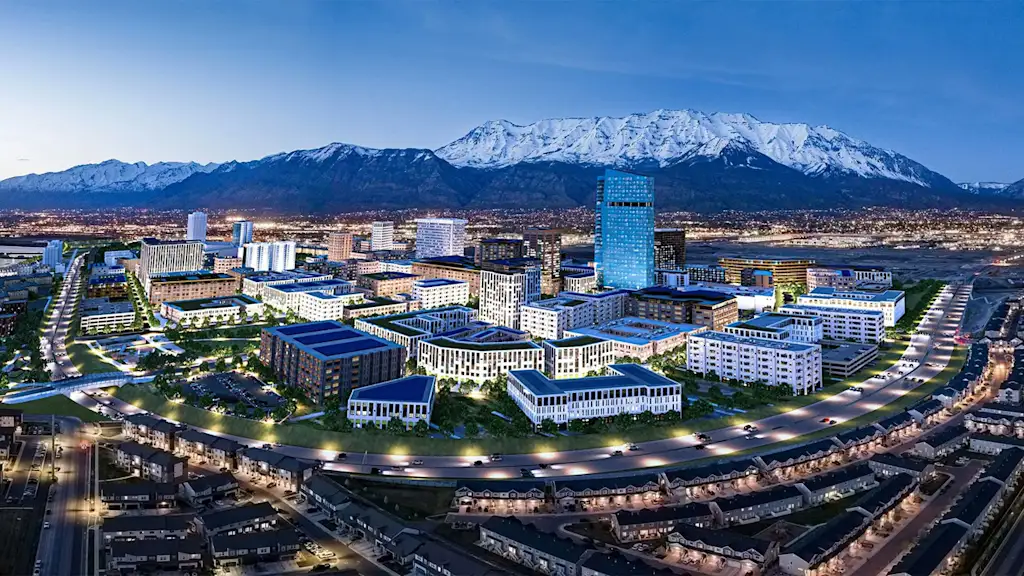
At the outset, Stout says the Woodbury team was clear that they didn’t want their project to sound like a gated community. For one thing, the scale of Woodbury’s ambitions was much bigger. The development was conceptualized as a walkable community that could cater to Utah’s rapidly expanding population, which is slated to surge by 58% to 5.2 million by 2060. Some 30% of that is in Utah County, where the former steel mill sits.
Woodbury decided its new city would feature complete neighborhoods with multiple types of housing; shopping, dining and entertainment; a range of business, civic and cultural spaces; plazas, parks; transit connectivity; and an overall focus on walkability.
“We’re building an entire urban district on the front door of a transit station, along a lakefront, with healthcare, education, retail and residential all integrated from the start,” Hutchinson says.
The breadth of the vision gave Pentagram a lot to play with. Stout says his team started with research: Given the nearby Wasatch Mountains, which, like “Utah,” derive their name from the indigenous Ute people, Pentagram explored similar elements before deciding to avoid plumbing the culture for nomenclature’s sake.
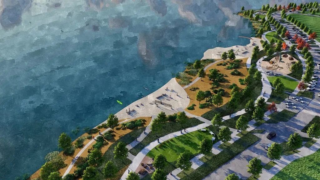
The area also had a significant railroad history, so coupled with the transit plans for the development, Stout’s team ideated some names around that; they explored names tied to Mormon settlers and the Mormon population in the area; they probed nature themes tied to Utah Lake, which is the state’s largest freshwater body.
Stout says they wound up with more than 100 potential names—but then he had a thought. Texas has a Texas City. Colorado has a Colorado City. There’s Kansas City. Oklahoma City. Hell, New York City. Was there really no Utah City?
In Pentagram’s first call with the developers, Stout says, they had mentioned that they wanted to some day be as well-known as Salt Lake City or Park City—and, well, when it came to Utah City, “I was like, I can’t believe this. I can’t believe nobody has it.”
‘THE OBVIOUS SOLUTION’
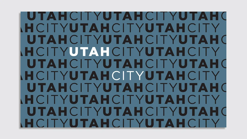
At the pitch meeting, Stout says his team presented around 50 names. When they got to the end of the list, he recalls saying, “I think I have your name. And here it is: It’s Utah City.”
He says he received a quizzical, unconvinced reaction from the head of Woodbury. “And then I made the case that if you really want to be that well-known of a city, if that’s your ambition in the state of Utah, just like Oklahoma City or Kansas City, you should grab this name. Nobody has it.”
That initial reaction wasn’t entirely isolated. When the name went public online, it took some hits on Reddit and elsewhere—and Stout has seen it. But here he cites Pentagram legend and friend Michael Bierut.
“He’s really good at just basically looking at something and saying, This is the obvious solution. A lot of times the best solutions are right there in front of your face, and they’re obvious,” Stout says. “And I think sometimes creatives or designers in general wouldn’t even look at that name because it seems too obvious; there’s this thinking that we’re being paid to do a fancy logo or to come up with a fancy name.”
He notes Bierut’s work with United Airlines. When the company was on the hunt for a new logo, Bierut suggested they hold on to the Saul Bass original.
“There’s this kind of lack of ego of that kind of ownership . . . and so I’m not afraid to think about things that just seem obvious—because that’s the best solution.”
At the pitch presentation, the team snapped up the Utah City URLs in real time.
Ultimately, says Hutchinson, “Pentagram helped us distill the project’s ambition into something clear.”
VISUALIZING A BRAND (OR NOT)
Pentagram usually delivers a comprehensive identity system, but Stout says the Utah City team didn’t want that because they still had a long runway to the project being realized. Nevertheless, Stout and his team created a logo.
The team pondered the idea: If this really was a city that could end up on a U.S. map, what would stand the test of time and not look like a mere trend blip?
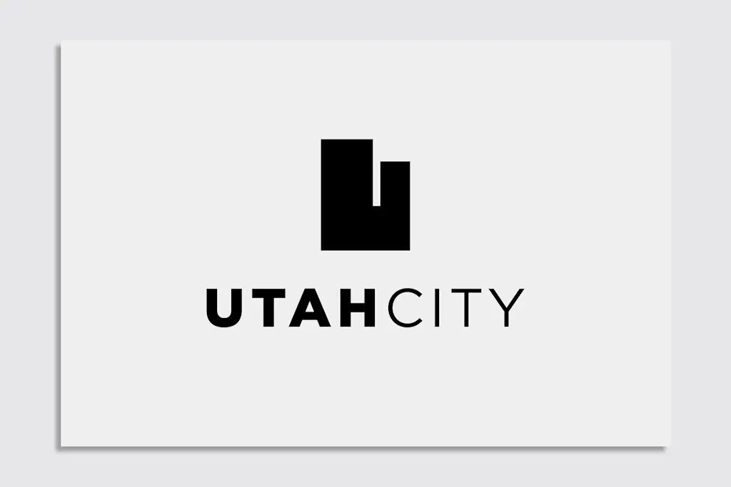
Stout says they played with a few ideas that nodded a bit at the vernacular, but eventually seized on the ubiquitous ‘U’s found across the state, with the University of Utah being dubbed “the U,” the Utah Utes, and other cultural touch points.
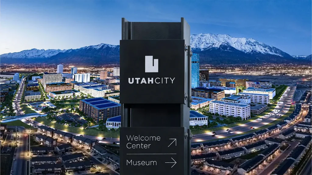
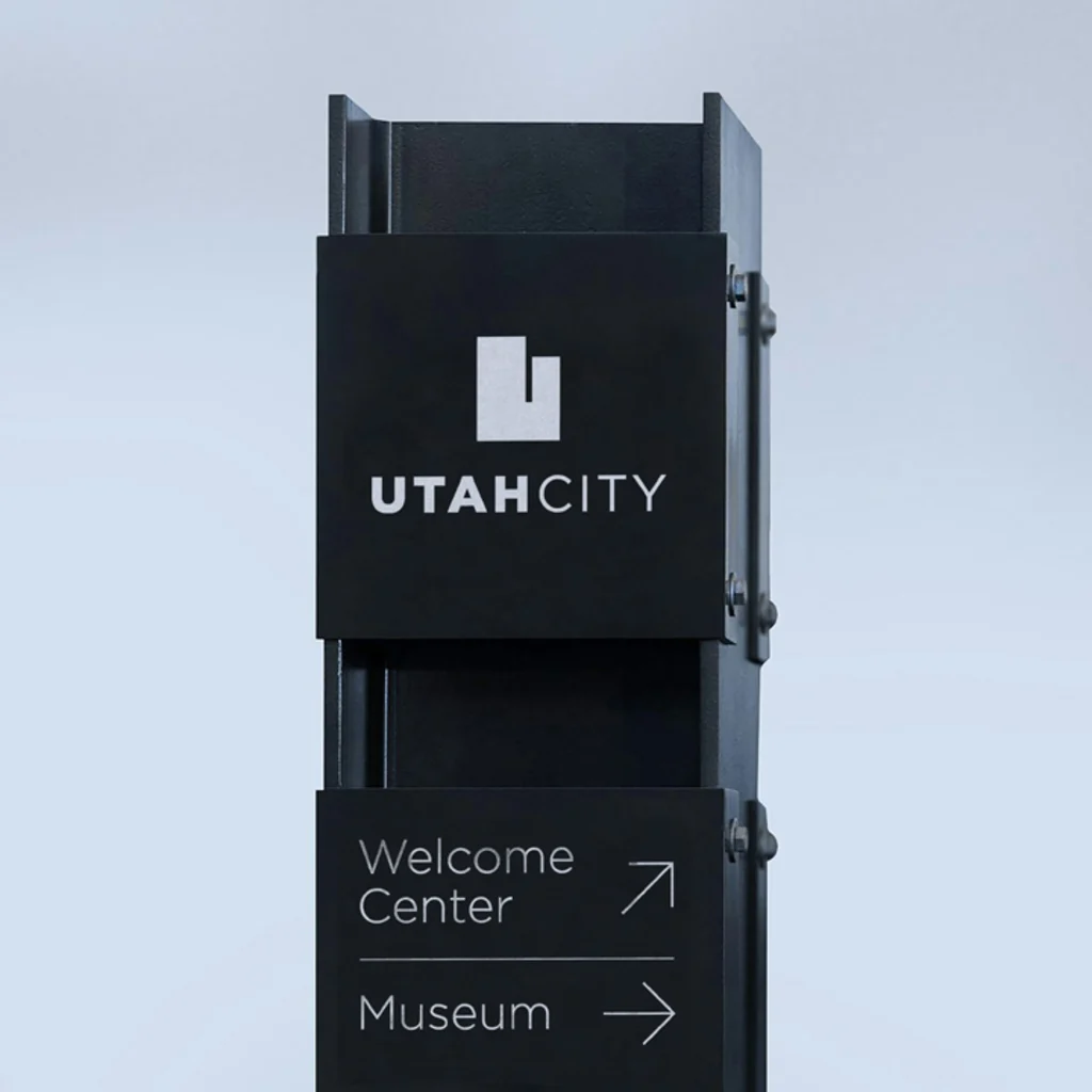
For the logo, Stout took a U and modified it into the shape of the state itself.
“Again, it’s just a simple solution,” he says. “If they’re going to own the ‘Utah’ in their name, then they might as well own the state.”
Given the intended city emphasis, Stout added the typeface Gotham, owing to its roots in one of the most famous cities in the world—and the branding was complete. Until it wasn’t. While the mark can still be seen on the Utah City website, a new logo has emerged on its social channels—a “C” somewhat awkwardly nestled within a “U.”
After years of development, Utah City has just opened the project’s first residential building, a 40,000-square-foot market is nearly complete, and the Huntsman Cancer Institute has broken ground on a 20-acre care and research center. According to Hutchinson, the first phase of Utah City is on track to deliver within the next couple of years, featuring additional housing, a promenade, retail village, wellness center, and miles of bike and walking trails.
As the project shapes up, the team behind it says the identity will also shift. A representative for Utah City said they have been working with a local team to refine and expand the brand with a new monogram and wordmark, noting, “We saw the need to evolve from an East Coast font and view of ‘what’ Utah is and can be, and moved into claiming our Western roots.”
And, well, hey—cities are by nature amorphous, living things. Perhaps branding one is, too.