Mazda’s latest logo lands somewhere between evolution and inevitability. The Japanese carmaker filed for the trademark last year, and now, after making an appearance at the Japan Mobility Show 2025, it’s set in stone. It represents the brand’s so-called “bridge to the future” – a cleaner, flatter design intended to suit the digital world. It isn’t offensive, nor is it exciting. It simply exists, doing its job with quiet adequacy. Like many recent corporate redesigns, it feels colorless, calculated, and perhaps a little too aware of what’s expected.
The Spirit Remains, Even If the Spark Doesn’t
Mazda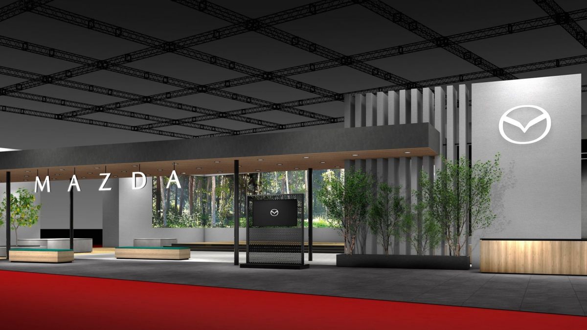
Mazda’s emblem still forms a stylized “M” shaped like a pair of wings, a symbol that has represented the brand since 1997. This new version smooths the edges, sharpens the points, and strips away any trace of depth. The accompanying wordmark has also been refreshed, appearing across Mazda’s digital channels and dealerships. It’s familiar enough to avoid backlash, yet restrained to the point of sterility. The company calls it a sign of “dynamic, unceasing growth,” but it feels a little too safe. Then again, subtle evolution has always been Mazda’s way – the MX-5 Miata is proof of just that.
Minimalism Fatigue
Volkswagen![]()
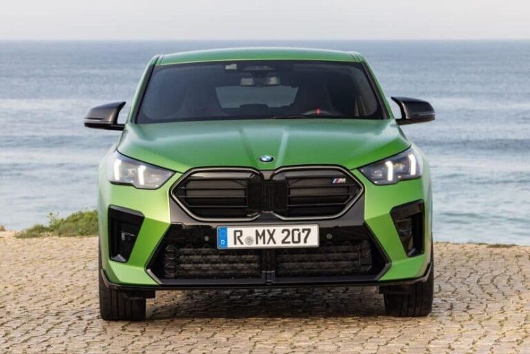
BMW![]()
Kia![]()
The era of “flat design” has reshaped nearly every major automaker’s identity. Volkswagen, BMW, Kia, and others have all gone the same route, abandoning three-dimensional emblems for cleaner, digital-friendly icons. What began as a fresh, modern approach has drifted into something borderline dystopian — a sea of monochrome badges that are becoming eerily indistinguishable. Mazda’s new symbol slots neatly into that aesthetic echo chamber. It’s not a bad design, just a predictable one. Which is puzzling, considering Mazda’s proven ability to evolve with grace. The recently unveiled Vision X concepts, for example, show that the brand can embrace the future without losing emotion or artistry. That same spirit feels absent here.
For Better or For Worse?
Mazda![]()
Mazda’s new look is clean, versatile, and modern; qualities that make sense in today’s branding playbook. Yet it lacks the intangible spark that once made Mazda’s imagery as soulful as its cars. It doesn’t offend, nor does it inspire. Maybe that’s the point. Mazda’s wings remain intact; they just don’t seem all that eager to fly anymore.