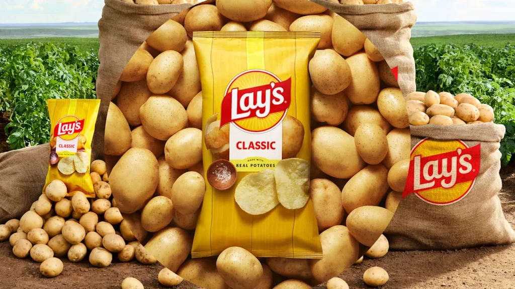
Lay’s sells more than 200 flavors of potato chips across the globe. Only one of them puts a potato on the package.
That’s because in many ways, the largest potato chip company in the world, Lay’s, is the embodiment of a modernist brand. Hear the word Lay’s and its red and yellow logo pops into your brain, quickly followed by a hallucinated blast of salt on your tongue. The logo is an abstract hero, associated with chips only through constant consumer exposure. But in Lay’s own market testing, it discovered a cost to this approach: Only 42% of people realized that Lay’s potato chips are made from potatoes.
Now—as the long, liberal war on ultra-processed food has been emboldened through a new Venn diagram with MAHA politics—Lay’s is launching a potato-forward makeover it’s calling “rooted in real.” It’s part of a larger initiative to stoke excitement around Lay’s, and salty snacking in general, as Frito-Lay attempts to counteract a 5% core profit decline in 2024.
The project kicked off two years ago, as the internal design team at PepsiCo, which owns Frito-Lay, began a redesign of the brand that reached all the way from the logo to the bag.
“I think what we’re trying to do is really pay homage to the 300,000 farmers [who grow] the real potatoes that are in the product . . . really bring that forward, front and center, so that it’s a feeling,” says Jonnie Cahill, CMO of PepsiCo’s international foods.
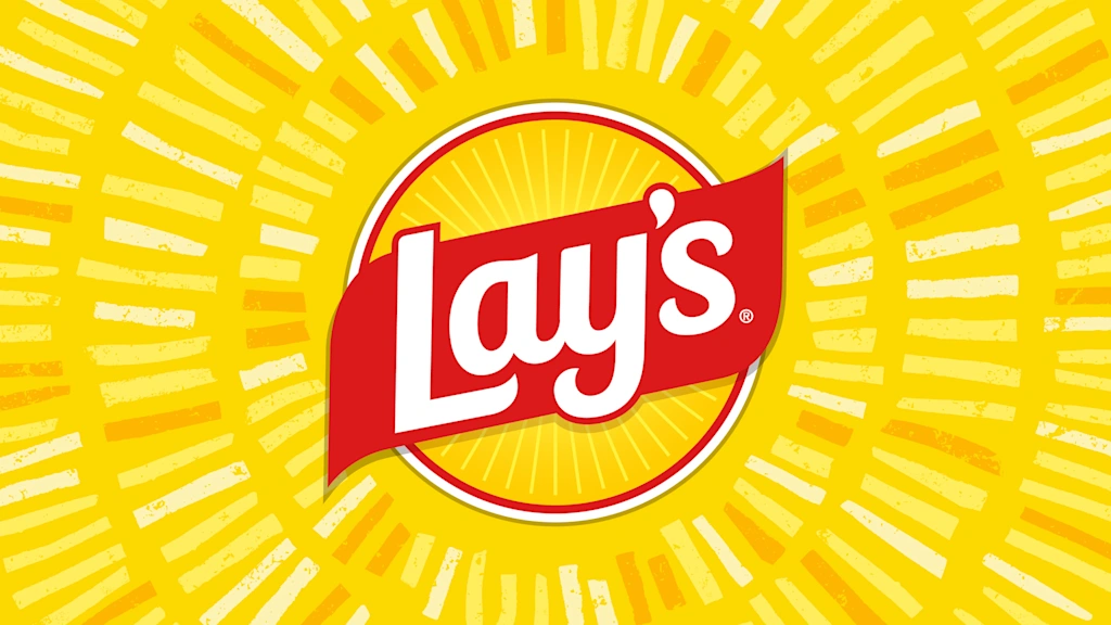
The new Lay’s logo
The PepsiCo team began the refresh with a deep analysis, and earnest retrospection, about what the heck the Lay’s logo even meant. Variations of the mark, with a yellow orb and red overlay, had been in use since 1995.
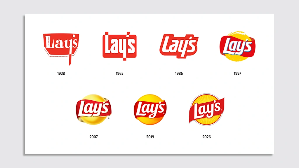
“The story wasn’t as sharp as we wanted it to be,” says Carl Gerhards, senior director of design at Lay’s who also worked on the relaunch of the Pepsi brand in 2023. “Some people, even internally, thought it was the chip [or] it was the potato.” In reality, it was supposed to be the sun. During market testing, in which the company asked people to draw Lay’s as an idea, a sun entered the scene again and again. Even if that relationship was subconscious or just tied to picnicking.
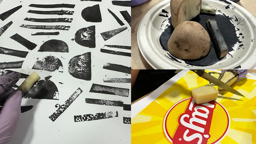
So Lay’s rolled with the sun, and wrapped it with a newly rendered red ribbon (indicating Lay’s is a “gift from our farmers”). “Lay’s rays” of sunlight now fill the orb and break out as a radiant glow across branding that almost looks like a circle of french fries. In fact, the design team members went full method actor with this image, and they actually stamped the rays with sliced potatoes dipped in ink to give the brand a deeper rooting in the root vegetable.
As for the wordmark, the last iteration actually featured a drop shadow, which dated it a bit. The bigger problem, though, was that it was “part joyful, part fanciful,” says Gerhards, who notes that the looping “y” in particular confused its identity. “It didn’t feel like it had quite embraced one world or the other.”
The new mark ditches the touches of script and focuses on terminals (the ends of letters) that finish with an almost organic point that falls just short of calling it a hook. Those terminals are meant to mirror the shape of the red ribbon that sits over the sun to ensure the letters are legible. In countries across the globe, of course, Lay’s isn’t always called Lay’s. In Columbia, for instance, Lay’s is called “Margarita”—and yes, that nine-letter brand has to fit in the same footprint as short-and-sweet Lay’s.
The new Lay’s packaging
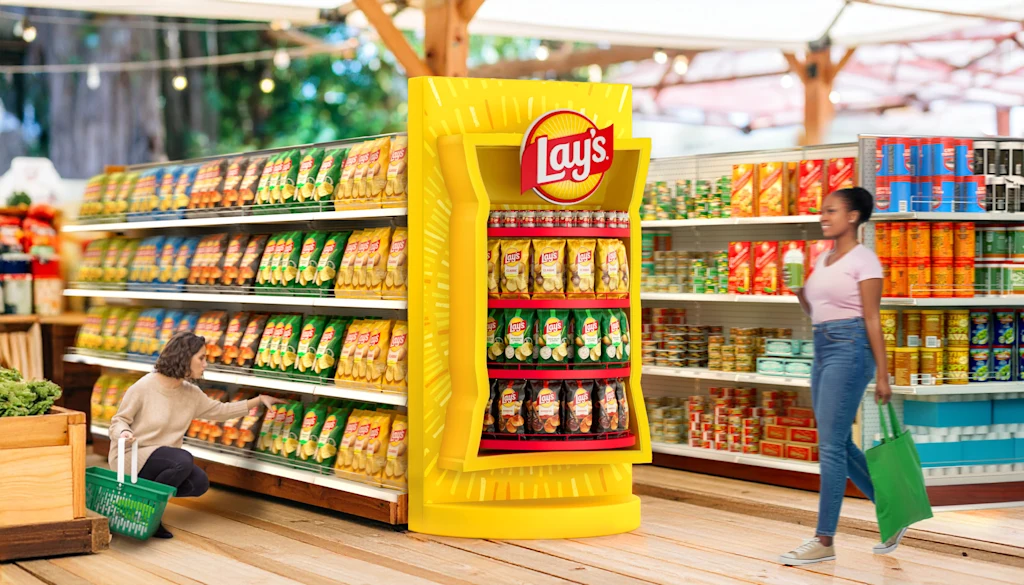
In many modern brand campaigns, it really only matters how something appears online. But for packaged foods, physical retail still reigns, as 82% of grocery shopping is still done in person. The Lay’s team confirmed that the impression of its packaging within retail environments is still paramount to selling chips.
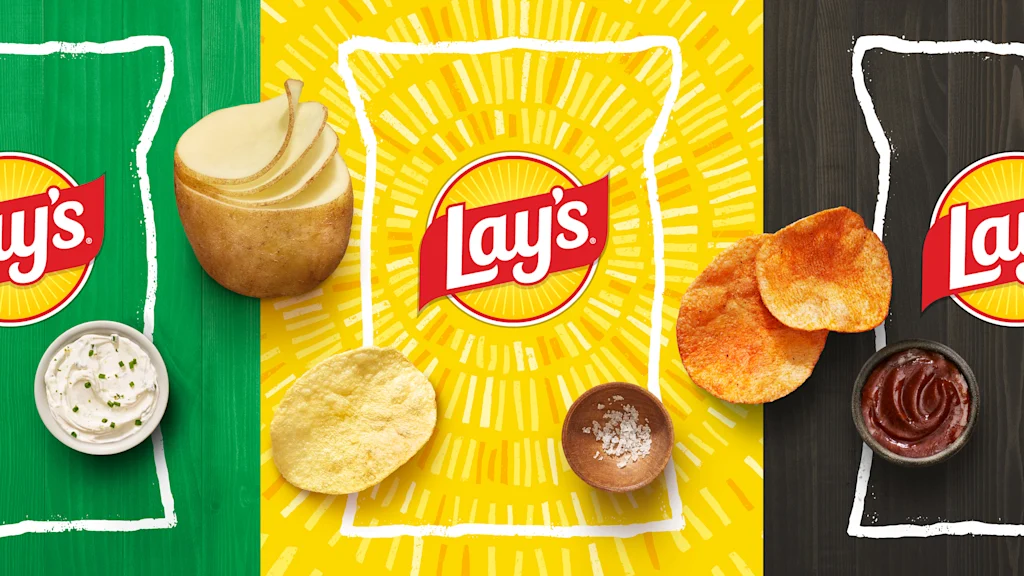
On store shelves, the potato is king, as Lay’s now features images of potatoes on every flavor. Those potatoes look different from flavor to flavor, too, emphasizing different natural shapes, slicing, and peeling techniques behind produce.
“Where most brands try to be more iconic, make one thing, and show it all the time the exact same way, food is not that way,” says Gerhards. “And so we wanted to embody that in our design.”
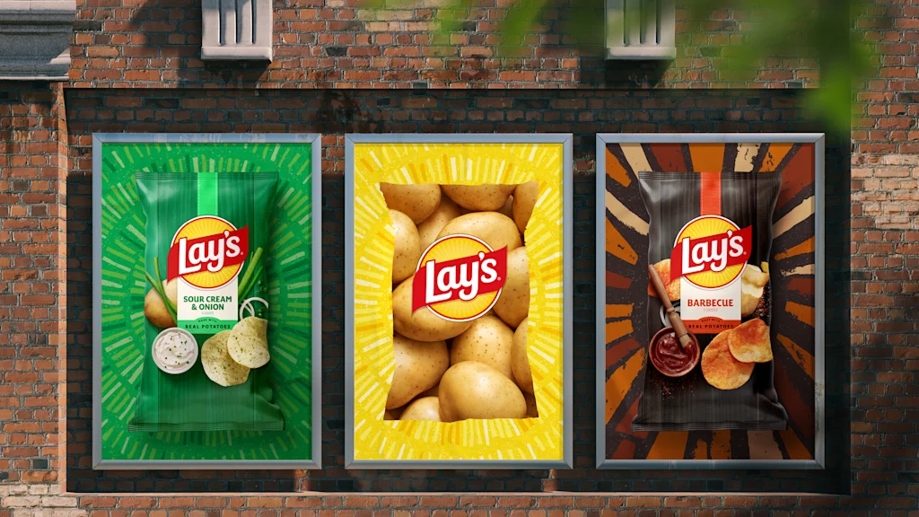
Real, photographed potatoes and chips now appear on every bag rather than for just the classic flavor. They are accompanied by flavoring elements (like salt or barbecue sauce). The new brand hues are less “candy-like” and derived specifically from the colors of real foods, like the bright-but-earthy green of a cut pickle.
All of this food lies atop a wood-block pattern, evoking a kitchen cutting board or hint of barnyard chic. Coupled with a bag that will shift from glossy to matte in many markets, Gerhards believes it all adds up to a more tactile, sensorial experience where the consumer senses texture.
“I think there’s a magnetism to this skeuomorphism,” says Gerhards. “I’m not going to put my hand up and say I’m the biggest fan of it in other areas of design, but for the latest [Lay’s] brand, I think it’s really appropriate.”
Then to validate these designs, the team set up retail tests (some in real stores, some in makeshift simulations) across the world, timing timed how fast people spotted the brand and their flavor. (Some testing even used eye tracking.) The company claims that in many cases, it saw an increase in hard benchmarks like “findability” and purchases, along with qualitative factors like customers believing the packs looked more flavorful and understanding that the chips are made from potatoes.
Lay’s plan to get you to eat more Lay’s
The Lay’s team sees a lot of value in the bag silhouette, and it’s being treated as a “portal” across in-person and online moments. That means in stores, you might see Lay’s sitting on a shelf that’s shaped like a big bag of chips. And on Instagram, you may see a Lay’s bag that appears as a cropped photo of potatoes.
That portal is a subtle but key part of Lay’s marketing strategy, because while the brand actually reached 28 million new households last year, it needs to continue to increase consumption to appease Wall Street. The company reported earlier this year that one of its most significant growth challenges is that people are chasing experiences on their limited budgets. The portal is essentially a way for Lay’s to toe-dip into lifestyle brand territory, inserting itself, or transporting its audience, to new places to eat Lay’s.
“I think one of the unlocks for growth is occasionality: occasion penetration and being relevant for more occasions,” says Cahill. “And I think you see that in this [larger rebrand], that you can imagine the brand and the product showing up in more occasions.”
But only when the rebrand launches on shelves later this month will we know: Are people more likely to eat chips if they know they’re made out of potatoes?