Any avid reader undoubtedly recognizes him: the sleek, inquisitive bird frozen inside an orange oval that’s become Penguin Random House’s distinctive logo. With its new brand refresh, Penguin Random House UK is setting that iconic penguin free.
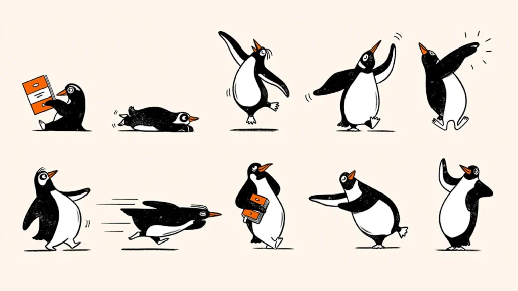
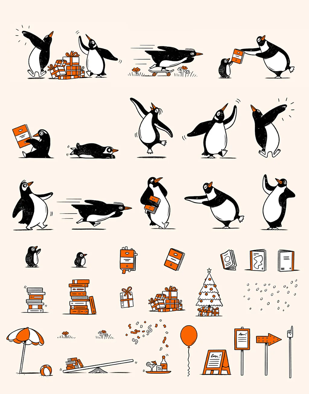
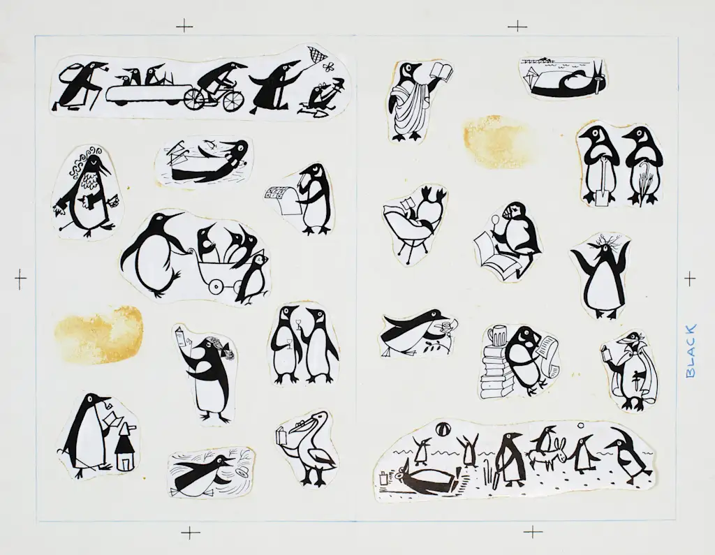
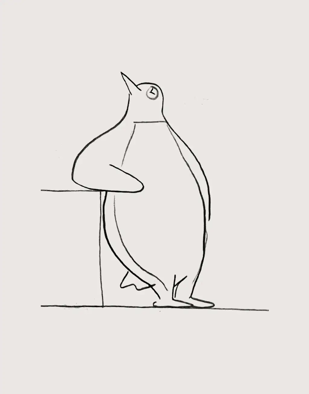
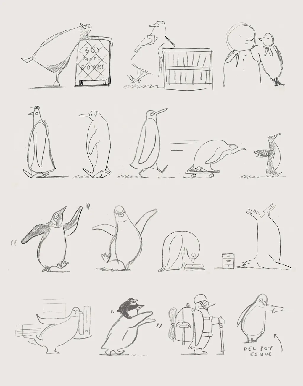
The brand just unveiled a delightful series of hand-drawn illustrations, named the “Playful Penguins,” which show the penguin jumping, strutting, dancing, and doing a whole lot of reading. The illustrations will show up everywhere from seasonal campaigns to social initiatives and point-of-sale displays—and they’re designed to bring some added joy and movement to the brand as it approaches its centennial.
In the years following Random House and Penguin Books’ 2013 merger, the massive publishing house has focused on streamlining representations of the penguin to one core logo—the bird inside its lozenge—in order to maintain a consistent masterbrand.
According to Derek Man, Penguin Random House UK’s design director, the company had an opportunity to “test and stretch” its brand for its 90th anniversary last year. At the time, his team uncovered a “rich collection of expressive illustrated penguins from our Bristol archive,” which they wove through the anniversary campaign. The public showed a major affinity for the bird, demonstrating to Man’s team that it was time to give the penguin an even bigger role in the brand.
While the orange penguin logo will remain the company’s core mark, Man says the Playful Penguins will help “answer the brand’s needs in 2026 and beyond” by setting clear guidelines for other ways that the penguin is permitted to trot, slide, and dance across the page.
How the Penguin Random House bird became an icon
The origins of the Penguin Books penguin is something of a brand legend. It traces back to 1935, when Allen Lane, the founder of the publishing house, apparently received a piece of advice from his secretary that “Penguin” would be a good name to encapsulate a “dignified” yet “flippant” brand attitude.
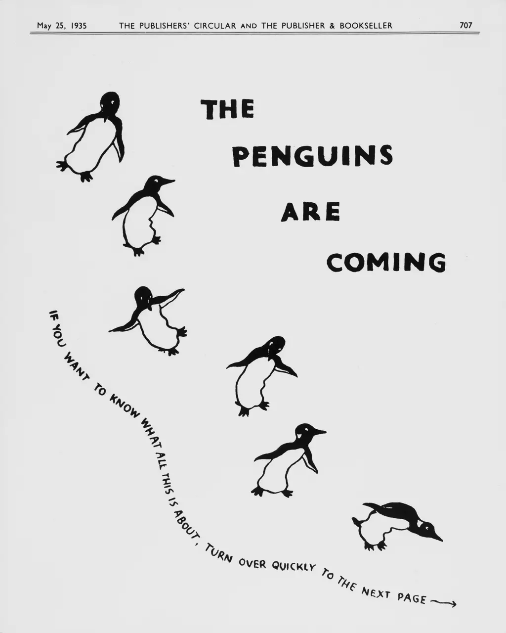
Soon after, Lane sent the 21-year-old illustrator Edward Young to the London Zoo, where, according to the oft-repeated tale, he apparently spent all day sketching penguins in action. His initial drawings are loose and playful, capturing a mischievous energy that suggests a creature constantly in motion. One of the first teaser ads for Penguin Books shows a series of six penguins scampering down a white page, accompanied by the text, “The penguins are coming. If you want to know what this is all about, turn over quickly to the next page.”
In the decades since Young’s initial sketches, the penguin has been shaped by the hands of multiple other creatives. In 1937, the logo was updated to a version with the penguin dancing and looking to the right, rather than the left. In 1939, it was tweaked to a more serious-looking bird. Arguably the most influential version of the bird came courtesy of graphic designer and typographer Jan Tschichold in 1946, whose penguin features thicker black lines and wings tucked demurely at its sides.
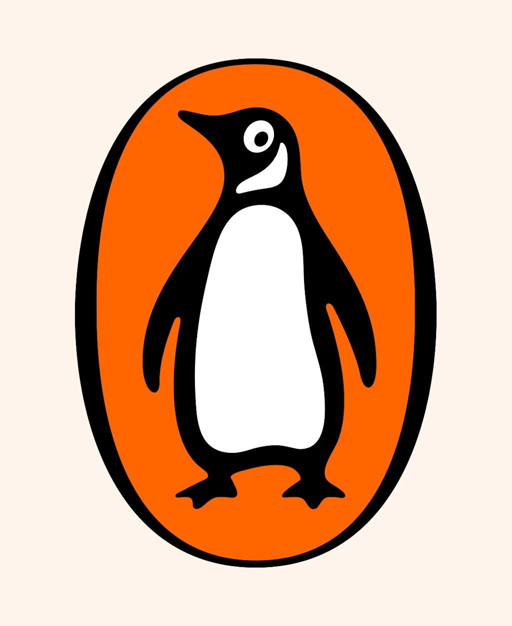
When the design agency Pentagram was asked to update the logo in 2003—the iteration that Penguin Random House still uses today—Tschichold’s gold standard served as the basis of its design, which is just a bit slimmer with a jauntily upturned beak.
After the 90th celebrations, Man says “it became very clear” that there was a need to create something that could continue the spirit of these archival illustrations, yet that was fit for contemporary use. To achieve that, he took the London-based illustrator Matt Blease on a trip back through these archives for inspiration.
‘I became part penguin for this project’
For Blease, trawling through Penguin Random House’s archival assets was only the beginning. In fact, he says, he “became part penguin” for the project.
“I spent hours watching footage of how penguins walk, twist, turn, and slide,” Blease says. “I absorbed as much as I could and then let it flow out onto my sketchbook as loosely as possible. It’s always a bit of a brain dump at the brainstorming stage. You’re sketching faster than ever, trying to keep up with your brain. It becomes all-encompassing, totally locked into the act of drawing. It’s a beautiful moment when you look up and actually see the work en masse.”
Throughout this creative exercise, Blease was working with one key parameter: The penguins needed to look like Penguin Random House’s iconic logo (who, he says, is internally named “Alan”), but they couldn’t be the exact same bird. Instead, he imagined them as “part of the same family,” sketching out penguins that might reasonably be “guests at Alan’s wedding.”
Man says this approach allowed Penguin Random House to “channel that sense of play in a controlled and cohesive way,” ensuring that the Playful Penguins could frolic without disrupting Alan’s status as the brand’s most recognizable asset.
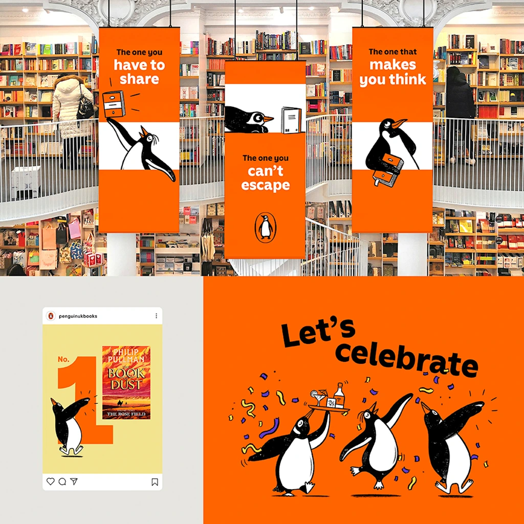
“Importantly, these illustrations have been carefully crafted to be visually distinct from the logo through differences in form and texture,” Man explains. “This clear distinction allows our iconic lozenge Penguin to remain untouched—continuing to stand proudly as one of our strongest and most recognizable brand assets, while providing teams with a flexible, engaging set of assets designed for creative use.”
Blease’s illustrations bring a warm, analogue feel to Penguin Random House UK’s brand that reflect the publisher’s visual past while setting it up for its next chapter.