
Google continues working on upgrading the capabilities of the Gemini application. This implies not only boosting its AI capabilities but also its user interface. The latest update, currently rolling out to Android users, brings a significant visual overhaul that shifts the app’s aesthetic while introducing several much-needed organizational tools. For many, the most important change is a fresh coat of paint—or rather, a deeper coat of black—for Google Gemini’s dark theme.
Google Gemini adopts true black for “dark” theme, partially
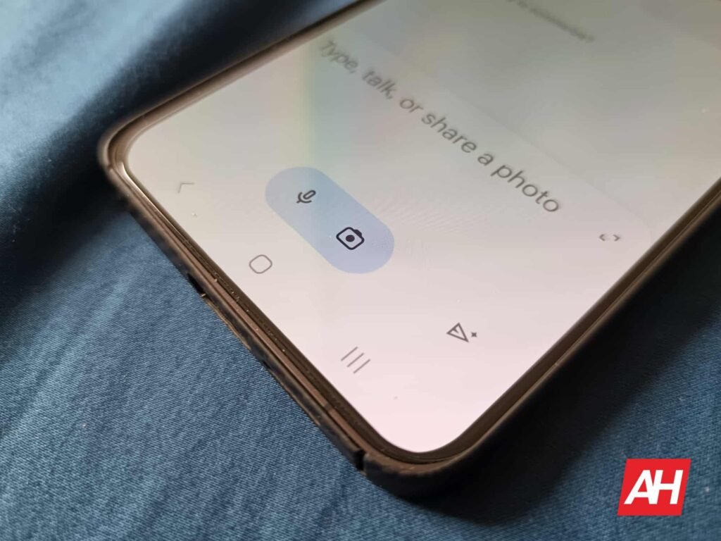
It seems Google is fully abandoning the traditional muted gray background in its dark mode. The Gemini app homepage now sports a much bolder, true black color scheme. For users with devices using OLED or AMOLED screens, this change is more than cosmetic. After all, a true black background allows those pixels to turn completely off. This results in less battery consumption and a sharper, more comfortable viewing experience in low light.
Gemini’s latest shift brings its UI in line with other modern “true dark” app designs. Interestingly, this new black (reported by 9to5Google) only affects the homepage and its elements, creating a subtle dual-tone look where the main prompt box and conversation windows retain a slightly different hue.


App gets ‘My Stuff’ for organization
Beyond the aesthetics, the update tackles usability and organization, starting with a new feature called “My Stuff.” Located conveniently in the navigation drawer, this section acts as a central hub for all the creative output generated by the AI. It provides an immediate preview of the last three images, videos, or Canvas works created. This gives users a simple, one-stop location to manage all their generated media.


The rest of the interface also receives thoughtful streamlining. The suggestion chips—the options that guide users to create images, conduct deep research, or write content—are now vertically arranged. This tweak makes better use of screen real estate. Some of these chips, like “Write” and “Build,” have been renamed to the clearer “Write anything” and “Build an idea.”
Furthermore, managing ongoing conversations is now easier. The new design replaces the old account switcher with a dedicated “New Chat” button. Plus, tapping the conversation name now pulls up a quick dropdown menu that allows users to share, pin, rename, or delete the thread instantly.


Embracing a true black tone for Google Gemini’s dark theme is a big step. However, many might not like that the new look only affects the homepage. Hopefully, Google will eventually bring the tweaked design to the entire app UI soon.
The post Google Gemini App Finally Goes True Black—With a Catch appeared first on Android Headlines.