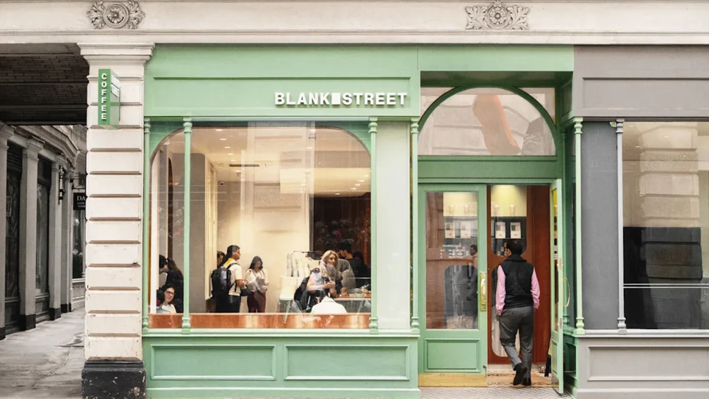
Blank Street started in 2020 as a coffee shop operated out of a single cart in Williamsburg. Just five years later, it’s a chain with more than 90 global locations that’s become almost more well-known for its over-the-top matcha drinks than its actual coffee. Now, it’s getting a subtle rebrand that makes the whole identity look like an ice-cold glass of green tea latte.
The new branding, crafted by the agency Wolff Olins, includes a new logo symbol inspired by that original coffee cart, new custom fonts, and a greater focus on green. It stays true to the brand’s quintessential neutral aesthetic while adding a few original touches to be just a bit more distinctive. George Lavender, creative director at Wolff Olins, says that, given the brand’s massive growth, Blank Street was due for a visual touch-up.
The company currently operates locations in New York, Boston, D.C., London, Manchester, Birmingham, Glasgow, and Edinburgh, and is gearing up to expand into L.A. soon. According to a June profile in the The Wall Street Journal, Blank Street’s current valuation is around $500 million, and it earns an estimated annual revenue of $149 million.
A large chunk of that income is thanks to the monumental popularity of Blank Street’s matcha creations, which includes flavors like its best-selling strawberry shortcake matcha, blueberry matcha, and cookies-and-cream matcha. Matcha’s popularity has exploded in the U.S. in recent years, with some reports estimating that the beverage’s sales have reached beyond $10 billion over the past 25 years.
Mohammad Rabaa, Blank Street’s global creative director, says that matcha now accounts for more than 50% of the business.
“It started as a coffee cart in Williamsburg and snowballed, becoming this thing that was much bigger than they ever thought it might become,” Lavender says. “I think it was a good moment for them to stop, reflect, and try to reestablish who they are.”
Refining a brand designed to be neutral
Blank Street’s former branding centered around the idea of its identity being almost an “empty vessel,” Lavender says—a metaphorical blank space that customers could fill with whatever drink they like best. To that end, their logo was an ultrasimple sans-serif wordmark, complimented by a palette of black, white, and fern green.
“With Blank Street, you have a company that’s highly creative and expressive in their creations,” Lavender says. “In order to have a sense of balance to that, their own identity needs to be so neutral, because every seasonal campaign is so wildly different.”
He adds that the existing identity was clearly working, but it was veering into a territory that was almost too neutral. “That’s why, through this process, we really wanted to make the evergreen Blank Street brand just a little bit more special.”
Lavender’s team started by adding a literal “blank” space as an added symbol in the logo. It’s a plain rectangular box that’s designed after the dimensions of the window on Blank Street’s original coffee cart, and it will start to appear on the brand’s cups, signage, packaging, and socials this fall.
Alongside the box motif, Wolff Olins also swapped out Blank Street’s former public domain fonts for two custom sans serifs, developed in partnership with the type foundry Due Studio. The refresh also includes a warmed-up version of Blank Street’s signature green hue, paired with a palette of various other greens that the brand can use in secondary applications. The goal is to eventually phase out any former black and white branding (which still remains on the outside of some small format stores) in favor of the new green and cream logo.
A more matcha-forward brand
Blank Street, which used to be called Blank Street Coffee, is also in the process of dropping the “coffee” from its name, including by moving the word to a secondary position on signage. The branding changes, alongside the name edit, seem to point to the idea that Blank Street is embracing a new identity—perhaps one that emphasizes its fan-favorite matcha over its coffee beverages.
“They are shifting away from ‘Blank Street Coffee’ to ‘Blank Street,’ and I’m sure that’s a very conscious move based on the strawberry shortcake matcha being their most popular seller ever,” Lavender says.
Lavender adds that the company’s creative direction was never to explicitly mimic matcha, but the drink’s growing popularity was more of an “unspoken thing” throughout the process. According to Rabaa, green was the company’s core color even before introducing matcha, and any similarities between the new branding and the green tea drink itself are “not a nod,” but more like “a happy coincidence.”
Either way, Blank Street’s sales numbers show that matcha is definitively its stand-out product—and now, it has an identity that looks the part.