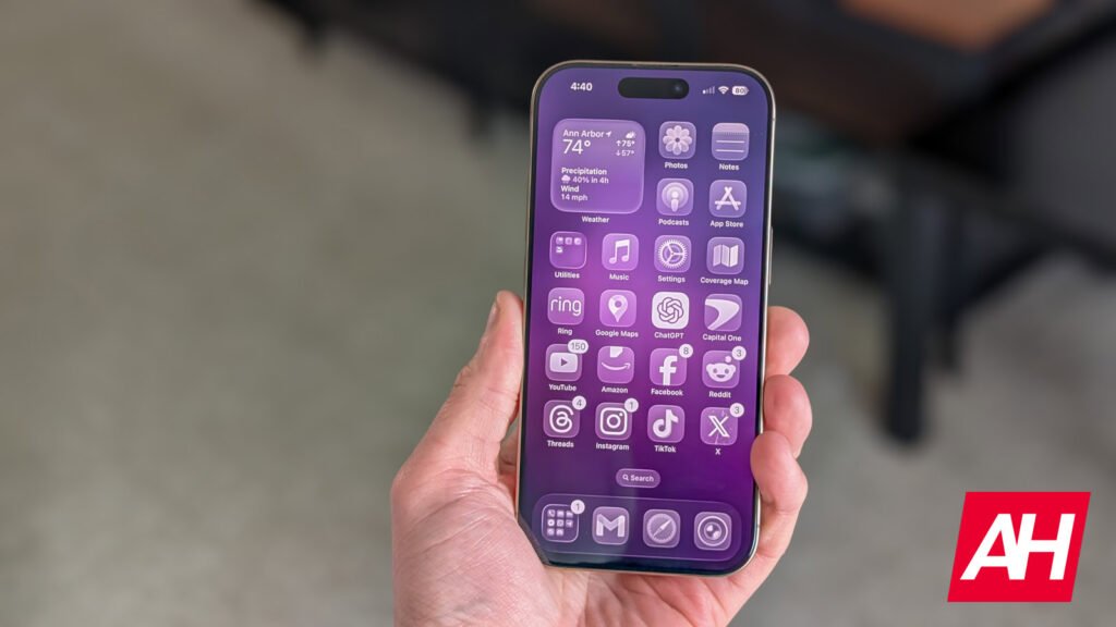

Apple recently announced iOS 26 as the latest major update for iPhones. This new firmware brought with it a significant visual overhaul. The OS now boasts a “liquid crystal” design language, giving the user interface a distinctly “glassy” feel. This aesthetic is prominent across buttons, switches, and status bars, even featuring neat effects that mimic light refracting through crystal. It’s certainly a fresh look for the iPhone experience.
However, this striking visual revamp didn’t come without its initial drawbacks. Soon after the first iOS 26 beta rolled out, users quickly noticed some frustrating readability issues. These problems were particularly apparent on certain buttons and switches that overlay other apps and menus. A common complaint centered on the redesigned Control Center, where the new “glassy” UI led to poor contrast with the background. Such problems made icons and text within the Control Center surprisingly difficult to see and interact with, impacting overall usability. The core problem seemed to be that the section’s transparency effect was, quite simply, too transparent.
iOS 26 Beta 2 brings fix to Control Center readability issues
Well, we have good news for those testing iOS 26: Apple has already taken action. The recently released iOS 26 beta 2 update brings a fix to these readability concerns. The update offers a noticeable improvement to the Control Center’s visibility. Apple’s solution was simple yet effective: they opted to add more contrast to the background of the Control Center’s buttons and options.


Now more similar to Samsung’s One UI
Interestingly, there is something about this fix that might raise an eyebrow for long-time smartphone users. The increased contrast, while improving visibility, gives the “liquid crystal” effect a more “frosted glass” appearance. This look is quite reminiscent of the effect Samsung uses in its One UI notification bar and control center. So, while Apple has certainly boosted readability in iOS 26, some might argue that the change causes it to lose a bit of its unique visual identity, leaning closer to what’s already familiar on Android.

It’s important to remember that iOS 26 is still in its beta phase. There’s a strong possibility that Apple will continue to refine the design, aiming to strike a perfect balance where the “glassy” UI can truly shine with its own distinct personality without compromising crucial visibility and user experience. Let’s hope that the giant from Cupertino achieves it before the stable rollout.

The post Apple Fixes iOS 26 Readability: Beta 2 Brings Clarity to the “Glassy” UI appeared first on Android Headlines.


