Austin just got its first official branding in nearly 200 years, and it’s an homage to natural springs, rolling hills, and a city that’s emerged as a liberal island in an overwhelmingly red state.
The branding, revealed at a press conference on September 4, includes an official logo for the city, a wordmark, and a set of guidelines for how Austin’s government will show up online. It was designed through a partnership between the Austin-based agency TKO, which handled an extensive preliminary interview process, and the Austin branch of the design firm Pentagram, which led the actual brand design.
According to Pentagram partner DJ Stout, the process was a balancing act of creating an identity that was both authoritative enough for the city government and representative of the average Austinite. Already the result is generating a firestorm of negative attention on social media—but Stout says that’s “completely expected” in today’s divisive branding reaction ecosystem.

Input from all over
In the years since its founding in 1839, Austin has developed many fragmented logos and symbols for various departments across the city, but never a cohesive brand system. By 2018, when Austin began considering a unified identity, Stout says there were more than 300 different amalgamations of logos for the city floating around.
Pentagram officially started on the branding effort in October 2024 after winning an initial competition to helm the project. At that point, the city and TKO had already spent several months conducting surveys with citizens, stakeholders, and government employees about how the identity should show up.
One of the main challenges that Stout’s team faced in the brainstorming process was a common obstacle when working with bureaucratic organizations: The final look had to pass muster with multiple audiences, often with vastly different opinions and agendas.

“Obviously it’s meant to represent all the Austinites and everybody in the city,” Stout says. “But [the city] was very clear that our objective was to come up with a solution for the city’s needs. Talk about ‘design by committee’—designing anything for city government is the ultimate design by committee.”
Initially Stout championed the idea of an “Austin star” symbol that would nod to Texas’s iconic lone star while also adding some unique Austin flair to a commonly used shape in place-based identities, similar to Chicago’s star logo or even Canada’s maple leaf.
“However, just from showing these to lots of different groups, audiences felt that anything that smacked of state government did not fit the personality and the attitude of people who live in Austin,” Stout says. “Austin is a little liberal island, politically.”
For a city that lives by the tagline “Keep Austin Weird” and celebrates “hippie” culture, as Stout puts it, the identity needed to tap into a less politically leaning idea.

A logo inspired by nature
Ultimately, instead of referencing Texas at large, Austin’s new identity is intended as a love letter to the city’s natural landscape. Stout was specifically inspired by a movement that started around the time he moved to Austin in 1986 called “Save Our Springs,” when the local community came together to fight water pollution and advocate for the protection of Barton Springs and the Edwards Aquifer that feeds it.

“I would say without a doubt that the reason people love Austin so much is because we have all this beautiful water,” Stout says. “We have Barton Spring[s], which is this giant spring-fed pool; we have Deep Eddy, which is a spring-fed public pool; the Colorado River runs right through Austin. The whole modern city is built around Lady Bird Lake.”
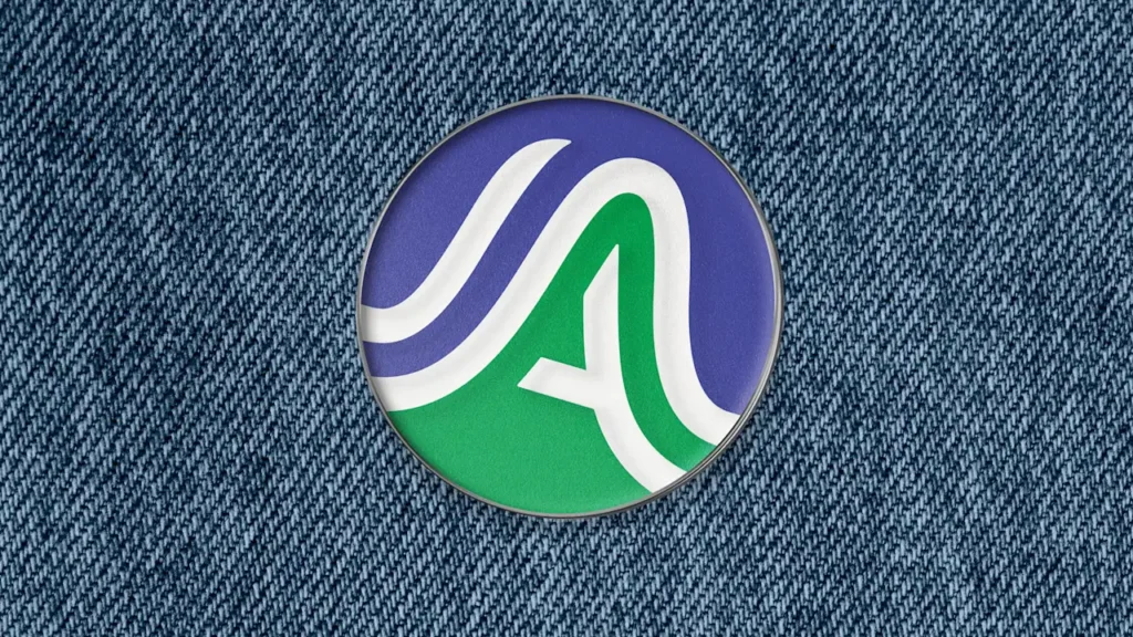
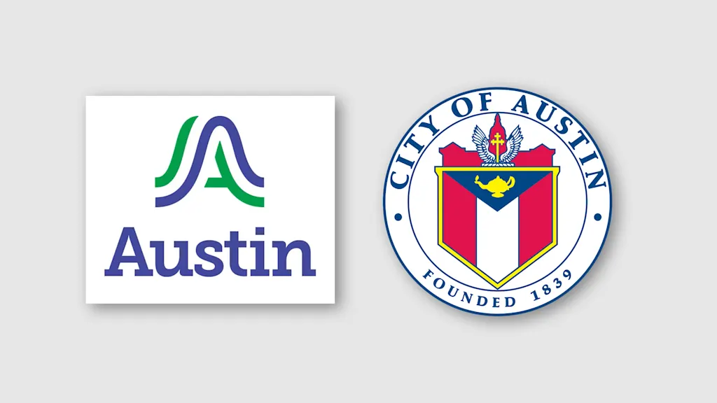
To reflect those water sources, the logo—a stylized “A”—includes a flowing blue wave. It’s sandwiched by two green lines: One represents Austin as the start of Texas’s Hill Country, and the other references the urban canopy that covers the city. Even the hue of blue that Stout’s team chose was inspired by a local phenomenon nicknamed the “violet crown,” which refers to the purplish color of the sunset.
The wordmark font, a serif called Museo Slab, was chosen both because it “feels a little Western,” Stout says, and because it offered a more authoritative element for the city government to work with alongside the logo.
The identity’s overall aesthetic is predictably simple and corporate for a project with so many voices at the table. (The colorful Los Angeles Tourism logo is one exception.) Still, the Austin logo does manage several clever nods to the features that make the city unique.

Why the internet hates rebrands
Austinites wasted little time voicing their discontent with the identity. A post from the local Instagram account @365thingsAustin has drawn more than 1,000 comments, most of which are resoundingly negative.
“Did they make it on Canva?!” one commenter asked. “[I]t is so bad i want to give it a zero but that’s not possible so i give it a 1,” another said.
Several locals seem particularly concerned with the cost of the project. Jessica King, Austin’s chief communications director, said in the press conference that the total cost to the city was $1.1 million. Stout adds that Pentagram and TKO split a total payout of $200,000.
“That cost $1.1M?! I could think of so many better ways to spend that money . . . there had to have been some prepping for winter weather that could’ve taken place instead of being surprised every year!” one commenter said.
Stout is unfazed by the backlash, which he says has become a side effect of working in the industry over the past several years. He points to Pentagram’s work on Hillary Clinton’s presidential campaign and his own rebrand for Loyola Marymount University as two examples of design efforts that received intense pushback when they first debuted but have since been recognized as solid identities.
“It’s because of social media,” Stout says. “Back when I first started about 40 years ago, nobody even knew what an identity system was.”
In an era when branding has become a hot topic in the internet reaction economy (see: Cracker Barrel retracting its latest rebrand over backlash) it’s almost impossible to design an identity that the internet will actually celebrate. As for the Austin branding, Stout believes Austinites will eventually come around to the look after the unfamiliarity wears off.
“I’ve been a partner for 25 years—this is not one of the higher-paying jobs,” Stout says. “I did it because I love this city, and because I’m from the city, and it really means a lot to me.”