
The more I use various Android UIs, the more frustrated I get. Some things make perfect sense; others, not at all. Before some of you start boasting about iOS, the situation is a lot worse there, as it doesn’t even have a universal back key, not to mention the horrible notifications system, etc. Apple’s iOS has much bigger problems than UI customization; it needs to get the basics right first. Those are just facts. You may be used to it and like/love it, but it’s simply not great or intuitive, for that matter, no matter how much some people claim it is. The sheer inability to go back with one gesture alone is enough to deny the intuitive argument.
Samsung’s Good Lock is a small window into limitless possibilities
I digress, though. I’m not here to rant about iOS; I did that in the past (things didn’t change much since then), and could surely do it again for hours. I’m here to talk about Android and its UI, which has so much potential, but Google and various Android OEMs are simply not taking the next step. Samsung’s Good Lock app has paved the way, in a sense, and showed us what we’re missing. From allowing us to completely change the Recents screen to allowing us to customize gestures, make outrageous animations, and so on. There are a ton of options in Good Lock, and the sheer fact that someone hasn’t copied it is… hard to understand.
I do think this should be a much more significant movement, starting with Google. I remember that, way back, I was able to use a third-party sharing app (there were several; I can’t remember their names) to essentially replace the default one. Needless to say,I found that to be extremely useful, as the current sharing screen doesn’t make much sense to me. Those sharing screens are always trying to guess who I want to share stuff with, both people and apps, and they’re often completely wrong. For example, I have a neighbor who is constantly spamming me with links on Viber, while I’m not really messaging him often, barely at all. I really don’t want him to be a part of my share screen. There are other examples of contacts I don’t often message or hear from, and yet they’re there. All companies are guilty of this, basically, as I’ve spotted the issue in various places.
Google often uses security as an excuse, but it shouldn’t
Google removed this option a long time ago, stating security reasons. Security is key, of course, but it’s a risk at every step of the way. That’s why necessary precautions are set, and that’s why Google Play Protect exists. If Google needs more steps to ensure security, I’m all for it, as long as that doesn’t kill off choice and freedom of customization. Android, with each new iteration, is getting more and more limited. It’s still light-years away from iOS, but the sheer direction in which it is going… I’m just hoping that Google won’t cut the cord at some point. In fact, it should do the exact opposite.
We need more customization options, not less. Those third-party sharing apps that I mentioned, they allowed you to set up custom apps and contacts to which you can share things to. For example, when I’m scrolling TikTok and Instagram, I do have a list of people who I share stuff with the most. And now, I don’t do it via apps directly all the time for various reasons. Then there’s sharing via Chrome; I usually share links with different people, and so on. The point is, I was able to set up the share screen to be exactly the way I like it. Nowadays, that’s not the case. Some OEMs allow you to set the apps at least, but not contacts within those apps.
Why not let us rearrange parts of the UI? Set up the UI/apps that way
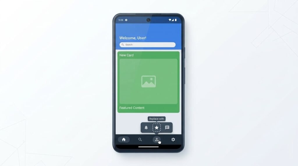
Now, I took a custom share screen just as an example, as the options are limitless. What I was really aiming at when I came up with an idea for this article is general customization, or something close to it. So, being able to rearrange parts of the UI to fit our needs. I know that would be a huge undertaking from the programming side of things, but it would be a great option to have. I would, of course, settle for some added options, such as the Good Lock offers. The real dream is total control over the UI. I firmly believe that’s what the next step should be for Android. It won’t be, but it should be, as it would offer us total control to customize our experience the way we, the users, want.
First and foremost, phones should be far more optimized for large devices. The vast majority of smartphones are large these days, and hand gymnastics are unavoidable, even if you have large hands. My hands are above average in size, and I still find myself annoyed when using a phone with one hand, which is very often, actually. In fact, I use smartphones with one hand the vast majority of the time, and I do believe it’s the same for a lot of people. Menus should be optimized to appear where your hand is, and options in them are actually useful. So if you’re a right-handed user, menus should go in that corner, etc.
Material Design was a strong guideline for DEVs; make a new one… a more ambitious one
My dream would be for Google to lay out a template for how apps are to look, as it did with Material Design, for example, but with a different focus. I’d love to see the company give directions to developers to adapt apps for one-handed use far, far more. And even to try and make some sort of template for icon swapping, option editing within apps, and so on. So, for example, if you don’t need a menu inside an app, you can change it.
Let’s take YouTube, for example, as it received a lot of negative feedback with its latest redesign. YouTube put Home, Subs, Music, etc. options at the very top. At the bottom, you have Home, once again, in addition to Shorts, Upload, and Profile options. Now, you can swipe left and right to move between the options above, but that move didn’t make any sense to me. I use Subs, aka Subscriptions, most often, and I’m sure many of you do too. So why move it out of the way? It would be great if we could edit those options. Why not push developers to use that bottom bar in every app? Make a template for X number of icons down there. Each developer could allow users to pick between X options within their app, and set the app the way they want, with options they prefer.
Options, options, and more options
Some of you may be using just Home and Subs, not Shorts, so why not have those options down there? The vast majority of people don’t upload anything, so why is that option readily available? You also don’t go to your Profile that often, so why is that not moved out of the way? And so on. If we could, at the very least, edit parts of the UI to our liking, that would be outstanding. I don’t think many people would disagree with that. Give us options; we’ll be immensely grateful. The ideal situation would be if we could manipulate UI elements (to a degree), that they’re set that way… modular UI, that’s the idea. The level of modularity is always a big question mark, but a move in the right direction would be greatly appreciated. I’m so tired of annoying UI/apps that feel horrible to use.
The post Android Needs More Customization, Not Less — The Modular UI Dream appeared first on Android Headlines.