Source: GeoHealth
No amount of lead exposure is considered safe for children. Even low levels of lead in a child’s blood can cause serious health problems and developmental delays. But data on lead exposure are sparse at the neighborhood level in the United States, leaving significant gaps in knowledge about where lead exposure may be occurring.
The sale of lead paint for home use was banned in 1978, so neighborhoods built before then, as well as neighborhoods with a higher poverty rate, face a greater risk of lead exposure. Lower-income communities are also less likely to have funds for lead remediation.
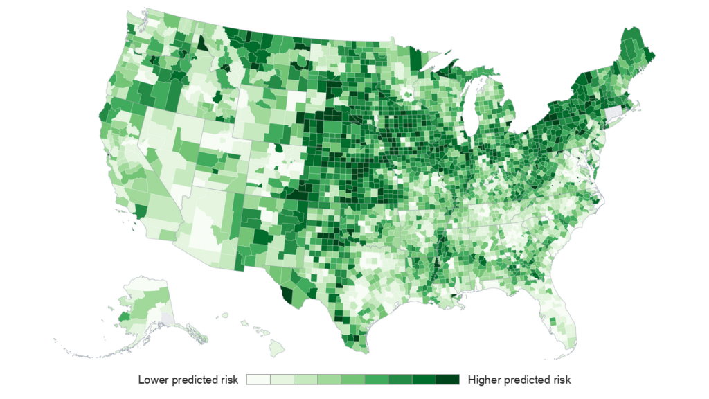
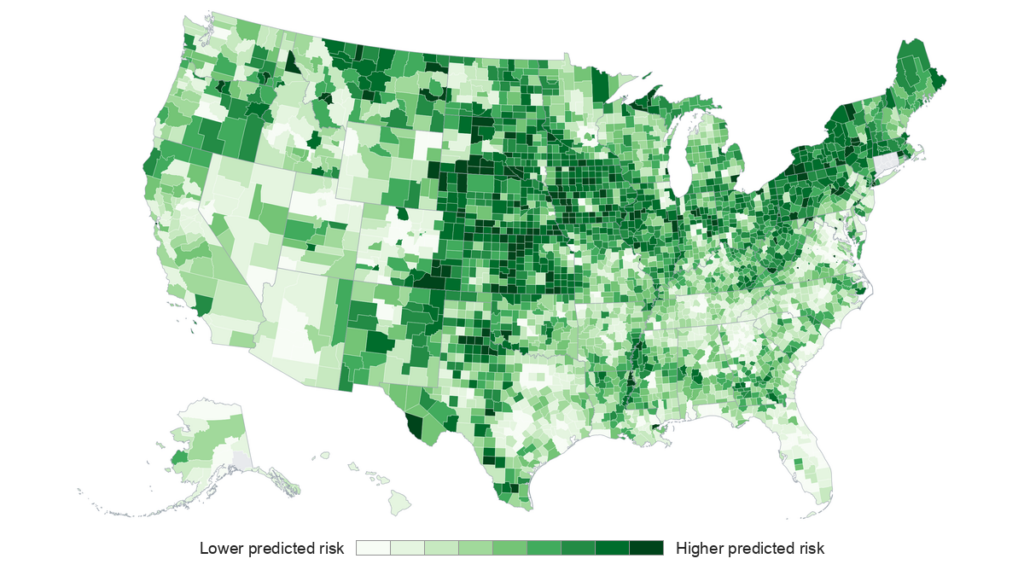
Working from EPA research that suggests a community’s housing stock age and poverty level are predictors for childhood lead exposure, Ritter, founder of the lead testing company Fluoro-Spec, computed a lead exposure risk score that covers all 83,388 U.S. census tracts and 3,222 counties. Though this metric for estimating lead exposure risk is not novel—it is an approach adopted by other public health agencies—the author updated it with data from the 2018–2022 American Community Survey and applied it across the entire country, creating a screening tool that may be useful for identifying places where children are at higher risk for lead exposure.
To validate the risk map, the author examined how closely the lead risk prediction score matched the actual blood lead levels found in children in 11 states: Illinois, Iowa, Massachusetts, Michigan, Minnesota, Missouri, New Jersey, New York, Ohio, Rhode Island, and Wisconsin. Some data came from the census tract level, and some came from the county level. The author notes that all 11 of the validation states are older-housing states in the Northeast, Midwest, and Great Plains, meaning that the map’s low-risk predictions for the West and Sun Belt haven’t been tested.
The results of the new map against blood lead level data showed a consistent positive relationship between predicted risk and measured blood lead levels across all states tested, including Michigan and Ohio, which served as consistency checks because the data from those states came from the earlier EPA research. Wisconsin had the strongest correlation among states whose data came from the census tract level (0.64), whereas Minnesota had the weakest (0.43). Among states where data came from the county level, New Jersey had the strongest correlation (0.77), and New York had the lowest (0.48).
The map isn’t able to tell a family whether or not their home is safe from lead; instead, the author says the map can be useful as a screening tool that helps identify neighborhoods where lead exposure may be more likely and to guide where blood testing, home inspections, and outreach might be done in the future. (GeoHealth, https://doi.org/10.1029/2026GH002053, 2026)
—Rebecca Owen (@beccapox.bsky.social), Science Writer


Citation: Owen, R. (2026), Mapping childhood lead exposure risk in the United States, neighborhood by neighborhood, Eos, 107, https://doi.org/10.1029/2026EO260290. Published on 8 October 2026.
Text © 2026. AGU. CC BY-NC-ND 3.0
Except where otherwise noted, images are subject to copyright. Any reuse without express permission from the copyright owner is prohibited.