It was once where Finland built most of its trains. Now it’s a cultural destination with restaurants, theatre and galleries. To bring it all to life, the identity began with a lifting symbol found on the side of a carriage.
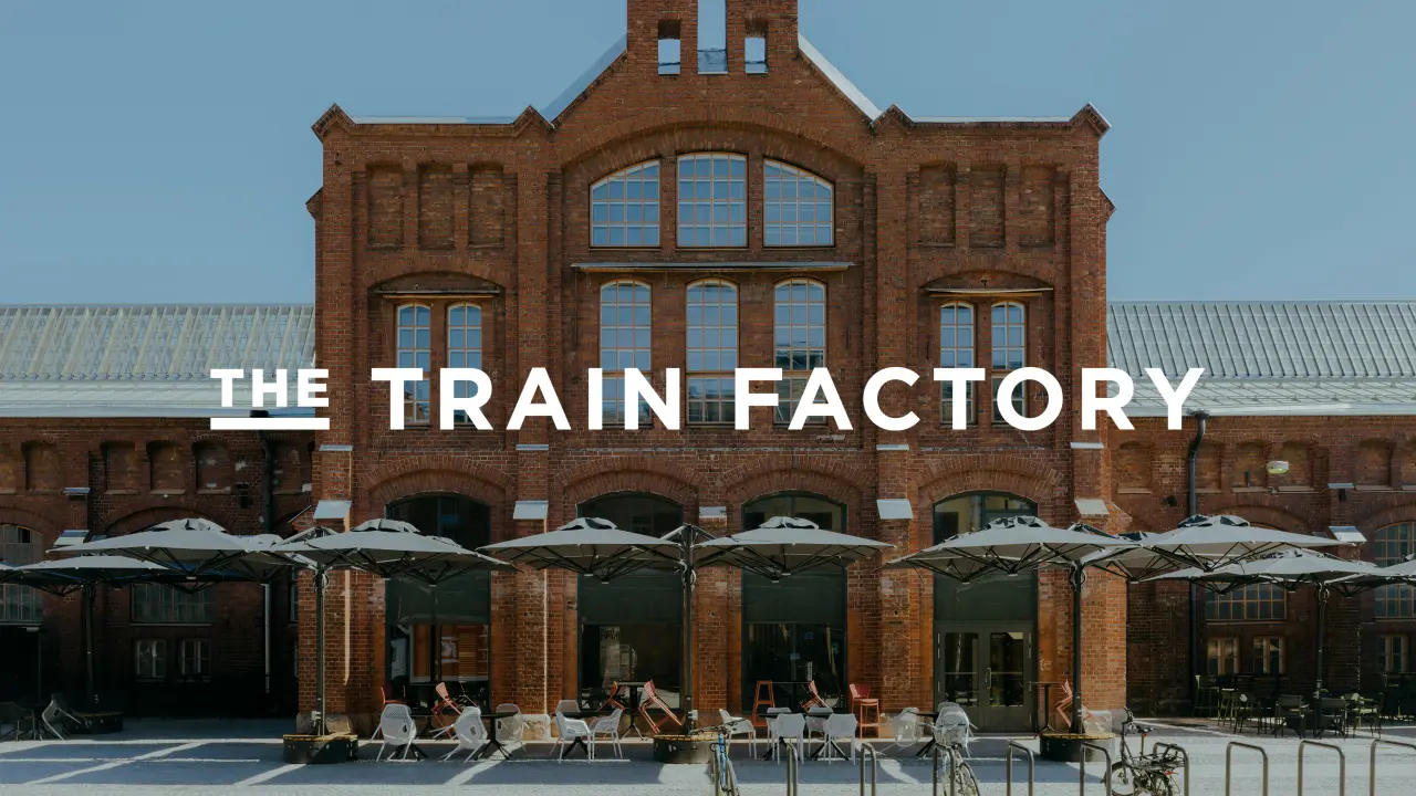
Back in the day, it was a bustling factory that produced most of Finland’s locomotives. Today it’s become The Train Factory, an exciting new venue for food, drinks, sports and culture in Helsinki. Based in the city’s Vallila district, it’s a gorgeous old space with red brick walls and a handsome facade, housing everything from modern dining to theatres and gallery spaces.
It’s classic late 19th-century Nordic industrial charm, with a tall central gable rising up to a chimney-like crown and glazed workshop roofs running off in both directions. For a branding agency tasked with creating its new identity, there’s plenty of inspiration to draw on – the arches, the large windows – where do you even begin? Hasan & Partners were brought in to help. They had just one starting point, and it wasn’t at all obvious.
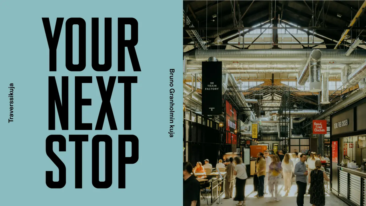
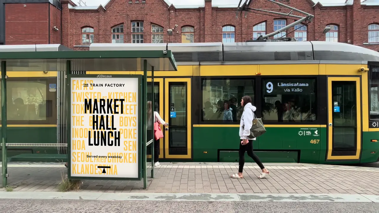
They discovered a functional graphic symbol that once told engineers where to lift a train carriage safely during maintenance. It seemed perfect for the job, so they redesigned the utilitarian mark into a sharp ‘T’, a nice touch given how keen the studio was to honour the site’s history. But it’s also a symbol of elevation or, in this case, a platform for something new. Its shape even echoes the building’s triangular skylights that dominate the space. “We felt strongly that the foundation of the new identity should stem from the history of the site but with a renewed intent,” the studio explains.
The logotype and signage, meanwhile, are inspired by the Finnish train car numbering styles and work well beside a strong industrial headline typeface. The colour palette comes from the building itself: the red brick and accents of yellow and grey-blue from the original factory markings as well as the heavy yellow cranes you can still see hanging over the space.
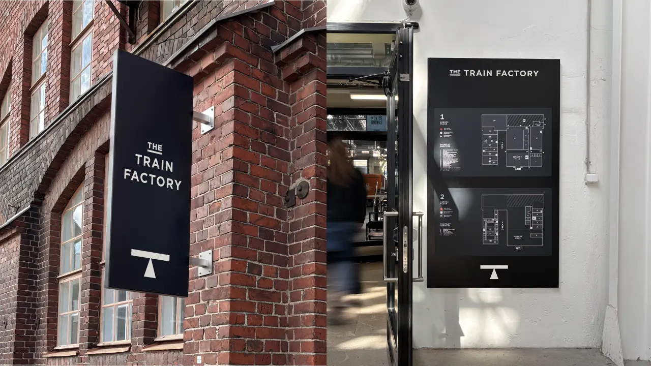
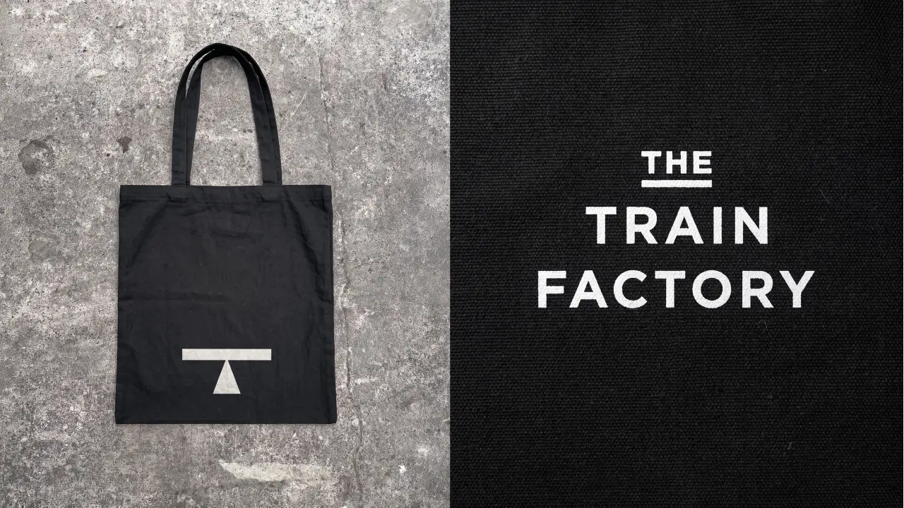
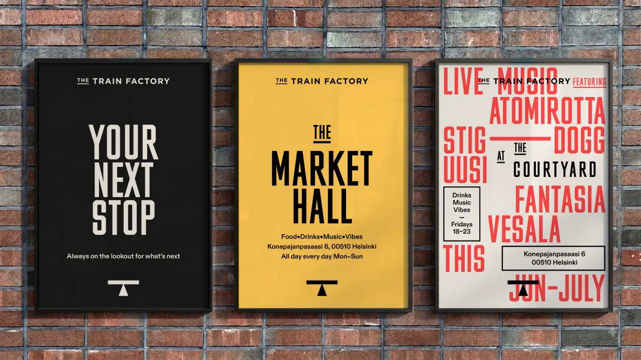
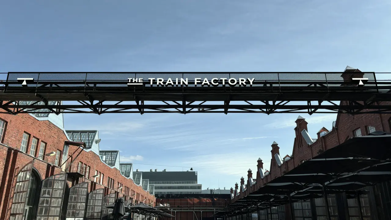
The identity has been rolled out across wayfinding, brand communication, social media and a new website. Motion comes into play on screen, reminding us of those announcements that used to flicker on old railway signs, the letters dropping into the right sequence. You can almost hear the sound of them changing over.
“The result brings the legacy of the site back to life with a brand that references its industrial past through a new, lively attitude,” says Hasan & Partners. The clever tagline, ‘Your Next Stop’, is the one railway pun the studio allowed itself. “Everything else came from the building.”
And I’d say they’re on the right track to where they want to be. It’s full steam ahead with a brand they can get on board with. No signal failures here. Mind the gap and all that. I’ll get my coat.