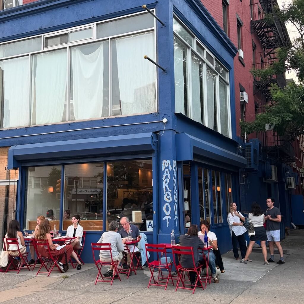

Amid a stretch of red-brick buildings, the Brooklyn restaurant Margot, right at the corner on a busy intersection, stands out. It’s blue: very blue, its two-story exterior painted the color of a pair of Prue Leith’s glasses, a chore coat worn by a server at a trendy natural wine bar, or a Molly Baz cookbook.
During its tenure, Horses, the now-infamous Los Angeles restaurant, was similarly eye-catching: a shock of glossy Yves Klein blue on Sunset Boulevard, the color named for the French artist who made it famous. Across the city, Electric Bleu — which gets its name from the 1987 song by Australian band Icehouse — features a towering panel on its exterior in the same shade, thanks to its owners’ similar affinity for the artist. It projects upward above the restaurant’s entrance, looking, at the right angle, like a lightning bolt has struck life into the otherwise gray-and-brick building.
Abroad, some restaurants have taken this very blue trend to its ultimate conclusion. The exterior of Patio, a wine bar in Brighton, England, is painted a blue so saturated that it almost looks fake in pictures. The same goes for the interiors of Berlin’s Cafe Gentil, monochromatic Yves Klein blue from moldings to baseboards. And at Singapore’s Punch Room, everything that isn’t wood, glass, or metal is the same color — a true example of monochromania. (New York City had a place like this, too: the short-lived Only Love Strangers, all cobalt and chrome.)

Are restaurants in a blue moment? Absolutely, says Anna Polonsky, who runs the hospitality-focused branding and design studio Polonsky & Friends. Those blue boxes holding NYC’s statusy Ceres pizzas? Her studio’s work, as are the cool blue accents at seafood spot Penny. While there is some variation in these blues — Yves Klein blue isn’t the same as Majorelle blue, though the two might look identical to the untrained eye — there is indeed a bias toward a certain kind of bold blue right now. “A lot of clients do ask for blue,” Polonsky says. It’s gotten to the point that her studio is now “actually trying to steer [clients] away from it” for fear of oversaturation.
The mid-to-late 2010s were dominated by millennial pink, a trend that swept restaurants as much as it did the broader culture. Restaurant design during this period was dominated by earthy, graphic-design-informed flourishes like terracotta blobs and textured plaster walls, and wabi sabi, muted, and neutral aesthetics reigned, Polonsky explains. Eventually, the all-millennial-pink restaurant, like London’s Sketch, became notorious “Instabait,” as Laura Fenton wrote for Eater in 2019. As the world began to open up again in the wake of the pandemic, candy-colored, vacation-inspired vibes emerged, filling restaurants with millennial-pink-adjacent pastels.

Now, the tide has turned toward saturation, hence all the blue restaurants. “I do feel, as always in design, it’s a reaction to that era: We wanted to go back to more primary colors,” Polonsky says. That blue won out of the three primaries shouldn’t be surprising. Blue, Polonsky notes, has a cool factor that red and yellow, which are now so strongly associated with fast food, do not; still, the blue on the Domino’s box was a reference point for Ceres.
Restaurants are reflecting what’s happening across the culture: The major fashion publications have identified primary colors as one of this year’s dominating clothing trends, while Vogue deemed Yves Klein blue “undoubtedly” the “winner of the night” at the most recent Met Gala. In Polonsky’s estimation, sky blue is ambient, more background energy than the main event. Navy blue is institutional: the color of banks, old New England, and the Ivy League. But in restaurants, this shade of blue — the family of cobalt, electric, royal, ultramarine, lapis lazuli — “feels intelligent and design-forward, but it’s also dynamic enough that it works on social media and it just can’t be ignored.”

In 1960, the artist Yves Klein patented the formula for the intense blue that now colloquially bears his name, though it’s also known as International Klein blue. According to France’s Centre Pompidou, “In his pursuit of pure, luminous blue, the artist sought a way to preserve the intensity of raw pigment in his monochromes.” The color is so saturated it almost vibrates with energy, as though it can’t be contained to the canvas. For some restaurant owners, the color echoes the feeling they wanted to evoke.
If Margot, the restaurant, was a person, she would be “this whimsical, hedonistic eater who loved eating and drinking and dining,” says owner Halley Chambers, who worked with designers Matthew Maddy and Nico Arze on the restaurant. “That shocking blue color felt representative of that ethos.” Still, moderation mattered: Despite its bright exterior, Margot’s interiors are subdued, with white walls and red accents.
Similarly, Mai Sakai and Craig Hopson of Electric Blue drew inspiration for their restaurant from the neobistros of Paris, they explain. “The food is always amazing, and it’s a little rowdy and a lot of fun. That’s the sense we wanted our restaurant to have,” Sakai says. The color felt “fun and like we didn’t take ourselves too seriously,” Hopson adds.
At Cafe Gentil, which is in the process of also becoming an art gallery, the immersive use of blue was a way for founder Christophe Collado to combine his interests in both art and hospitality, “while also breaking away from the idea that art has to feel elitist or inaccessible,” he says. To sit inside Cafe Gentil is to be a part of Yves Klein blue. According to Collado, “I wanted the cafe to feel open, welcoming and alive, a place for everyone.”
In The Devil Wears Prada, released in 2006, Meryl Streep as Miranda Priestly famously uses cerulean blue to explain the trickle-down of colors from niche artistic choices to overarching mass-market trends, with which everyone interacts whether they care about the source material or not. Twenty years later, the movie is back; the same example could be made with another shade of blue.