
The well-known Manchester studio has turned its own book about club culture into a living promoter brand, complete with custom variable font and a debut event.
There’s a particular kind of professional restlessness that comes from documenting someone else’s glory days. F37, the Manchester-based design studio and type foundry, spent considerable time and energy producing Clubbed: A Visual History of UK Club Culture, a best-selling book that chronicled four decades of flyers, posters and visual identities from the golden era of British clubbing. The book made it into the V&A’s permanent collection. Critics praised it. Then came the obvious question: what next?
The answer, it turns out, was to stop documenting and start doing. F37 has now become an actual club promoter, launching its own nightlife brand Clubbed with a debut event on 28 November at Area Manchester. Seb Fontaine and Tall Paul will headline, with support from Samuel Lamont, Tom Duncalf and Rick Banks, along with rising talent LD50.
But the real story here isn’t the lineup. It’s what happens when a design studio decides to become its own client.
The problem with nostalgia
Club culture nostalgia is everywhere right now. Trance is resurging. Younger audiences are discovering the genre whilst older ravers dust off their memories of Cream and Gatecrasher. But nostalgia, particularly in design, tends to produce lazy work.
Throwback aesthetics that mistake mimicry for homage. Gradient-heavy posters that borrow the visual language of the late nineties without understanding why it mattered in the first place.
F37 designer Keelin Wright is clear about the intention: “We wanted Clubbed to feel like a continuation of that era, not a throwback.”

It’s a crucial distinction. The Haçienda’s graphics weren’t remarkable because Peter Saville had good taste. They were remarkable because they treated club promotion as a serious design challenge, worthy of the same rigour as corporate identity or editorial work. They elevated the form.
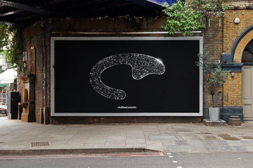
Clubbed attempts the same elevation, but in a modern-day style. At the centre sits F37 Euphoria, a custom variable font that transitions from structured letterforms into dispersed particles. It’s a direct visual translation of the sparkling cover of the original book and the euphoric build that defines trance music itself. Rick Banks, F37 founder, describes it as “translating that physical, tactile energy into something dynamic and digital; something that moves with the music rather than just representing it”.
Technical challenges
The technical challenges of animating a variable font are considerable. After Effects, the industry standard for motion graphics, couldn’t handle it, so the team decided to switch to Cavalry, a newer platform that few in the studio knew how to use.
Freelance animators were brought in, then had to learn the software from scratch. Eventually, Ryan, F37’s type designer, took over because he already knew Cavalry. It’s the kind of production nightmare that would make most studios reach for a simpler solution.
But constraints breed invention. The fact that Euphoria required specialist knowledge to animate properly means it can’t be easily copied or diluted. It’s a genuine technical achievement, not just a stylistic flourish. Meanwhile, design director Duncan Gravestock’s persistence in getting the motion right speaks to a studio treating this project with the same seriousness they’d apply to client work… perhaps more, because their own name is on it.
The broader visual system extends beyond type. F37 commissioned Davidope for 3D DJ portraits and stage screen visuals that echo the typeface’s particle dispersion. They also brought in Stüdio to interpret the brand through motion and texture.
Detail and small text, meanwhile, is handled by F37 Zagma Mono, adding a precise, technical layer that balances Euphoria’s kinetic energy. Overall, the system works across billboards, posters, digital platforms and merchandise: a genuinely flexible identity, not just a few social media templates.
F37’s motivation for launching Clubbed stems partly from frustration with Manchester’s current visual landscape. Despite the city’s rich design heritage (the Haçienda, Factory Records, the typography of Central Station Design), contemporary Manchester lacks the bold visual presence found in London.
F37 felt this acutely during their recent out-of-home campaign for F37 Mancunio, a new typeface. The work cut through precisely because so little else does. People noticed, shared, remembered.
Lessons for creatives
What makes Clubbed genuinely interesting for creative professionals isn’t the event itself (although we’re sure that’ll be legendary), but the structural position F37 has created. They’re not designing for a club promoter. They are the club promoter.
This means no client revisions, no budget negotiations about print quality, no compromises on animation complexity. Every design decision serves the work itself.
It’s a privileged position, certainly. F37 can afford to self-finance because their foundry and studio work pays the bills. But it’s also a challenge. When you’re both creator and client, there’s nowhere to hide. The work either succeeds on its own terms or it doesn’t. No one else to blame.
Whether Clubbed works as a promoter brand remains to be seen. One event doesn’t establish a legacy. But as a case study in how design studios might operate beyond client service, it’s certainly worth watching. Sometimes the most interesting work happens when you stop waiting for permission and commission yourself.