AI-powered health benefits platform Healthee has unveiled a new brand identity by Scout Lab, designed to bring clarity, warmth, and humanity to a notoriously complex category.
Health benefits are rarely simple. That’s why Healthee – an AI-powered platform designed to help people navigate them – came to creative communications agency Scout Lab to make them clearer to their users.
“Healthee came to us with a strong vision but a visual identity that didn’t reflect the emotional value of what they offer,” says Willow Hill, co-founder and chief creative officer at Scout Lab. “Our challenge was to create a brand that could build trust in a highly technical space while also standing out from the many cold, corporate healthcare brands.”
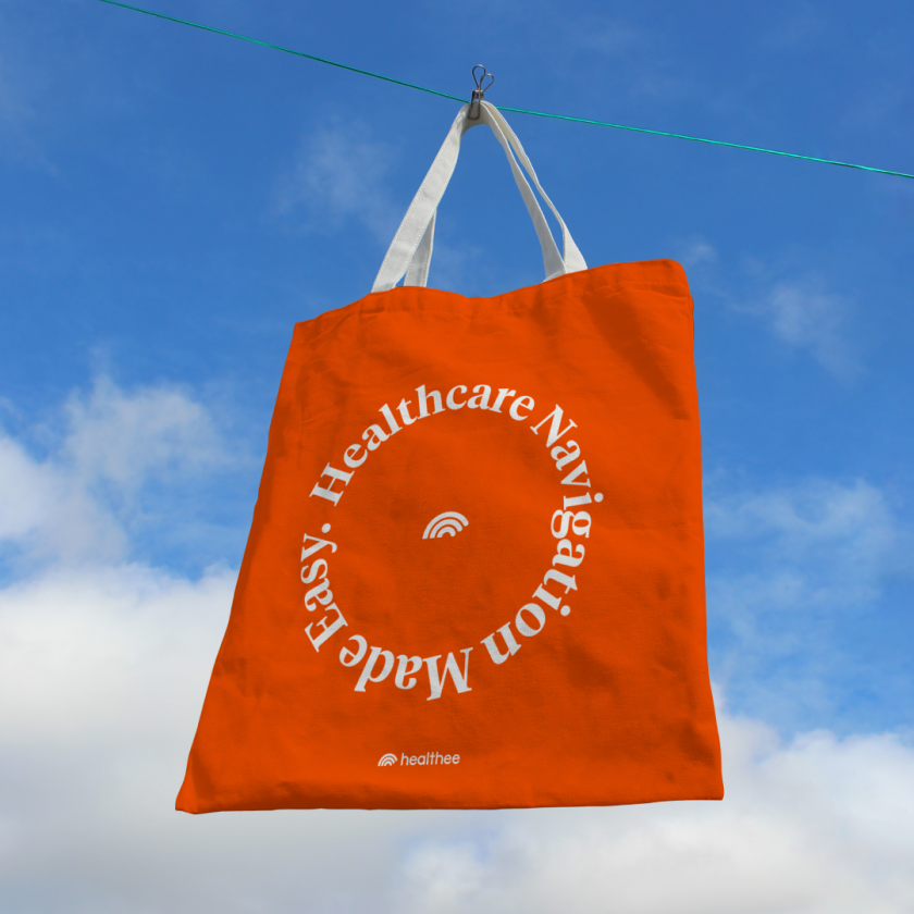
The new identity introduces a confident visual language, anchored by a ripple motif in the logo, designed as a symbol of impact and positive change. “The ripple represents impact,” Willow explains. “When someone understands their benefits and feels empowered in their healthcare journey, that clarity creates positive ripple effects in their life.”
The logo’s circular form and subtle movement work seamlessly across digital platforms, with the potential for animation to reinforce that sense of energy and flow.

At the heart of the redesign is the brand’s mission to make healthcare more accessible and intuitive. Scout Lab leaned into simplicity and emotional resonance, stripping away the unnecessary and leaning into elements that signal care rather than complexity.
“We wanted Healthee to feel like a guide, not a gatekeeper,” says Willow. “Every design decision supported that balance – from approachable typography to clear UX and a calming yet bold palette.”

Moving away from the conventional blues and greens that dominate healthcare, Scout Lab built a colour palette that feels both authoritative and optimistic.
“It was really important that we focused on scaling back their original colour palette and leaning into something ownable,” Willow explains. At its core sits poppy red, paired with black and white for contrast and strength. Surrounding it is what the team calls the ‘Healthee Glow’ – a series of luminous gradients in softer hues that suggest warmth, care, and optimism.
“The contrast helps the brand flex emotionally while staying unified and identifiable,” Willow says. “We used the poppy to create a clear and bold statement, then added the softer tones to make it feel more human.”

While the visual elements are striking, much of the project’s insight came from restraint. A key moment for Scout Lab was realising that Healthee’s AI technology didn’t need to be the hero.
“A key insight was recognising that the AI engine did not need to be the focus,” says Willow. “Leading with the technology could make the brand feel cold. The emotional power came from how the AI helps people. Once we agreed to centre human experience over technical explanation, the design system became much clearer.”
Shifting the emphasis from artificial intelligence to actual empathy aligns perfectly with Scout Lab’s broader mission to move humanity forward through thoughtful design and communications. Willow says: “With Healthee, that meant putting empathy and accessibility at the forefront.
“We approached the brand not just as a visual system, but as a way to improve people’s relationship with a confusing part of their lives.”


The rebrand also signals a broader movement in health and tech design, where clarity, emotion, and usability increasingly outweigh sterile minimalism. “Branding can make healthcare feel more human,” Willow explains. “It provides clarity, confidence, and emotional grounding in moments that can feel stressful or vulnerable. A thoughtful brand builds trust, and trust is essential to helping people take control of their health.”
In Healthee’s case, that trust now glows and radiates from every touchpoint.