
Rooted in the idea of “fragmented beauty,” the design embraces imperfection, tactility and discovery to reflect both the spirit of contemporary art and the layered character of its host city, Bradford.
The Turner Prize has landed in Bradford this year, marking the first time one of the world’s most recognised contemporary art awards has been hosted in the city. It’s fitting, then, that it’s also the first time its identity feels so distinctly influenced by its surroundings.
Created by Yorkshire and Glasgow-based creative studio Rabbithole, the 2025 Turner Prize identity celebrates what the studio calls “fragmented beauty” in a design concept that rewards those who take a closer look. Rather than chasing polish or symmetry, Rabbithole has built a visual system that thrives on tension and imperfection. Circular cut-outs, layered compositions, and vibrant bursts of colour give the work a sense of movement and depth, inviting viewers to peer beneath the surface.
“The brand identity for this year’s prize draws directly from conversations with local people, including a powerful image shared in a brand workshop by a young participant: ‘a flower slowly blooming out of a crack in the pavement,'” the team at Rabbithole explains. “This idea – of something quietly beautiful emerging from an overlooked place – became the emotional and conceptual anchor for the visual identity.”


A prize meets a place
Balancing the prestige of the Turner Prize – a Tate-led award known for its critical rigour – with the personality of Bradford was no small task. The studio wanted to create something that felt both serious and accessible, engaging not only the art world but also those who might be discovering the prize for the first time.
“The challenge was clear: speak to both the artworld-initiated and the casually curious,” says Rabbithole. “By avoiding lofty or overly polished design tropes, the joyful Turner Prize 2025 visual identity invites and welcomes all who encounter it.”
Accessibility is key to the project’s success, so the new identity embraces the nuances of the host city through its form and philosophy. Bradford, as the 2025 UK City of Culture, is a city of contradictions and contrasts that’s proud of its industrial past, shaped by migration, and brimming with cultural energy. In the identity, layers of shapes overlap and reveal fragments of what lies beneath, mirroring the city’s hidden beauty and the prize’s reputation for surfacing the unexpected.

Type, colour and character
Typography plays a defining role in grounding this expressive world. Rabbithole opted for a heavier, more robust cut of Denim by Displaay Type Foundry, contrasting with the softer Denim Ink used in the broader Bradford 2025 identity. The Turner Prize logo is built around a bold “T” formation, which separates “Turner Prize” and “2025” to create breathing space—both literally for layering and motion, and conceptually for interpretation.
The colour palette evolves from the familiar tones of Bradford 2025 – green, pink and gold – but pushes them further. Gradients, higher saturation, and a broader spectrum of hues create a sense of energy and unpredictability. The gradients also echo the idea of discovery, as colours blend and shift depending on light and scale.
In short, the identity feels tactile and human. It’s not a static system, but something that lives, moves and reveals itself over time.


Design you can touch
While much of the final work translates beautifully into digital and 3D applications (developed in collaboration with artist Joseph Töreki), Rabbithole placed special emphasis on making the identity physical.
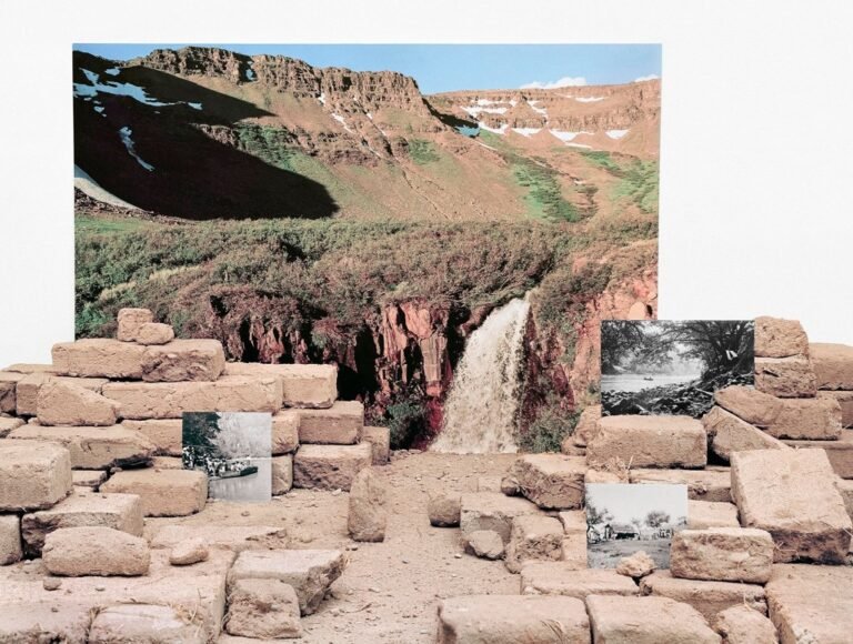
“With paper cut-outs especially, we wanted the identity to feel humble and accessible in its simplicity,” the team explains. Exhibition brochures feature die-cut holes that reveal glimpses of layers beneath, wall panels that overlap, and a timeline display constructed from stacked materials rather than a single flat graphic.
The intention was to give the identity dimension, so it’s almost like you can walk through it, not just view it on a screen.
Harriet Hudson, head of brand and marketing at Bradford 2025, describes the collaboration as “a joy.”
She says: “They’ve played, adapted and had fun with the brand they originally created across a range of projects, from the identity of pop-up venues to merchandise.
“For Turner Prize 2025, they’ve cleverly developed an appealing, punchy and distinctive identity that works on multiple levels: as a campaign it turns heads, in an ornate historic gallery it commands presence, and when needed it can sit back and allow the artist’s work to shine.”

Balancing playfulness and precision
An ability to shift gears from full-volume campaign to subtle exhibition support was central to the success of the design system. “When representing shortlisted artists and their work, the identity strips back to simple, minimal elements,” Rabbithole explains. “In contrast, event marketing posters crescendo at full volume with expressive fragmentation and colour with gradients and pushed saturation.”
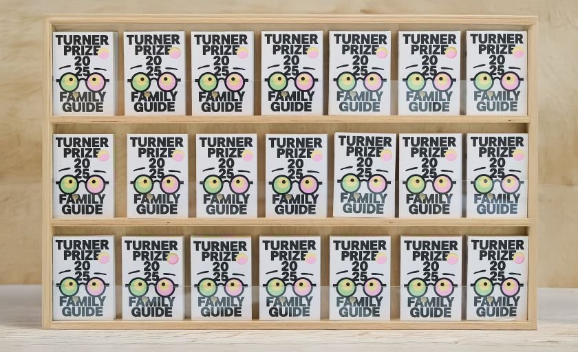
Having this dynamic range allows the identity to move easily between audiences and contexts. Playfulness emerges in interactive details, such as pop-out elements on family guides and bold motion graphics for social media, while precision shows up in the meticulous typographic hierarchy and accessibility standards used across signage and print.
The balance, Rabbithole says, “creates something that feels open and energetic, resonating with Bradford’s local character, while remaining refined enough for national media and curatorial audiences.”

A living, breathing identity
One of the most important elements is that the identity works because it doesn’t feel overly “designed.” There’s room for humanity, for spontaneity and for the imperfections that make both art and cities interesting.
“Rather than chasing symmetry or pristine polish, the identity favours unexpected alignments, quirky overlaps, and unpredictable gaps,” the team says. “This approach creates depth, tension and richness, echoing the multifaceted reality of Bradford and the often-challenging yet hopeful nature of contemporary art.”
That sentiment plays out in delightful ways. One of Rabbithole’s favourite moments came not from a poster or a billboard, but from watching kids pop out the cut-out glasses from a family leaflet. “Seeing them engaging with the brand like that really brought it to life,” they say. “That interaction – that curiosity – is exactly what we hoped for.”
The Turner Prize 2025 exhibition is now open at Cartwright Hall Art Gallery, and Rabbithole’s identity has already done its job by sparking curiosity, inviting conversation, and giving one of Britain’s most prestigious art prizes a distinctly Bradford soul.
Much like the prize itself, it rewards those who take a second look.