
The Copenhagen studio’s work for this butter cookie brand is a great example of how to bridge local heritage and international appeal through thoughtful design.
To someone in their 50s like me, there’s a specific thrill that comes with opening one of those old Danish butter cookie tins —the ones with scenes of windmills and half-timbered houses that once adorned grandparents’ homes worldwide. This visual language was deeply kitschy, undeniably charming and completely frozen in time. Which raises an interesting creative question: how do you take something so beloved and so dated, and make it work for today?
That’s exactly what Copenhagen’s Studio Morfar was asked to do for Juno the Bakery’s new butter cookie line. In other words, this wasn’t a simple packaging refresh. It was a sophisticated exercise in cultural storytelling that demonstrated how designers can serve as translators between heritage and contemporary audiences, as well as between local identity and global appeal.
The brief
The project began with an intriguing brief. Juno the Bakery had perfected their Danish butter cookies, and they were flying off the counter. But founders Emil Glaser and Nina Schmiegelow wanted more than a product that sold well locally. They wanted a brand that could travel as far as the cookies themselves, carrying Danish culture with it whilst resonating in Tokyo, New York or Hong Kong.
Studio Morfar’s creative director Torsten Power and his team didn’t start by sketching; they started by looking—really looking—at those vintage Royal Dansk tins and similar designs that had become cultural exports in their own right.
“It wasn’t about rejecting the traditional imagery so much as paying homage to Danish agricultural and urban life,” Torsten explains. “We wanted to give that visual language a modern spin; much like Juno does with its pastries and cookies.”


The solution lay in commissioning Japanese artist Kento Iida to illustrate a journey through Denmark. The idea sounds counterintuitive, but it was actually brilliant.
Juno had already run a successful pop-up in Japan, proving there’s a genuine appetite for their work abroad. More importantly, Danish and Japanese aesthetics share fundamental values: simplicity, craftsmanship, and a certain quiet beauty. Also, Emil and Nina’s own love of Japanese culture made the connection feel natural rather than forced.
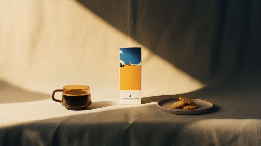
Kento’s serene, dreamlike illustrations capture Danish summer in lush greens and blues. The designs work as a visual narrative: golden wheat fields and wildflowers represent “Our Land”, Rosenborg Palace and the King’s Garden become “Our City”, and the streets of Østerbro, where Juno is based, form “Our Bakery”. It’s a portal into Denmark that works whether you’re intimately familiar with Copenhagen or you’ve never set foot in Scandinavia.
Brand universe
The colour palette draws from the high Danish summer; those particular shades of green and blue that define Scandinavian light. Every element reinforces the central idea: these cookies are deeply rooted in Danish tradition, whilst being designed for the world.
The scope of Studio Morfar’s work extended beyond the tins themselves. They created a dedicated e-commerce website and launch animation, building what they call a complete brand universe. The animation, with its playful movement and tactile textures, introduces the brand with warmth and personality.


The cookies are already stocked at Magasin du Nord and Copenhagen Airport, with international ecommerce launching soon. And overall, this positioning seems smart: an authentic taste of Denmark, yes, but also a “globally exportable design object,” as the studio calls it. That phrase matters: it acknowledges that people don’t just buy these cookies for what’s inside the tin.
For creative professionals working on heritage brands, food packaging, or any project requiring cultural translation, this work offers valuable lessons. Start with genuine research into what made the original successful. Find collaborators who bring fresh perspectives. Be willing to reinterpret rather than replicate. And remember that honouring tradition can mean setting it free to evolve.
Torsten sums it all up neatly. “Juno represents today’s Copenhagen that is both modern and rooted in tradition,” he says. “This project reflects our shared belief in doing simple things exceptionally well, and in using design to connect heritage with new audiences.”
In an industry often chasing trends, there’s something quietly radical about doing simple things exceptionally well – especially when those simple things happen to be biscuits.