
The presentation platform has unveiled a hand-drawn, single-colour illustration universe by Dutch designer and animator Loek Vugs, bringing a tactile and expressive counterpoint to its bold new brand.
Mentimeter has rolled out a fresh suite of illustrations and animations as part of its wider rebrand, pairing a crisp, graphic identity with a more human, hand-drawn world developed by Dutch designer and animator Loek Vugs.
The platform, best known for its interactive tools used across classrooms, boardrooms and live events, wanted an illustration style that felt expressive without breaking the clarity of its new aesthetic. The new simple, single-colour system does just that, looking deceptively minimal but with a surprising amount of life.
The brief landed with Loek at a time when he was used to working on smaller, more contained illustration projects. “This was the first time I did a project on this scale, so it was quite scary to dive into,” he says.
What eased that leap was the openness of the early conversations with art directors Mikael Lundin and Peter Viksten. Those first calls set the tone for a collaborative process, in which Loek was encouraged to explore scale, character behaviour, and energy before the team defined the system’s rules.


He began with a huge canvas of exploratory sketches, with figures large and small, hands drawn with varying levels of detail, and early experiments with how far the “cartooniness” could stretch. As Mikael and Peter marked up favourites and ruled others out, the shape of the universe emerged.
Anything too elastic or exaggerated was cut. Characters needed limbs that bent like real limbs, not noodle-like ones. That decision created an unusual constraint: the drawings had to feel like they were dashed off quickly, yet still carry the weight of real human movement.
It’s here that the illustrations really come into their own and find their charm. They remain flattened and immediate, almost like notebook doodles made during a lecture or meeting with a sketchbook quality that Loek deliberately pushed.
“The idea was to generate an illustration style that could feel like small little scribbles you put in your notebook,” he explains. Everything is drawn digitally, but with wobbly strokes that prevent the linework from feeling too perfect, keeping the characters emotionally readable without relying on faces, which he never draws.


Establishing the boundaries of this world early on was crucial. Loek experimented with scale first, partly to understand how bold characters could appear alongside Mentimeter’s UI and partly to see how much personality he could squeeze from the fewest marks.
“Having a good balance between minimal forms and believable human movement is, I think, exploring what is possible within the limitations,” he says. Perhaps problem-solving isn’t a skill one would often associate with illustration, but finding a way to draw elbows that kink at just the right angle or a stance that communicates excitement, hesitation, or frustration sounds like just that.


The system covers two main illustration types: broader conceptual spot illustrations and a full icon set. Designing icons, Loek says, forces him into an entirely different mode. With so little space to work in, they must be “balanced and clear”, while spot illustrations can embrace ideas that are looser, stranger or more metaphorical.
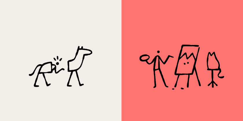
Having that freedom led to some of the project’s most memorable concepts, including the now-famous half-horse costume used to visualise “error”. Loek recalls how that moment appeared almost accidentally: “In one of the early sketches, I already had a drawing of the two characters with the horse suit. I added a note that it might be fun for a possible error page.”
Other illustrations tackle abstract concepts such as “complexity”, “celebration” and “participation”. Loek’s method for these is disarmingly simple: filling his sketchbook with quick drawings sparked by associations, whether it’s team sports, music groups or participation trophies.
“After a few stupid ideas, a good one comes out,” he says, laughing. Those sketches often become the groundwork for later animations, even when the movement wasn’t originally planned.

Motion plays a subtle but important role throughout the system. Loek’s background in animation meant he could design with movement in mind, ensuring the illustrations translated cleanly when animated later. He admits that the challenge lies in making animations loop naturally while keeping them as simple as the drawings themselves. A character jumping across letters to represent “writing” is a good example because it’s a single gesture expressed clearly, which makes it easy to bring to life without complicating the style.
Mentimeter is gradually rolling out the new brand across its platform, and Loek is eager to see how the illustrations behave in situ. Small UI interactions, such as hover-triggered animations, particularly excite him. “It is a super simple interaction, but it feels super satisfying,” he says. “It’s just a fun little surprise when you are exploring the website.”
Looking back, Loek sees two lessons he’ll carry forward: the importance of a clear key pose in character work, and the surprising power of a well-balanced static illustration to hold its own once animated. As Mentimeter rolls out over the coming months, its playful, handcrafted world looks set to become one of the platform’s most distinctive assets.